
- Getting Started
- Creating Your First Funnel
- CartFlows Funnel Step Types
- Starting a Funnel from a Product Page
- How to Edit and Customise Funnel Steps
- Using CartFlows with or without Store Checkout
- How to Add /Assign Products to a Checkout Step
- How to Create One-Click Upsell and Downsell Offers
- How to Use Canvas Mode to Visualize Your Sales Funnel
- Hiding Fields on the Checkout Page
- Installing WooCommerce
- Using WooCommerce
- Adding Products in WooCommerce
- Using Your Theme's Header & Footer in a Step
- Embedding a Checkout Form on the Checkout Page
- Hiding WooCommerce Pages and Products
- Using Pricing Tables
- Adding an Affiliate Program
- Setting a Funnel as the Homepage
- Dynamic Offers aka Rule Engine
- Instant Layout for Checkout and Thank You Step
- Adding Products from the URL to the Checkout Page
- Deleting Plugin Data During Uninstallation
- Importing Ready-Made Templates for Funnels and Steps
- Importing and Exporting Funnels and Step
- URL Parameters
- Replacing the Main Checkout Order with an Upsell or Downsell
- Rolling back to a Previous Version
- Using the "Order Custom Field" Rule of Dynamic Offers with Custom Field Editor
- Optin
- Separate Orders
- Setting Up Pre-Checkout Upsell
- Refund Offer
- Applying a Coupon from the URL
- How to Create a Direct Buy-Now Checkout Link for a Product
- How Coupons Work in CartFlows?
- User role manager
- Instant Layout for Upsell and Downsell
- CartFlows Smart Login
- How to Set Preferred Countries on the Checkout Page
- CartFlows Product Options
- How to Set Up Two Step Checkout in CartFlows
- How to Set Up Multistep Checkout in CartFlows
- How to Customize the CartFlows Thank You Page
- How to Set Global Styling for a CartFlows Funnel
- How to Close a Checkout After a Date or Number of Orders
- Google Address Autocomplete
- Flatsome UX Builder
- ActiveCampaign
- Paypal Reference Transactions
- How PaypPal/Stripe Works
- Enabling Enfold Avia Layout Builder
- Setting Up Authorize.net for Upsell & Downsell
- Supported Payment Gateways
- Setting Quantity and Discount for Products on the Checkout Page
- Adding Custom Payment Gateway Support for One-Click Upsell and Downsell
- Funnel in Test Mode
- Troubleshooting Plugin and Theme Conflicts
- Resolving the "Please Select a Simple, Virtual, and Free Product" Error
- Fixing Endless Loading on the Checkout Page
- Fixing the "We can't seem to find an order for you." Error on the Thank You Page
- Troubleshooting License Activation Issues
- Fixing the "Checkout ID Not Found" Error
- Fixing the "Session Expired" Error Message
- Resolving "Order Does Not Exist" Error on Upsell/Downsell Page
- Fixing the "Sorry, This Product Cannot Be Purchased" Error
- Disabling Auto-fill of Address Fields Based on Zip Code
- Enabling Theme's Scripts & Styles Without Changing Page Template
- Disabling Auto-fill of Checkout Fields
- Allowing Cache Plugins to Cache CartFlows Pages
- Changing the "Choose a Variation" Text
- VAT Field Not Displaying for WooCommerce EU/UK VAT Compliance Plugin
- Enabling the Product Tab on Store Checkout
- Displaying the Order Summary Open on Mobile Devices
- Refreshing the Checkout Page After CartFlows AJAX Calls
- Overview
- Installing Modern Cart Starter
- Installing Modern Cart Pro
- Activating License Key
- Customizing General Settings
- Customizing Cart Tray Labels
- Customizing Cart Icon Settings
- Customizing Cart Tray Styling
- Understanding the Product Recommendations Feature
- Controlling Product Recommendation Source for Empty Cart
How to Set Up Two Step Checkout in CartFlows
CartFlows includes a Two Step checkout layout that splits your checkout form into two short tabs. Customers enter their details first, then review their order and pay on the second tab, so the page never feels like one long form.
This guide shows you how Two Step checkout works, how to turn it on for a checkout step, and how to customize the note, step titles and button text.
How Two Step Checkout Works
Two Step places a numbered tab bar at the top of the checkout form. Each tab shows one part of the checkout.
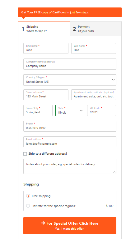
- Step 1 (Shipping) collects the customer’s billing and shipping details. A large button at the bottom moves them to the next step once the required fields are filled in.
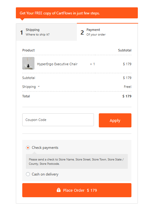
- Step 2 (Payment) shows the order summary, the coupon field, the payment methods and the Place Order button.
- A colored note box above the tabs gives you room for a short message, such as a reminder of what the customer is getting.
Customers can click the first tab at any time to go back and edit their details.
Before You Start
Two Step is included with CartFlows Pro. In the free version, you’ll see it listed as Two Step (Available in higher plan).
Where to Set the Layout
Where you choose the Two Step layout depends on how your checkout page is built.
- Using the CartFlows checkout shortcode — If your checkout page uses the CartFlows checkout shortcode, you set the layout and its design from the Design tab in your checkout step settings. This tab appears when CartFlows → Settings → General → Show Ready Templates for is set to Other. Follow the steps in the next section.
- Using a page builder with the CartFlows Checkout Form widget or block — If you built your checkout page with Elementor, the Block Editor, Bricks or Beaver Builder, the CartFlows Checkout Form widget or block on the page controls the layout. Open the checkout page in your page builder, select the Checkout Form widget or block, and choose Two Step under Layout → Select Layout. The design options for this layout then appear in the same widget or block settings.
Here is how it looks in Elementor, with the Checkout Form widget selected:
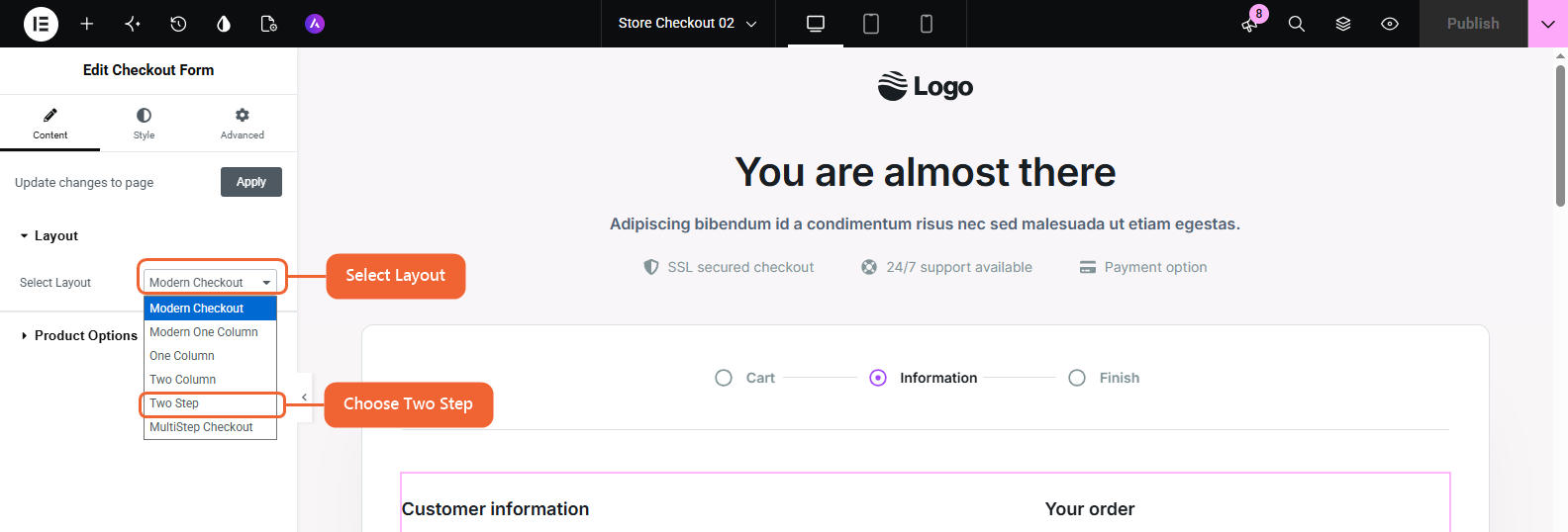
In the Block Editor, select the Checkout Form block and pick Two Step from Select Layout in the block settings sidebar. To learn more about the Design tab, see How to Modify the Checkout Page Using Backend Settings.
How to Set Up Two Step Checkout (Shortcode)
Use these steps if your checkout page uses the CartFlows checkout shortcode.
Step 1. From the WordPress admin, go to CartFlows → Funnels and open the funnel that contains your checkout step.
Step 2. Click the gear icon on the checkout step to open its settings.
Step 3. In the left menu, click Design → Checkout Design and turn on Enable Design Settings.
Step 4. Open the Checkout Skin dropdown and select Two Step.
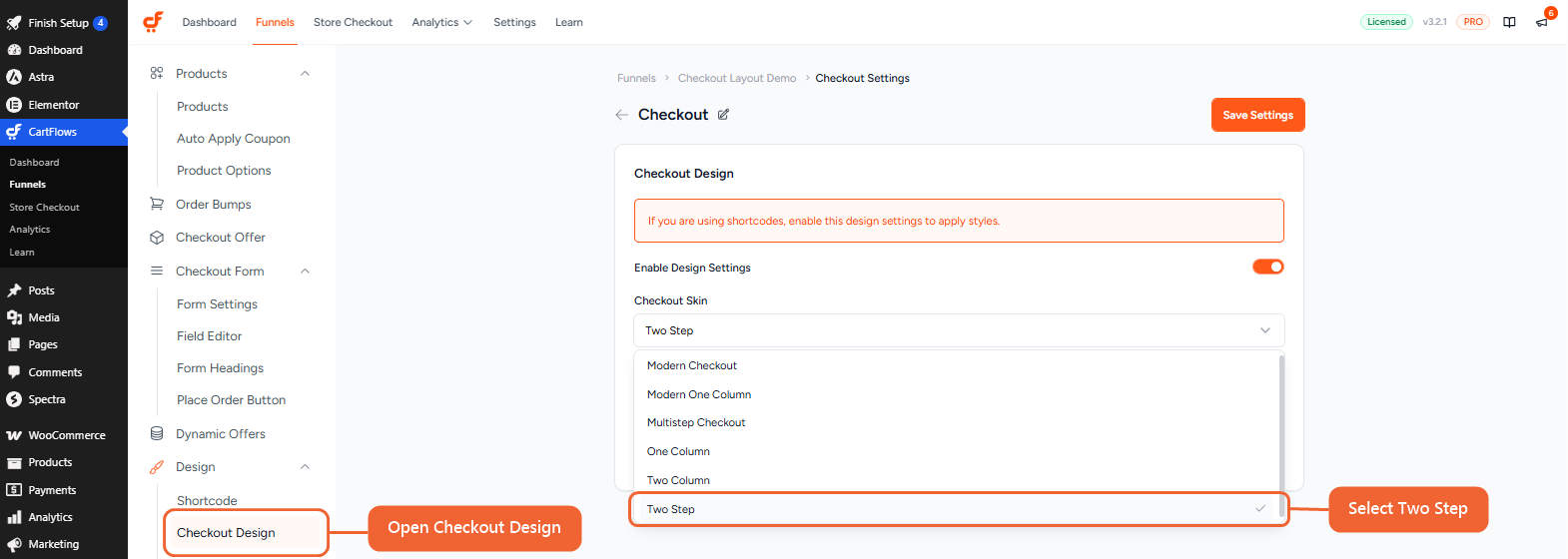
Step 5. Click Save Settings at the top right.
Two Step checkout is now active on that checkout step. Tip: Two Step shows when Instant Layout is off for the funnel. You can check this under Funnel Settings → Instant Layout.
How to Customize the Two Step Design
After you save the Two Step skin, a new Two-Step Design item appears under Design in the left menu. Click it to change the text and look of each part of the layout.
Using a page builder? You’ll find the same options, such as the note text, step titles and offer button text, in the Two Step section of the Checkout Form widget or block.
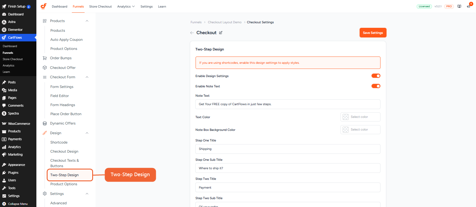
You can change the following options:
- Enable Note Text — Show or hide the note box above the tabs.
- Note Text — The message inside the note box.
- Text Color and Note Box Background Color — The colors of the note box. By default, the box uses your Primary Color.
- Step One Title and Step One Sub Title — The label of the first tab. The defaults are Shipping and Where to ship it?
- Step Two Title and Step Two Sub Title — The label of the second tab. The defaults are Payment and Of your order.
Scroll down for the remaining options.
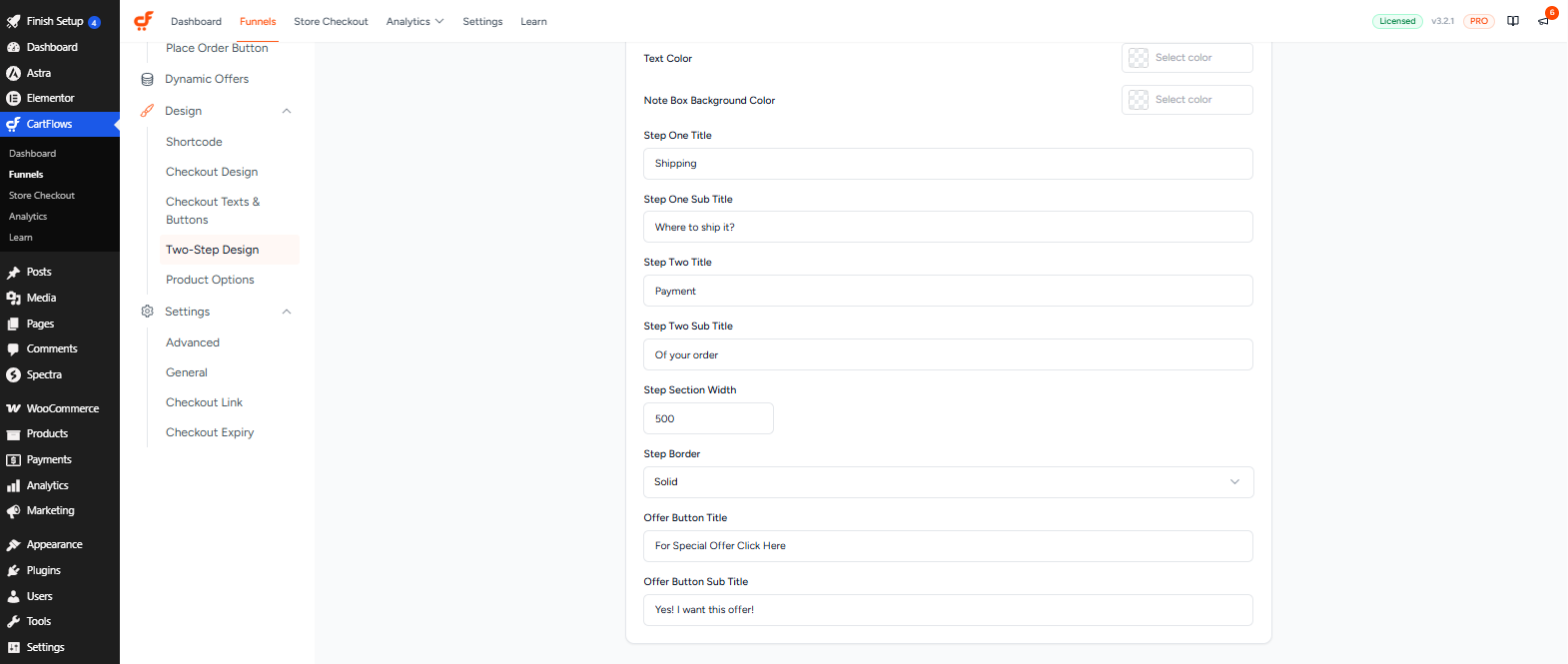
- Step Section Width — The width of the checkout form, in pixels.
- Step Border — Choose Solid to show a border around the form, or None to hide it.
- Offer Button Title and Offer Button Sub Title — The text on the button that moves customers to the second step.
Click Save Settings when you are done.
Two Step Checkout in Action
When customers open your checkout page, they see the note box, the two tabs, and the first step with their billing and shipping details. The button at the bottom takes them to the second step.
On the second step, customers see their order summary, the coupon field, the payment methods and the Place Order button.
On Mobile Devices
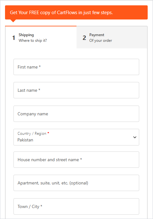
On phones and small tablets, the tab bar stretches to the full width of the screen and the spacing tightens, so both steps stay easy to use.
Frequently Asked Questions
We don't respond to the article feedback, we use it to improve our support content.