
- Getting Started
- Creating Your First Funnel
- CartFlows Funnel Step Types
- Starting a Funnel from a Product Page
- How to Edit and Customise Funnel Steps
- Using CartFlows with or without Store Checkout
- How to Add /Assign Products to a Checkout Step
- How to Create One-Click Upsell and Downsell Offers
- How to Use Canvas Mode to Visualize Your Sales Funnel
- Hiding Fields on the Checkout Page
- Installing WooCommerce
- Using WooCommerce
- Adding Products in WooCommerce
- Using Your Theme's Header & Footer in a Step
- Embedding a Checkout Form on the Checkout Page
- Hiding WooCommerce Pages and Products
- Using Pricing Tables
- Adding an Affiliate Program
- Setting a Funnel as the Homepage
- Dynamic Offers aka Rule Engine
- Instant Layout for Checkout and Thank You Step
- Adding Products from the URL to the Checkout Page
- Deleting Plugin Data During Uninstallation
- Importing Ready-Made Templates for Funnels and Steps
- Importing and Exporting Funnels and Step
- URL Parameters
- Replacing the Main Checkout Order with an Upsell or Downsell
- Rolling back to a Previous Version
- Using the "Order Custom Field" Rule of Dynamic Offers with Custom Field Editor
- Adding Order Bumps to WooCommerce Sales Funnel
- Replacing the First Product on Checkout with Order Bump
- Dynamic (Conditional) Order Bumps
- Order Bump AI
- Positions and Styles
- How to Auto-Apply a Coupon When an Order Bump Is Accepted
- How to Add Variable Products to an Order Bump
- How to A/B Test Order Bumps in CartFlows
- Google Address Autocomplete
- Flatsome UX Builder
- ActiveCampaign
- Paypal Reference Transactions
- How PaypPal/Stripe Works
- Enabling Enfold Avia Layout Builder
- Setting Up Authorize.net for Upsell & Downsell
- Supported Payment Gateways
- Setting Quantity and Discount for Products on the Checkout Page
- Adding Custom Payment Gateway Support for One-Click Upsell and Downsell
- Funnel in Test Mode
- Troubleshooting Plugin and Theme Conflicts
- Resolving the "Please Select a Simple, Virtual, and Free Product" Error
- Fixing Endless Loading on the Checkout Page
- Fixing the "We can't seem to find an order for you." Error on the Thank You Page
- Troubleshooting License Activation Issues
- Fixing the "Checkout ID Not Found" Error
- Fixing the "Session Expired" Error Message
- Resolving "Order Does Not Exist" Error on Upsell/Downsell Page
- Fixing the "Sorry, This Product Cannot Be Purchased" Error
- Disabling Auto-fill of Address Fields Based on Zip Code
- Enabling Theme's Scripts & Styles Without Changing Page Template
- Disabling Auto-fill of Checkout Fields
- Allowing Cache Plugins to Cache CartFlows Pages
- Changing the "Choose a Variation" Text
- VAT Field Not Displaying for WooCommerce EU/UK VAT Compliance Plugin
- Enabling the Product Tab on Store Checkout
- Displaying the Order Summary Open on Mobile Devices
- Refreshing the Checkout Page After CartFlows AJAX Calls
- Overview
- Installing Modern Cart Starter
- Installing Modern Cart Pro
- Activating License Key
- Customizing General Settings
- Customizing Cart Tray Labels
- Customizing Cart Icon Settings
- Customizing Cart Tray Styling
- Understanding the Product Recommendations Feature
- Controlling Product Recommendation Source for Empty Cart
Styling the Frequently Bought Together Widget
The Frequently Bought Together section is built to inherit your theme, so on most stores it already looks at home. There are no colour or font settings for it, so anything beyond what your theme gives you is done with a few lines of custom CSS.
How It Works
The section takes its cues from your theme wherever it can, and falls back to a neutral built-in style for its own parts.
- Text picks up your theme’s fonts and colours.
- The add button uses your theme’s own button style, so it matches the other buttons on the page.
- The panel itself, the row separators and the total use a plain built-in style you can override.
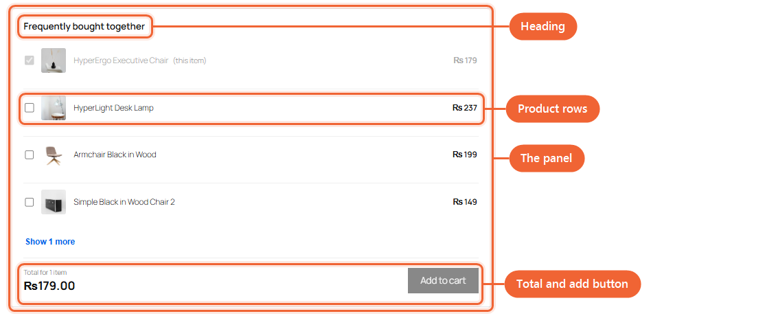
Here are the parts you can target, so you know what to aim at before you write anything.
Where to Put Your CSS
Custom CSS belongs with your theme, never in the plugin’s own files, so it survives every plugin update.
Step 1. Go to Appearance and open Editor, then choose Styles.
Step 2. Click the three dots at the top of the Styles panel and choose Additional CSS.
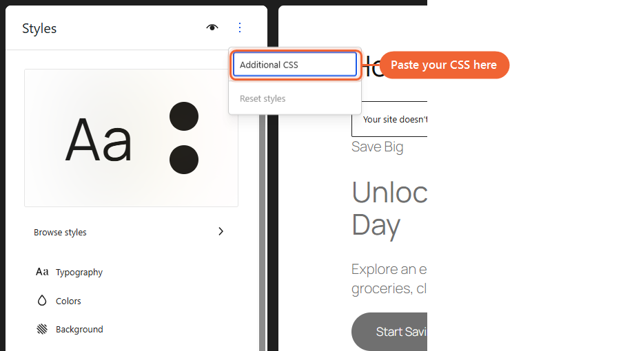
Step 3. Paste your CSS, then save.
If your theme is a classic one rather than a block theme, the same box lives under Appearance, then Customise, then Additional CSS.
Keep in mind that this CSS is stored against the theme you are using, so if you switch themes later you will need to move it across.
The Names to Target
Each part of the section has its own name you can style.
.wcf-fbt-widgetis the panel around everything.wcf-fbt-widget-titleis the “Frequently bought together” heading.wcf-fbt-widget-rowis one product line.wcf-fbt-widget-thumbis the small product image.wcf-fbt-widget-nameis the product name.wcf-fbt-widget-priceis the price on the right of a row.wcf-fbt-widget-toggleis the “Show more” link.wcf-fbt-widget-totalis the total in the footer.wcf-fbt-widget-addis the add button
A Worked Example
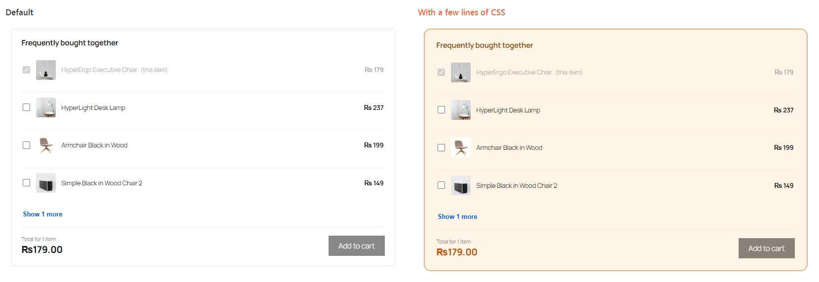
This is the whole of what produced the change below.
.wcf-fbt-widget.wcf-fbt-widget {
	border: 2px solid #d9b382;
	border-radius: 14px;
	background: #fdf4e6;
	padding: 24px;
}

.wcf-fbt-widget-title {
	font-size: 18px;
	color: #7c4a11;
}

.wcf-fbt-widget-total {
	color: #b45309;
}
Notice the first line has the panel’s name written twice. That is deliberate, and it matters.
If a Change Does Not Show Up
The section brings its own styling for the outer panel, which can win over yours for things like the border, the background and the corners. Writing the name twice, as in the example above, gives your rule enough weight to take over.
You only need this for the outer panel. The heading, prices, rows and total all take a single name without any trouble.
If something still does not change, clear any caching plugin you are running and reload the page, since a cached copy of the page can hold on to the old styling.
Common Changes
A few short recipes for the things people usually ask about.
Make the product images bigger
.wcf-fbt-widget-thumb {
	width: 60px;
	height: 60px;
}
Hide the product images entirely
.wcf-fbt-widget-thumb {
	display: none;
}
Remove the lines between products
.wcf-fbt-widget-list > * + * {
	border-top: none;
}
Make the total stand out
.wcf-fbt-widget-total {
	font-size: 24px;
	color: #b45309;
}
Frequently Asked Questions
We don't respond to the article feedback, we use it to improve our support content.