
- Getting Started
- Creating Your First Funnel
- CartFlows Funnel Step Types
- Starting a Funnel from a Product Page
- How to Edit and Customise Funnel Steps
- Using CartFlows with or without Store Checkout
- How to Add /Assign Products to a Checkout Step
- How to Create One-Click Upsell and Downsell Offers
- How to Use Canvas Mode to Visualize Your Sales Funnel
- Hiding Fields on the Checkout Page
- Installing WooCommerce
- Using WooCommerce
- Adding Products in WooCommerce
- Using Your Theme's Header & Footer in a Step
- Embedding a Checkout Form on the Checkout Page
- Hiding WooCommerce Pages and Products
- Using Pricing Tables
- Adding an Affiliate Program
- Setting a Funnel as the Homepage
- Dynamic Offers aka Rule Engine
- Instant Layout for Checkout and Thank You Step
- Adding Products from the URL to the Checkout Page
- Deleting Plugin Data During Uninstallation
- Importing Ready-Made Templates for Funnels and Steps
- Importing and Exporting Funnels and Step
- URL Parameters
- Replacing the Main Checkout Order with an Upsell or Downsell
- Rolling back to a Previous Version
- Using the "Order Custom Field" Rule of Dynamic Offers with Custom Field Editor
- Adding Order Bumps to WooCommerce Sales Funnel
- Replacing the First Product on Checkout with Order Bump
- Dynamic (Conditional) Order Bumps
- Order Bump AI
- Positions and Styles
- How to Auto-Apply a Coupon When an Order Bump Is Accepted
- How to Add Variable Products to an Order Bump
- How to A/B Test Order Bumps in CartFlows
- Google Address Autocomplete
- Flatsome UX Builder
- ActiveCampaign
- Paypal Reference Transactions
- How PaypPal/Stripe Works
- Enabling Enfold Avia Layout Builder
- Setting Up Authorize.net for Upsell & Downsell
- Supported Payment Gateways
- Setting Quantity and Discount for Products on the Checkout Page
- Adding Custom Payment Gateway Support for One-Click Upsell and Downsell
- Funnel in Test Mode
- Troubleshooting Plugin and Theme Conflicts
- Resolving the "Please Select a Simple, Virtual, and Free Product" Error
- Fixing Endless Loading on the Checkout Page
- Fixing the "We can't seem to find an order for you." Error on the Thank You Page
- Troubleshooting License Activation Issues
- Fixing the "Checkout ID Not Found" Error
- Fixing the "Session Expired" Error Message
- Resolving "Order Does Not Exist" Error on Upsell/Downsell Page
- Fixing the "Sorry, This Product Cannot Be Purchased" Error
- Disabling Auto-fill of Address Fields Based on Zip Code
- Enabling Theme's Scripts & Styles Without Changing Page Template
- Disabling Auto-fill of Checkout Fields
- Allowing Cache Plugins to Cache CartFlows Pages
- Changing the "Choose a Variation" Text
- VAT Field Not Displaying for WooCommerce EU/UK VAT Compliance Plugin
- Enabling the Product Tab on Store Checkout
- Displaying the Order Summary Open on Mobile Devices
- Refreshing the Checkout Page After CartFlows AJAX Calls
- Overview
- Installing Modern Cart Starter
- Installing Modern Cart Pro
- Activating License Key
- Customizing General Settings
- Customizing Cart Tray Labels
- Customizing Cart Icon Settings
- Customizing Cart Tray Styling
- Understanding the Product Recommendations Feature
- Controlling Product Recommendation Source for Empty Cart
Instant Checkout: Customizing the Popup Design
The Instant Checkout popup comes with its own design settings, so you can match it to your brand without touching your theme or checkout page. You can pick a layout, add your logo, change the button text, and set the colors and text size.
How Popup Design Works
Each funnel has its own popup design. The settings live on the funnel’s Instant Checkout tab, next to the switch that turns the feature on.
- The design you set applies to every product that opens this funnel’s popup.
- If you use Instant Checkout on more than one funnel, each funnel can have a different look.
- The popup uses your theme’s font, so it already feels like part of your store.
To see your design, save your changes, then open a product page and click the Instant Checkout button (Buy Now by default). The popup opens with your new look, just as your shoppers will see it.
How to Customize the Popup
Step 1. From the WordPress admin, go to CartFlows → Funnels and open your funnel. For a store-wide popup, go to CartFlows → Store Checkout instead.
Step 2. Click the settings icon next to Live Mode, then click the Instant Checkout tab.
Step 3. Make sure Enable Instant Checkout is turned on. The design options appear below it once it’s on.
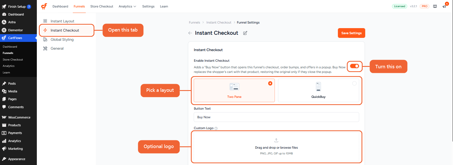
Step 4. In the layout cards, choose Two Pane or QuickBuy. Both are explained in the next section.
Step 5. Set the Button Text shown on the product page. It reads “Buy Now” by default.
Step 6. Upload a Custom Logo if you’d like your logo in the popup. It accepts PNG, JPG and GIF files up to 10MB.
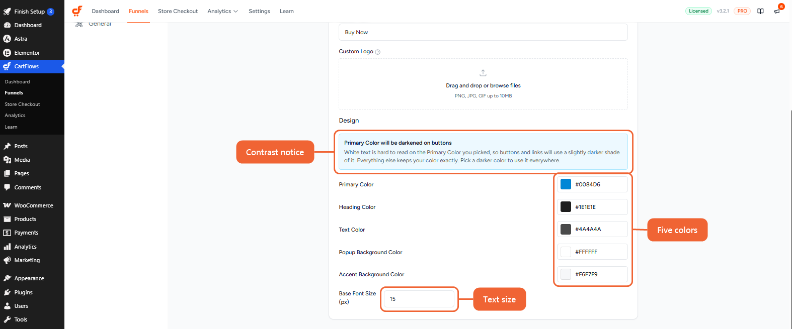
Step 7. Scroll to the Design section and set your colors and text size.
Step 8. Click Save Settings.
Your new design is now live in the popup.
Choosing a Layout
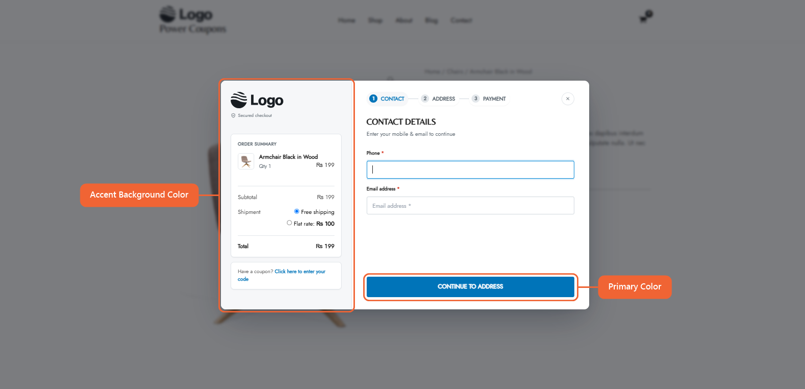
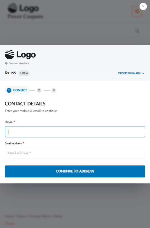
Two Pane is the full checkout experience. The order summary sits in its own panel on the left, with your logo, store name and coupon field. Shoppers move through three steps: Contact, Address and Payment.
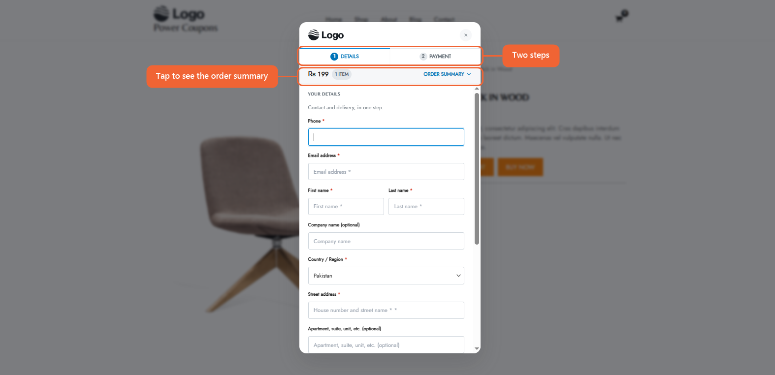
QuickBuy is a compact, single-column popup built for speed. It has two steps, Details and Payment, with a progress bar at the top and the order total in a strip that shoppers can tap to see the full summary.
Two Pane suits stores where shoppers like to review their order as they go. QuickBuy works well for quick, single-product purchases.
What Each Design Setting Changes
- Primary Color — The main action color: the Continue and Place Order buttons, the active step, links, the outline of the field a shopper is typing in, and the selected payment method.
- Heading Color — Step headings, field labels, product names, prices and the order total.
- Text Color — Body text, order summary rows and payment method descriptions.
- Popup Background Color — The main background of the popup.
- Accent Background Color — The soft background behind highlighted areas. In Two Pane, this is the order summary panel. In QuickBuy, it’s the order total strip and the selected payment method.
- Base Font Size (px) — The size of all popup text. It’s 15 by default, and everything scales up or down with it.
Each color has a Reset icon that appears once you change it, so you can go back to the default with one click.
Keeping Buttons Readable
If you pick a light Primary Color, a notice appears that says “Primary Color will be darkened on buttons.” White button text is hard to read on light colors, so the popup uses a slightly darker shade for buttons and links. Everything else keeps your exact color.
If you’d rather see your exact color everywhere, choose a slightly darker shade.
Your Logo in the Popup
The popup shows your Custom Logo if you’ve added one. If you leave it empty, it uses your theme’s site logo, or your store’s initials if you don’t have one set.
Your logo always keeps its shape and is never cropped. In Two Pane it sits at the top of the order summary panel, and in QuickBuy it sits in the header next to your store name.
On Mobile Devices
On phones, the popup stretches to the full width of the screen. In Two Pane, the order summary moves above the form and folds into a tappable total. In QuickBuy, each field gets its own row, and on smaller phones the Back and Place Order buttons stay pinned to the bottom of the screen.
Frequently Asked Questions
We don't respond to the article feedback, we use it to improve our support content.