- Hiding Fields on the Checkout Page
- Installing WooCommerce
- Using WooCommerce
- Adding Products in WooCommerce
- Using Your Theme's Header & Footer in a Step
- Embedding a Checkout Form on the CartFlows Checkout Page
- Hiding WooCommerce Pages and Products
- Using Pricing Tables
- Adding an Affiliate Program
- Setting a Funnel as the Homepage
- Dynamic Offers aka Rule Engine
- Instant Layout for Checkout and Thank You Step
- Adding Products from the URL to the Checkout Page
- Setting Up Split Testing for Steps
- Deleting Plugin Data During Uninstallation
- Importing Ready-Made Templates for Funnels and Steps
- Importing and Exporting Funnels and Step
- URL Parameters
- Replacing the Main Checkout Order with an Upsell or Downsell
- Rolling back to a Previous Version
- Google Address Autocomplete
- Flatsome UX Builder
- ActiveCampaign
- Paypal Reference Transactions
- How PaypPal/Stripe Works
- Enabling Enfold Avia Layout Builder
- Setting Up Authorize.net for Upsell & Downsell
- Supported Payment Gateways
- Setting Quantity and Discount for Products on the Checkout Page
- Adding Custom Payment Gateway Support for One-Click Upsell and Downsell
- Funnel in Test Mode
- Troubleshooting Plugin and Theme Conflicts
- Resolving the "Please Select a Simple, Virtual, and Free Product" Error
- Fixing Endless Loading on the Checkout Page
- Fixing the "We can't seem to find an order for you." Error on the Thank You Page
- Troubleshooting License Activation Issues
- Fixing the "Checkout ID Not Found" Error
- Fixing the "Session Expired" Error Message
- Resolving "Order Does Not Exist" Error on Upsell/Downsell Page
- Fixing the "Sorry, This Product Cannot Be Purchased" Error
- Disabling Auto-fill of Address Fields Based on Zip Code
- Enabling Theme's Scripts & Styles Without Changing Page Template
- Disabling Auto-fill of Checkout Fields
- Allowing Cache Plugins to Cache CartFlows Pages
- Changing the "Choose a Variation" Text
- VAT Field Not Displaying for WooCommerce EU/UK VAT Compliance Plugin
- Enabling the Product Tab on Store Checkout
- Displaying the Order Summary Open on Mobile Devices
- Refreshing the Checkout Page After CartFlows AJAX Calls
- Overview
- Installing Modern Cart Starter
- Installing Modern Cart Pro
- Activating License Key
- Customizing General Settings
- Customizing Cart Tray Labels
- Customizing Cart Icon Settings
- Customizing Cart Tray Styling
- Understanding the Product Recommendations Feature
- Controlling Product Recommendation Source for Empty Cart
Basic Settings
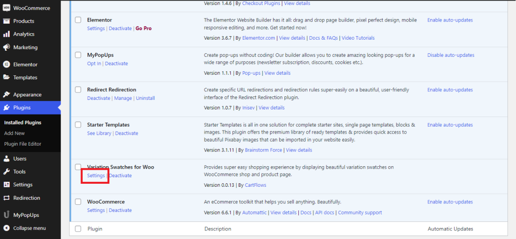
Once the plugin is installed you will need to manually set it up in order to get the customized and desired results on your WooCommerce products. To access the settings, you will need to navigate to the WordPress dashboard and click on plugins>installed plugin. Scroll down to the plugin and click on settings to access the settings page.
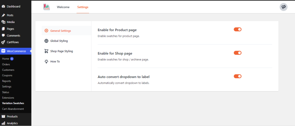
General Settings:
Under general settings, you will find three options which are mentioned below:
- Enable for product page: This will enable the features of the plugin in the single product page where the plugin will show the variants available for a particular product
- Enable for Shop Page: This will enable the users to select the different variants of the products directly from the shop/archive pages
- Auto convert the drop downs to labels: Enabling this feature will automatically convert the drop-downs to labels
Global Styling:
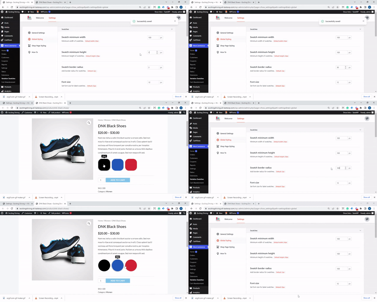
Under the global styling options, you will be able to customize the swatches as per your requirements and style segments. Following are the options available:
Swatch Styling
Swatch minimum width:
By default the minimum width of the swatches are set to 24px. You can change this by clicking on the arrows or by manually typing the number of pixels inside the box.

Swatch minimum height
By default the minimum width of the swatches are set to 24px. You can change this by clicking on the arrows or by manually typing the number of pixels inside the box.

Swatch border radius
The border radius is by default selected as 3px. You can change this by clicking on the arrows or by manually typing the number of pixels inside the box.

You can customize the swatches as per your requirements by changing the default value to any value. Please note that the global setting will only be applied to the product if the product attribute settings is set to default. Changing the height, width and the border radius to the same value will change the shape of the swatches as circles.
Font size
The font size of the swatch is by default selected as 12px. You can change this by clicking on the arrows or by manually typing the number of pixels inside the box.

Please note that you can change the font only for the label attribute. This does not work for the color or the size attributes.
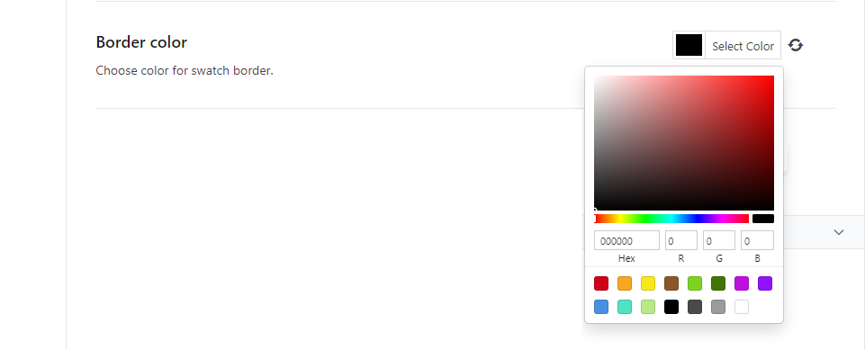
Border color
You can use the color selector to chose the border color of the swatch as per your requirement.
Disabled attribute effect
This option will help blur the disabled attributes so that the users can not select the same attribute. There are three major options that you can choose from which are blur, blur with cross and hide it completely from the front end of the website.

Tooltip Styling
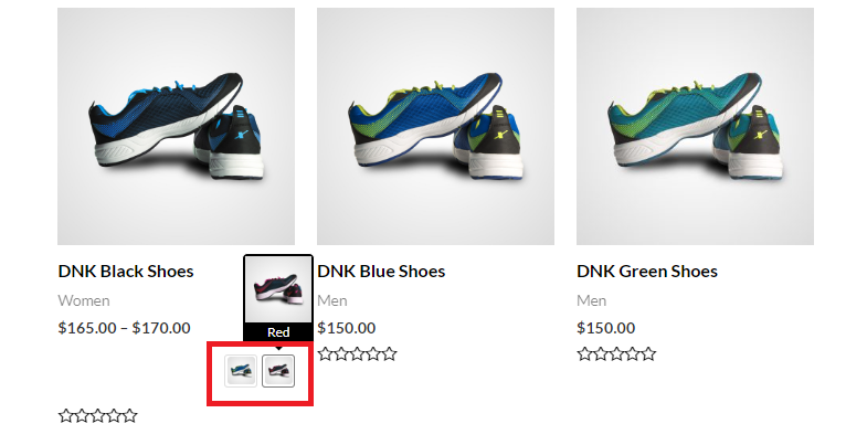
Tooltip is the option that helps pop up the name of the label, color or the size attribute when the user hovers the mouse cursor over them. There are the following options that you can choose from to customize how Tooltips appear on your website. You can simply choose to turn this option on or off by using the toggle button.

Front End view of the Tooltip
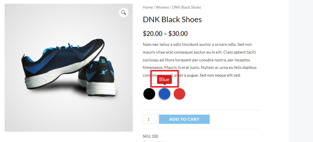
Tooltip background color
This option will help you customize the background color of the tooltips. In this example, we have set the background color as red.

Tooltip font color
This option will help you customize the font color of the tooltips. In this example, we have set the background color as white. You can change this by clicking on the “Select Color” option.

Tooltip font size
This option will let you change the font size of the tooltip. By default this is set to 12px. You can change it by entering the custom value in the box or using the up and down arrow adjacent to it.

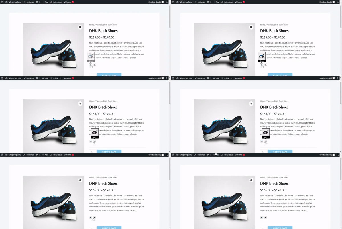
Image preview on tooltip
Image preview will be shown in tooltip if this option is enabled, This setting works only for image type swatches
Label Styling
Label position
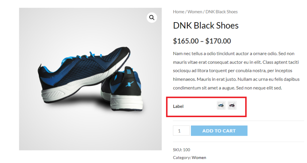
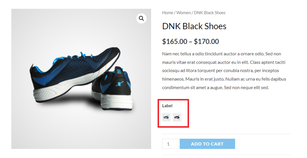
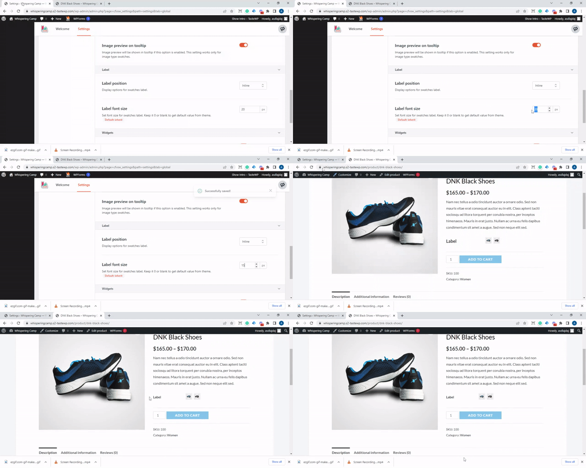
This option will help you in positioning the label on the product page. Currently there are three settings available to this function. They are None, Inline and stacked.

Inline: Inline settings will position the labels in the same line as mentioned in the image below:
Stacked: this option will stack the label below the tag as mentioned in the image below
Label font size
This option enables the users to change the font size of the labels
Widgets Styling
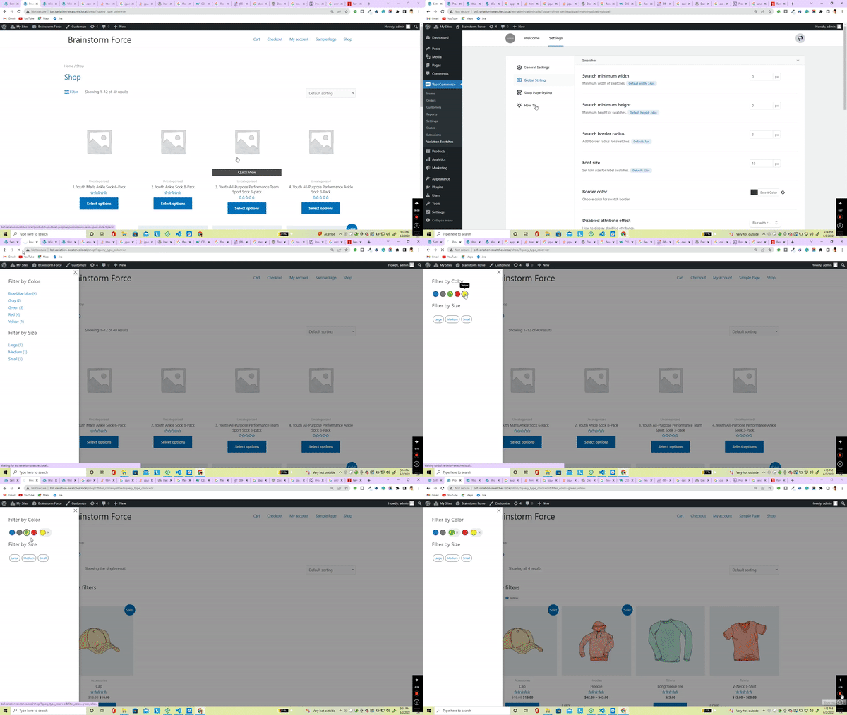
Filters
Enabling this option will add the swatches to the filter option of the woocommerce that means the users can use the filter option to choose from different swatches on the product archive page.
Shop Page Styling
To design and style the swatches on the shop page of your website, we have incorporated a few cool styling options.
Swatch Alignment
This option enables you to change the alignment of the swatches on the shop page. Currently, there are three different styles available as left, right and central.

This is how it looks on the front-end with a right alignment of the swatches
Swatch Position
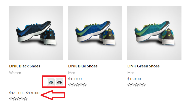
This option enables you to change the position of the swatches on the shop page. Currently there are 4 different positions that you can place the swatches on the shop page and they are After Price, Before Price, After Title and Before Title.

Here is an example of how this looks on the front-end of the website when you place the swatches before price
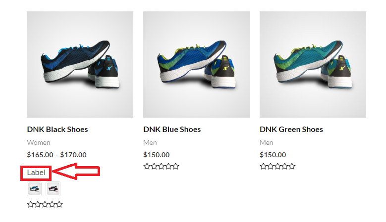
Show Swatches Label
Turning this toggle button on will display the labels for the swatches on the shop page. As you can see in the image below that the color and label are visible stacked to the swatches.
Attributes limit
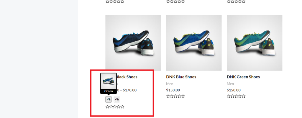
You can limit the number of attributes that would be displayed on the shop page using this option. You can either leave it blank or enter 0 in the box to load all the attributes. You can choose any number of attributes that you would like to display on the shop page.

Fron-end view
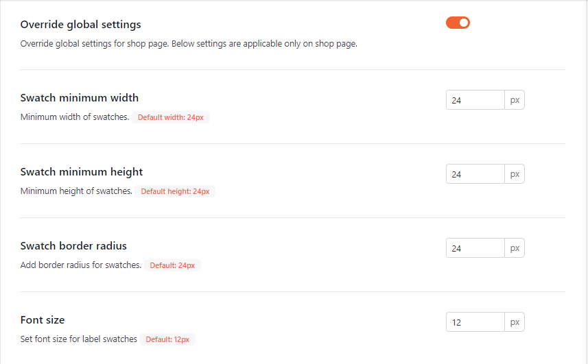
Override global settings
This option overrides any global setting inside the plugin and allows you to set customized width, height, border radius and font size inside the shop page.
We don't respond to the article feedback, we use it to improve our support content.