



Ever reached a checkout on your phone and found yourself scrolling through one long form just to place an order?
It’s easy to assume that breaking it into smaller steps would make the experience easier. Most guides ranking for this search suggest exactly that: more steps mean fewer abandoned checkouts and more conversions.
But our checkout statistics tell a different story. They show that it’s the number of fields, not the number of steps, that makes checkout difficult. And most checkouts ask shoppers to fill in far more than the tested ideal of about eight fields.
So, when does a WooCommerce multistep checkout actually help, and when is a single-page checkout the better choice? We’ll walk you through both, show you how to structure the steps, and explain how to set up and test your checkout. We also built one on our test store and went through every screen on desktop and mobile.
What is a multistep checkout?
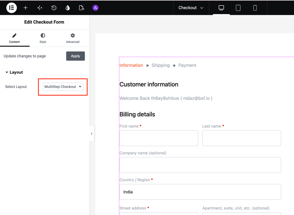
A multistep checkout (also written as multi-step checkout) divides the WooCommerce checkout form into a series of shorter screens, usually for contact details, delivery and payment. This allows shoppers to complete one section at a time, while a breadcrumb or progress bar at the top shows how far they’ve come. WooCommerce’s default checkout appears on a single page, so you’ll need a plugin or custom code to split it into steps. Here’s the first screen of the multistep checkout we built using CartFlows, a WordPress plugin that replaces WooCommerce’s default checkout. While the free plugin doesn’t support multistep checkout, CartFlows Pro adds this functionality. (We’ll cover the setup later.)
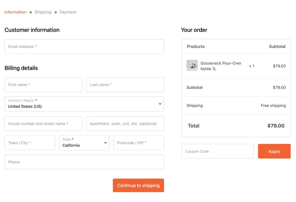
Step one of three: contact and billing details. On desktop, the order summary stays visible on the right throughout all three steps.
A multistep checkout is just one way to make checkout feel shorter. Our WooCommerce checkout optimization guide covers the other ways to simplify the process.
When should you use a WooCommerce multistep checkout?
Use a WooCommerce multistep checkout when you have a lot of information to collect. If you don’t, a single-page checkout may be all you need.
Splitting the checkout process into screens doesn’t remove any fields. To complete the checkout, the shopper still types the same details and clicks the same Place Order button. The only difference is how much they see at once.
That’s helpful when your checkout feels like a lot to tackle at once, especially for gift orders, delivery dates, business details, or anything that requires extra information. But if someone is buying a PDF, all they need is a name, an email, and a card number. Splitting that into three screens just means two extra clicks between them and their purchase.
| Your store | Multistep? | Why |
| Physical products with several shipping options | Worth testing | Address, delivery choice and payment each get a short screen, but most big stores we checked keep them on one page |
| Long forms (gift messages, delivery dates, business details) | Yes | The first screen looks short, and the extra fields come later |
| Any of the above, with most orders on mobile | Worth testing | Each screen fits the phone, but every step is another tap |
| Digital downloads, courses, memberships | No | There’s too little to split. Keep it on one page |
| One low-priced product sold from an ad | No | Send buyers straight to checkout instead |
In the “No” rows, a well-trimmed one-page checkout will do more for you than steps. And if shoppers are waiting on a slow checkout rather than a long one, speed up the checkout first, because splitting a slow page gives you three slow screens. In the “Worth testing” rows, set it up and test it against a one-page version (the measuring section below shows how).
Splitting the checkout into steps
Keep the email field first, give each screen a clear purpose, remove any unnecessary fields, and make sure shoppers can always see their order and go back to previous steps if needed.
Ask for the email first
Start with the email field. It’s the one detail that lets you reach shoppers who leave without completing their purchase.
Cart Abandonment Recovery, CartFlows’ free companion plugin, captures the cart as soon as a shopper enters their email at checkout, even if they close the tab right after. You can learn more about how it tracks abandoned carts and sends reminders to bring shoppers back.
Putting the email field first means you can reach more shoppers who leave before completing their purchase. In the older short-code checkout, the email field sits further down among the billing details, so shoppers who drop off early may never get to it. The newer WooCommerce block checkout avoids this by asking for the email upfront.
Give each screen one job
Three screens are enough for most stores:
- Information: the shopper enters their email, name and billing address.
- Shipping: they choose the delivery method, or “ship to a different address” for a gift.
- Payment: they pick a payment method and click Place Order.
That’s the split CartFlows uses (Information » Shipping » Payment). You don’t need to add a fourth screen for login, coupons or a separate order review unless there’s a good reason. After all, every extra screen means another click before shoppers can place their order.
Each screen should validate its own fields before letting shoppers move on. When we tested it, clicking Continue wouldn’t take us to the next screen until all required fields were filled in. This way, shoppers can fix missing details as they go instead of discovering an error at the very end of checkout.
Trim your checkout fields before adding more steps
Splitting makes checkout only feel shorter, but removing unnecessary fields actually shortens it. Start by trimming your form and aim for around eight fields, based on our checkout statistics.
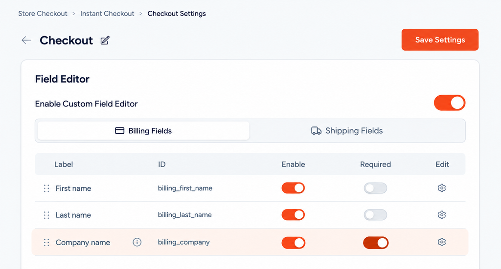
Go through every field and ask whether you need it to deliver the order. Company name, the second address line and phone number are the usual candidates. In CartFlows, go to CartFlows → Store Checkout (the checkout CartFlows runs in place of WooCommerce’s) and click the gear icon on the Checkout row (CartFlows calls each page of that checkout a step). Under Checkout Form → Field Editor, switch on Custom Field Editor, then turn fields off, make them optional, reorder them or rename their labels, and click Save Settings. For more details, see our guide to customizing checkout fields.
Keep the order and the way back in view
Shoppers should always know what they’re buying and have an easy way to go back and fix their details.
In CartFlows’ multistep checkout, the order summary and coupon field stay beside the form on desktop. On mobile, they collapse into a bar at the top that shoppers can tap to view their order.
As shoppers move through the steps, their previously entered details (like their email address) remain visible, along with a Change link and a Back to Information link. This makes it easy to review or edit details without starting over.
Using an order bump (a one-click add-on offered at checkout)? It stays below the order summary, so shoppers can still see it without losing track of their order.
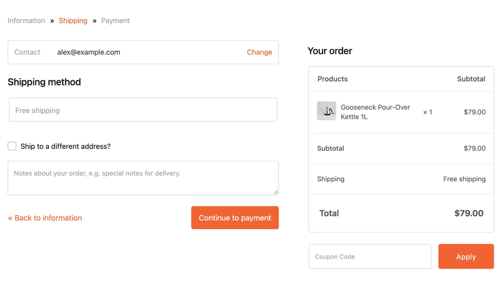
Step two: the email from step one shows with a Change link, and the order stays in view.
Real-world examples: A multistep checkout vs. a one-page checkout
Most large stores we checked use a single-page checkout. On 23 September 2026, we visited the checkout pages of 14 well-known Shopify stores, including Allbirds, Glossier, Brooklinen, Rothy’s, Skullcandy, and Death Wish Coffee. We found that 13 use a single-page checkout, while only one, ColourPop, splits the process into steps.
ColourPop: a three-step checkout in a straight line
ColourPop’s checkout runs Information › Shipping › Payment, the same straight-line split as the CartFlows checkout above. It also follows two of the same principles: the email is the first form field, and the order summary stays visible. The first screen shows express payment buttons, followed by the email and delivery address fields, and a button to continue. The order summary and discount field remain on the right.
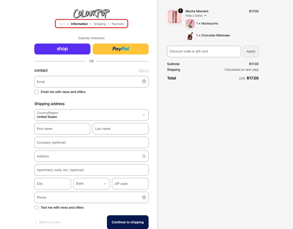
ColourPop’s checkout, first screen (colourpop.com, checked 23 September 2026). The red boxes highlight the three checkout steps: Information, Shipping, and Payment. The shopper is currently on Information.
Allbirds: a one-page checkout, because the form is short
Allbirds puts its whole checkout on one page: express payment buttons at the top, then contact details (email first), the delivery address and method, and payment.
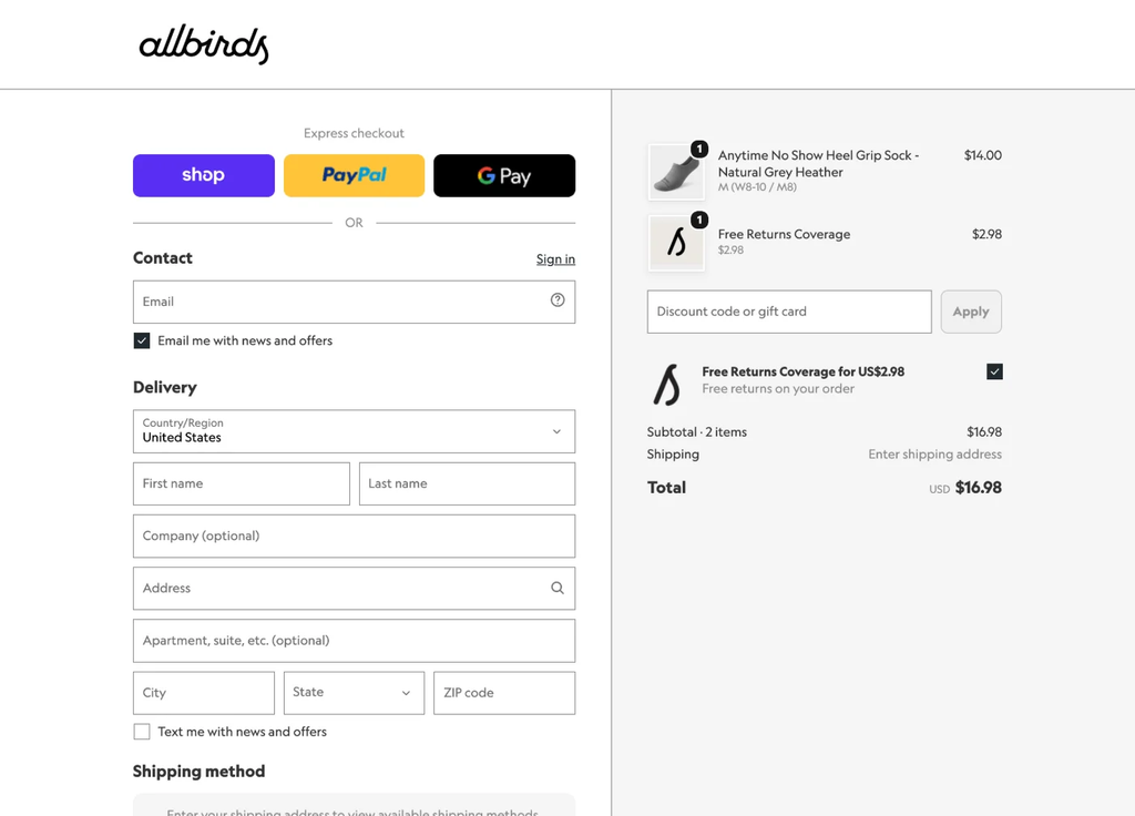
Allbirds’ checkout (allbirds.com, checked 23 September 2026): one page, express buttons first, then the email.
A pair of socks needs only an email, an address and a payment method, and shoppers who use an express button skip the form altogether.
Both sell physical products and ask for much the same details, so neither layout is a one-size-fits-all solution. What decides it for your own WooCommerce store is how long your form is. Whichever layout you choose, put the email field first.
How to add a multistep checkout to WooCommerce
WooCommerce can’t split its checkout into steps on its own, so a WooCommerce multistep checkout takes one of three routes: CartFlows, a single-purpose plugin, or custom code.
Option 1: CartFlows (no code)
CartFlows replaces your WooCommerce checkout page with its own, which you can then lay out as steps. The free plugin already replaces the checkout and offers one- and two-column forms. The multistep version comes with CartFlows Pro.
Before you start, check three things:
- CartFlows and CartFlows Pro are installed, and your license is activated.
- Your page builder is set under CartFlows → Settings → General. CartFlows works with the block editor, Elementor, Beaver Builder, Divi, Bricks and others. Where a step happens in the page builder, the screenshot uses Elementor.
- A Store Checkout is set up. It’s the CartFlows checkout that every order in your WooCommerce store goes through, in place of WooCommerce’s own. If CartFlows → Store Checkout is empty, create one first, starting from one of the ready-made Store Checkout templates (Store Checkout docs).
Step 1: Turn off Instant Layout. Instant Layout applies a ready-made CartFlows design without a page builder, so switch it off before you pick the multistep layout in your builder. Go to CartFlows → Store Checkout, click the gear icon at the top right, switch off Enable Instant Layout, and click Save Settings.
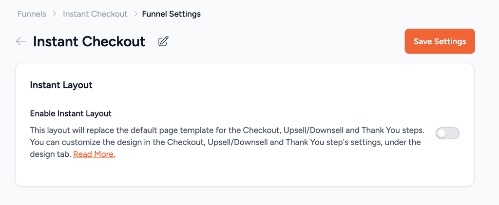
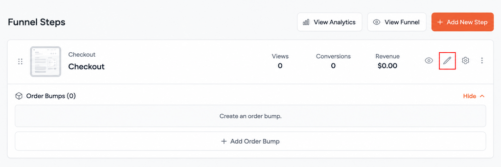
Step 2: Open the checkout in your page builder. On the Store Checkout screen, click the pencil icon (Edit Step) on the Checkout step. The checkout page opens in the page builder you set in CartFlows, whether that’s the block editor, Elementor or another builder.
Step 3: Choose MultiStep Checkout. In Elementor, if the page doesn’t have a checkout form yet, search “Checkout Form” in Elementor’s widget panel and drag the CartFlows Checkout Form widget onto the page. Click the widget. In the Content tab, open Layout, and under Select Layout choose MultiStep Checkout. Click Apply, then Publish. To undo it later, pick your old option in the same dropdown. The widget’s Style tab, next to Content, is where you change the look of the form itself, such as its colors and buttons (Checkout Form widget docs).
Not using Elementor? Click CartFlows’ checkout form element in your builder and look for the same choice. In the block editor, the Checkout Form block offers one-column, two-column and two-step options but no MultiStep, check out our Checkout Form block documentation for details. So if you use the block editor, your builder doesn’t list MultiStep, or you don’t use a page builder at all, set CartFlows → Settings → General → Page Builder to Other. Then click the gear icon on the Checkout row, and you’ll find a Design tab where you pick Multistep Checkout under Checkout Design → Checkout Skin (checkout design docs).
Step 4: Check it as a shopper. Open your store in a private window, add a product to the cart and go to checkout. You’re done when:
- The breadcrumb at the top reads Information » Shipping » Payment.
- Continue won’t move past a screen until its required fields are filled in.
- Continue takes you through all three screens to Place Order.
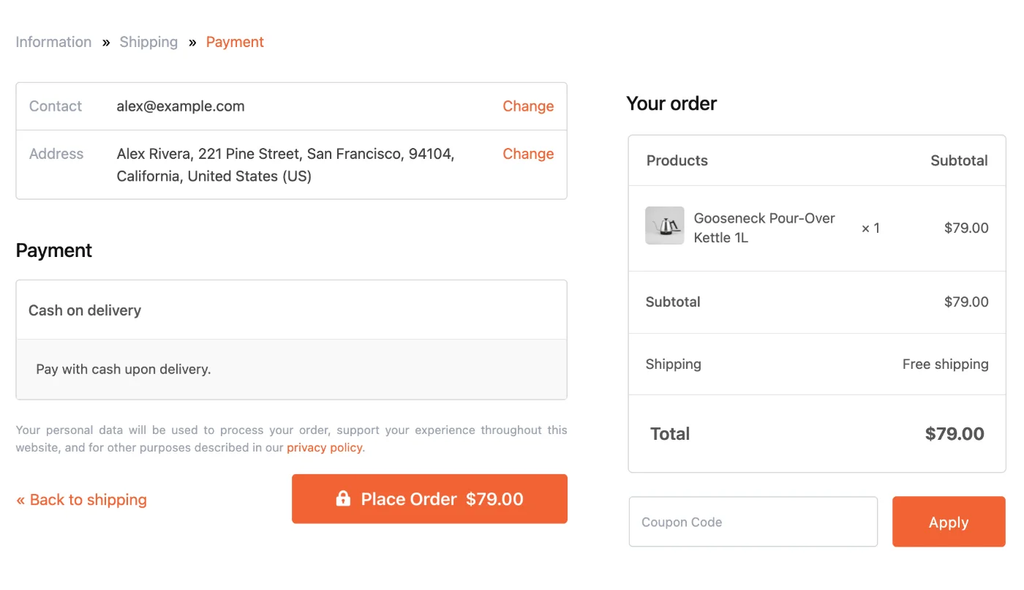
The last screen: what the shopper entered, the payment method, and Place Order.
On a phone, the order summary folds into a “Show Order Summary” bar at the top, so the form gets the whole screen. One tap opens it to show the items, totals and coupon field.
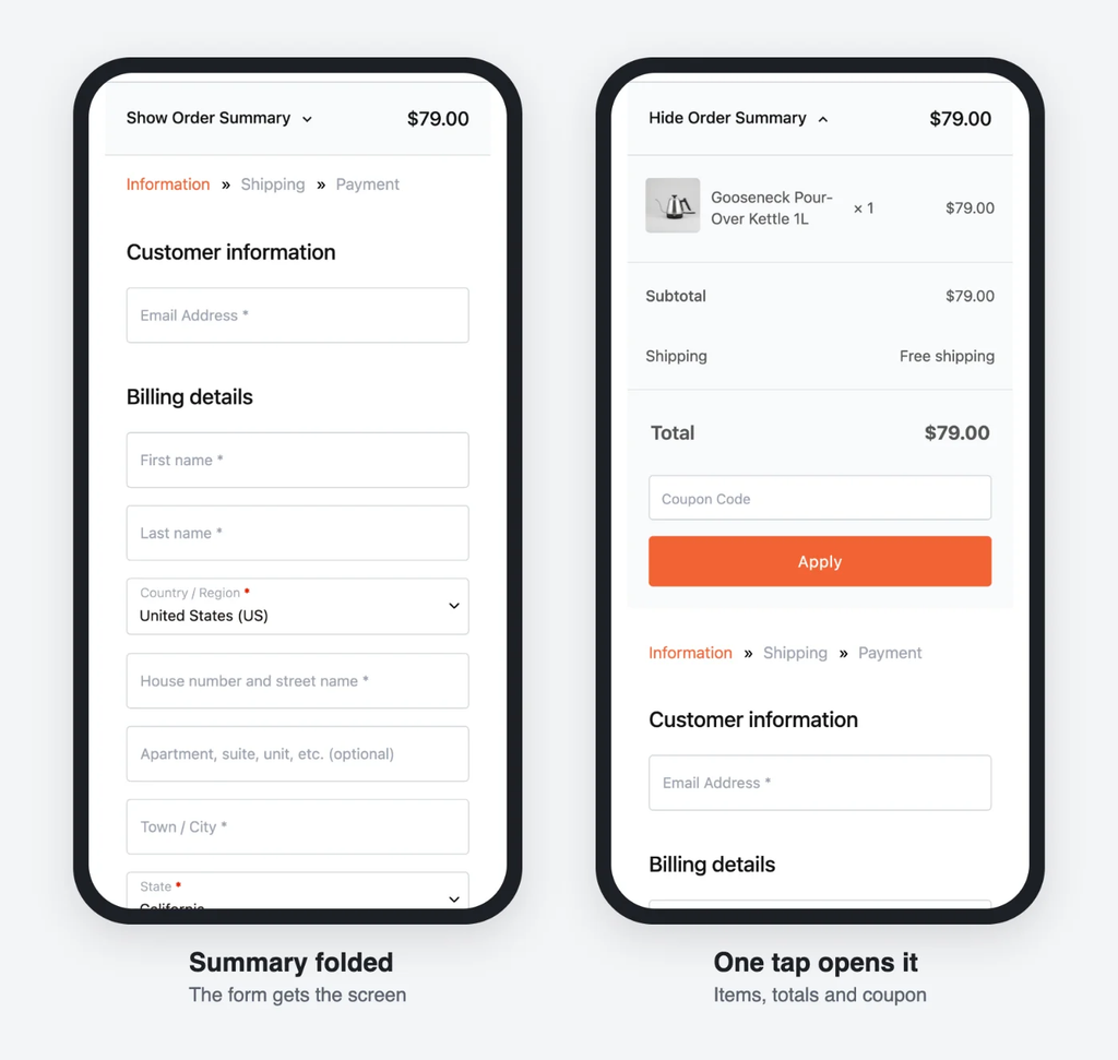
On mobile, the order summary folds into one bar and opens with a tap.
Option 2: A WooCommerce multistep checkout plugin
If steps are all you want, a dedicated multistep checkout plugin does the job. The catch comes later. When you want an order bump, a one-click upsell or a split test, each one is another plugin to install, pay for and keep compatible with the others. CartFlows and CartFlows Pro cover the multistep checkout and those extras together, which is why we’d start there.
If you do go with a single-purpose plugin, first check which checkout your store runs, because many of these plugins only work with one of the two.
Since WooCommerce 8.3, released in November 2023, new stores use the block checkout by default, while older stores may still use the shortcode checkout. You can read more in the WooCommerce developer blog. To check which one your store uses, go to Pages, open your Checkout page, and look for:
- If you see a Checkout block with sections such as contact information and a delivery address, your store runs the block checkout.
- If you see a Classic Checkout block, or a shortcode block with [woocommerce_checkout], it runs the shortcode checkout.
Then pick a checkout plugin that supports your type of checkout, and these two are a good place to start:
- Multistep Checkout on the WooCommerce Marketplace has horizontal, vertical and accordion layouts, and its page says it’s compatible with the Checkout block.
- YITH WooCommerce Multi-step Checkout has around ten step layouts and lets you merge or drop steps, such as shipping for stores that don’t ship. Its page doesn’t say whether it supports the Checkout block, so ask before you buy.
Free multistep checkout plugins exist on wordpress.org, but read the FAQ first. At least one popular free option says it only works with the [woocommerce_checkout] shortcode, so it won’t run on a block checkout (wordpress.org).
Option 3: A multistep checkout without a plugin
You can build a multi-step checkout yourself, but it takes custom development.
With the shortcode checkout, the entire checkout sits in one HTML form and is submitted at once. A custom multistep version would need to:
- Use JavaScript to show and hide each section.
- Validate each section before shoppers move to the next.
- Keep WooCommerce’s live updates (shipping costs, totals, payment methods) working along the way.
On the block checkout, the page is built from React blocks, so you’d write a custom extension instead.
Take this route if you have a developer and a specific need that no plugin meets. Otherwise a plugin is cheaper to keep working through WooCommerce updates.
Measure the multistep checkout against a one-page version
Compare the checkout’s conversions with a one-page version, on mobile and desktop separately, and watch how many shoppers who leave an email go on to buy.
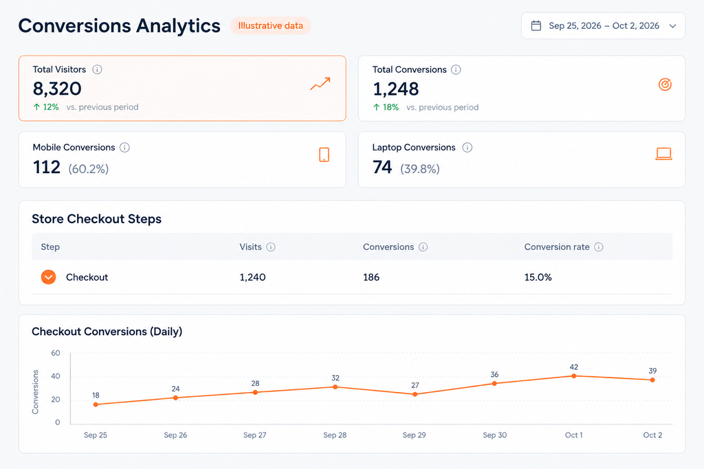
- Watch the checkout’s conversion rate in CartFlows Pro analytics. The analytics dashboard shows visits, conversions, and revenue for each Store Checkout step, including the checkout itself, with mobile and desktop split out. Because it counts the checkout as one step, it compares whole checkout versions rather than showing drop-off between screens one, two, and three.
- Track the share of captured carts that end in an order, not the raw count. If your old checkout had the email among the billing fields, moving it to screen one means Cart Abandonment Recovery captures more carts, so the count will rise even if the change doesn’t work. If that share falls, shoppers are getting through screen one and giving up later.
- Run a split test, because a before-and-after comparison can be thrown off by a sale or a slow week. CartFlows Pro can split-test two versions of a checkout step. Follow the split testing guide to run the multistep version against a one-page, one-column version at the same time and keep the winner. Run it for at least two full weeks, weekends included, before you compare.