



Your WooCommerce checkout is the last screen between a shopper who wants your product and the money, and most store owners have never touched it. WooCommerce ships one generic checkout template to every store on earth, so it fits yours by accident rather than design.
A checkout loses people in six places, and they are not equally likely to be yours. By the end of this guide you will know which one is costing you orders today, what the fix costs, and whether it takes a plugin at all before you change a single setting.
In short. WooCommerce checkout optimization means removing every reason a shopper who already wants your product fails to pay.
- A checkout loses people in six places: what it asks for, what it tells them, what shape it is, whether it holds up on their phone, whether they believe you, and what happens to the ones who leave.
- Measure first. Your funnel names the place costing you most today, and the order of the six names what has to land before that fix can pay.
- Most of the first place is free: guest checkout is a WooCommerce setting, and on a block checkout so is hiding the company, address line 2 and phone fields.
- Field reordering without code is free in CartFlows. Custom checkout fields and multistep checkout are CartFlows Pro.
Start where your shoppers actually stop, not with the longest list of tactics.
- Is This Guide for You?
- What Is WooCommerce Checkout Optimization?
- Why the Checkout Is Where Stores Lose the Most Money
- Find Out Where Your Own Checkout Loses People
- The Six Places a Checkout Loses People
- What Your Checkout Asks the Shopper For
- What Your Checkout Tells Them Before They Pay
- The Shape of the Checkout, and What Else Is on the Page
- Whether the Checkout Holds Up on Their Phone and Their Connection
- Whether They Believe You at the Payment Step
- Winning Back the Ones Who Still Leave
- Do You Need a Checkout Plugin, and Which Tier?
- How to Start This Week
- Frequently Asked Questions
- Final Thoughts
- Continue Learning
Is This Guide for You?
You have read the tactic lists and still do not know what to change first. This guide is written for the store owner in that position: someone running a live WooCommerce store, not a developer.
A new store starts at what the checkout asks for, the cheapest thing on the page to change. A store whose shoppers reach the checkout and leave starts by measuring. A store weighing a plugin goes to the tier question near the end.
One reader should leave here. Open WooCommerce > Analytics > Orders and set the date range to last month. When most days on that chart show no orders, one extra order redraws it, and no checkout change shows up against that. Traffic is the leak, not the checkout.
What Is WooCommerce Checkout Optimization?
For everyone whose shoppers reach it, WooCommerce checkout optimization means removing every reason a shopper who already wants your product fails to pay. Some of those reasons are things the software does, and the rest are things the shopper feels.
The software half is visible: extra fields, a forced account, a slow page, a missing payment method. The felt half is suspicion at the card step, impatience with typing and doubt about the final price. Both empty carts, and only one shows up in a plugin’s feature list.
Two different jobs hide inside that one screen, and mixing them is why checkout advice feels contradictory. Editing fields changes what the form asks for. Changing the layout changes how the page looks and how many steps it takes.
Your theme controls most of that appearance, and how much it controls depends on which of WooCommerce’s two checkouts you run. One is the block checkout, built from WordPress blocks. The other is the older classic checkout, built from a shortcode, and WooCommerce’s own documentation on customizing the cart and checkout sets out how the two differ.
Finding out which one you are running takes a minute. Open the page set as Checkout under WooCommerce > Settings > Advanced in the editor. One block named Checkout means the block checkout, the [woocommerce_checkout] shortcode means the classic one, and page builder rows around it mean your builder owns the layout.
Write that answer down. One decision later in this guide turns on it: whether hiding a checkout field is a setting you own or a job for a plugin.
The other job, changing the layout itself, is where a checkout plugin comes in, because no theme setting rebuilds the page’s structure. Store Checkout is the screen in the free CartFlows plugin that does that job.
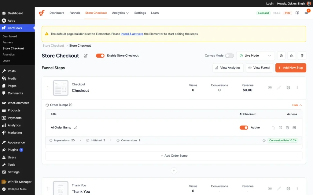
CartFlows > Store Checkout replaces the WooCommerce checkout page.
Whichever of those two jobs you are looking at, one question decides how much the screen deserves: how much it loses you. The published abandonment numbers answer that.
Why the Checkout Is Where Stores Lose the Most Money
Most shoppers who reach your checkout never pay, and that is not a verdict on the product. The published reasons are problems you control rather than demand you do not: extra costs, a forced account, a form that is too long, a page that is too slow. Roughly seven in ten carts end this way.
In 2026 the documented average cart abandonment rate across 50 studies was 70.22 percent. Over the trailing 12 months the live global average reached 77.54 percent.
Some of that is browsing. A shopper saving a cart for later or comparing prices is not a checkout problem, and no change to the page recovers them. The rest has named causes, and they are unusually fixable.
Extra costs lead. Baymard Institute found in 2026 that 40 percent of shoppers abandoned carts because extra costs such as shipping, tax and fees ran too high, the top fixable reason on the list.
Shipping revealed at the last step reads as a trick. It is a problem of what the checkout tells a shopper rather than what it asks them for.
The forced account comes next. Among fixable reasons for abandonment, 18 percent of shoppers were forced to create an account. That one is a setting, not a project.
Then there is the form. Baymard’s 2025 field count puts the average US checkout at 23.48 form elements by default, or 14.88 counting only fields, against an ideal of 12 to 14 elements and 7 to 8 fields. That gap is a week of work, not a rebuild.
Counting your own means telling the two apart first. A field is a box the shopper fills in, like an email address or a postcode. An element is anything the form asks them to touch, so tick boxes, dropdowns and buttons count as well.
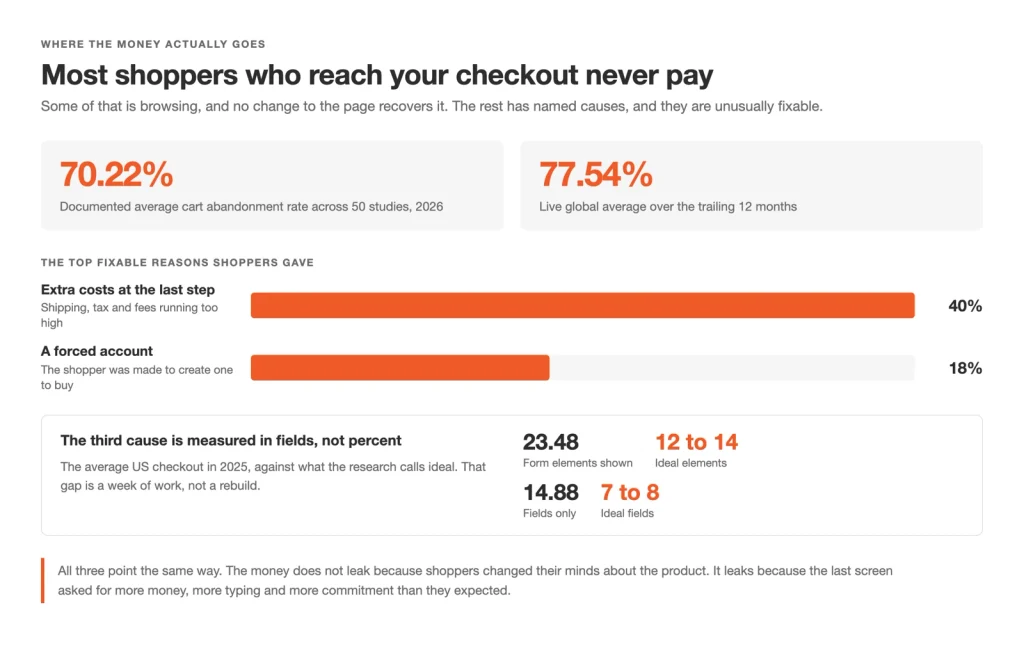
The published reasons shoppers abandon are problems you control, not demand you do not have
Find Out Where Your Own Checkout Loses People
One ratio tells you whether the checkout is your problem at all, and which part of it is broken. Divide completed orders by checkouts started, which is purchase divided by begin_checkout in Google Analytics 4, the free analytics product most WooCommerce stores already run. Your own number from last month is the benchmark, never another store’s.
Four checkout events record that journey in order. begin_checkout fires when the shopper reaches the checkout, add_shipping_info when the shipping details go in, add_payment_info when the payment details do, and purchase when the order is placed. Each gap between two of them is a place people stop, and none of the three steps below needs a developer.
- Check the four events are firing. A WooCommerce store sends them only when an analytics integration is connected, and the free Google Analytics for WooCommerce extension is the one WooCommerce publishes itself. Confirm all four appear before you trust any drop.
- Build the funnel. In Google Analytics 4, Explore > Funnel exploration takes the four events as its steps and shows the completion rate between each pair.
- Write down today. Save the four rates, the date and a screenshot of the checkout, taken logged out with one product in the cart on a phone.
A store without those events still has the ratio. Count the month’s orders under WooCommerce > Analytics > Orders. Count the sessions that reached the checkout URL in GA4’s Reports > Engagement > Pages and screens, then divide. Coarser, and it still settles whether the last screen is the leak.
One check comes before any of that. WooCommerce > Settings > Advanced holds the page your store actually treats as the checkout, and a store rebuilt once or twice often points at a page nobody has opened in a year.
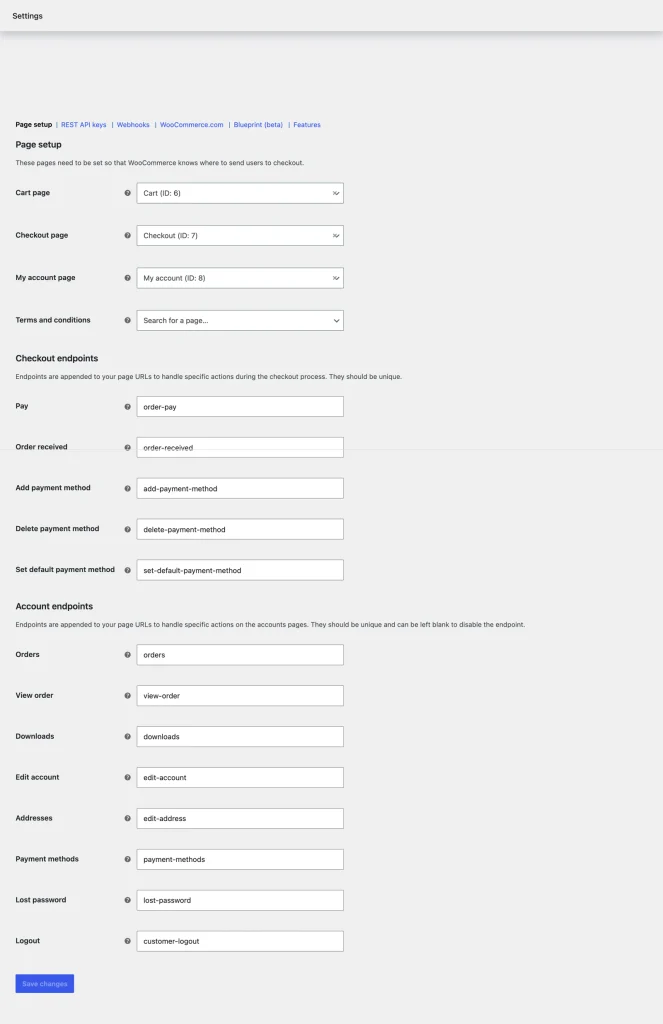
WooCommerce > Settings > Advanced sets which pages are the cart and the checkout.
The table below routes the step that drops hardest to one of the six places the rest of this guide works through.
| Where the funnel drops | The place to read first |
|---|---|
Between begin_checkout and add_shipping_info | What your checkout asks the shopper for |
Between add_shipping_info and add_payment_info | What your checkout tells them before they pay |
Between add_payment_info and purchase | Whether they believe you at the payment step |
| A steep drop on phones and a shallow one on laptops | Whether the checkout holds up on their phone and their connection |
| Small drops spread evenly across every step | The shape of the checkout, and what else is on the page |
| A healthy funnel and a flat month | Winning back the ones who still leave |
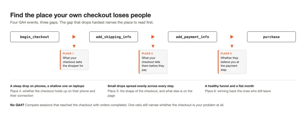
The four GA4 checkout events. The gap that drops hardest names the place to read first, and the three funnel shapes below it point at the places a single gap cannot show.
A drop in more than one place is common. That is why the six are ordered rather than listed.
The Six Places a Checkout Loses People
Whichever step your funnel points at, it lands in one of six places. A checkout loses people in what it asks for, what it tells them and what shape it is. It loses them again on their phone, at the payment step, and after they leave. The six pay off in that order.
Your funnel has already named the place costing you most today. The best way to improve the checkout area of a WooCommerce store is to work the six in order from wherever your own bottleneck sits.
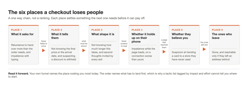
The six places as a chain. The arrows run forward only, because each place settles something the next one needs before it can pay off.
| The place | What the shopper feels there | What goes wrong | What the fix costs | Which guide executes it |
|---|---|---|---|---|
| 1. What it asks for | Reluctance, and impatience with typing | Unused fields, a forced account, errors only after Place Order | Free, until custom fields | customize the WooCommerce checkout page |
| 2. What it tells them | Not knowing the final price or the arrival date | Costs held to the last screen, a summary they cannot change, an empty coupon box | Free in WooCommerce, until a delivery date field | Worked in full below, on WooCommerce’s own controls |
| 3. What shape it is | Second thoughts, invited by every exit | A compulsory cart page, one long column, no progress indicator, the theme riding along | Free in CartFlows, until multistep | create a one-page checkout in WooCommerce |
| 4. Whether it holds up on their phone | Impatience on a connection worse than yours | A cached checkout, a slow response, two columns on a phone, a pay button below the fold | Free | mobile checkout optimization and speed up the WooCommerce checkout page |
| 5. Whether they believe you | Suspicion at handing a card to a store they have never used | No card brands named, a redirect off-site, an unreadable policy, a missing method | Free in WooCommerce | payment gateway setup for WooCommerce |
| 6. The ones who leave | Gone, and reachable only if they left an address | An email field that sits too late to capture one | Free in CartFlows | Worked in full below. No guide of its own yet |
The cost column is the half most fix lists leave out, and every place has a free move. Guest checkout is free in WooCommerce, and so is hiding three fields on a block checkout. Showing costs earlier, setting a free shipping threshold, adding and pruning gateways and placing policy text beside the card field cost nothing either.
The free CartFlows plugin covers most of what is left: reordering, relabeling and hiding fields on either checkout, moving the email field, and Store Checkout, which replaces the WooCommerce checkout page. Cache exclusions and layout work cost nothing either, and the gateway’s own fees stay the gateway’s.
CartFlows Pro starts at two things: custom checkout fields, which is what a delivery date on the form becomes, and multistep checkout. The sixth place’s follow-ups come from Cart Abandonment Recovery, a separate plugin in the CartFlows family. Where a plugin is the answer, our roundup of the best WooCommerce checkout plugins compares what each one changes.
- The form comes first because every later fix lands on a form the shopper is still refusing, and it is the cheapest thing to change.
- What the checkout tells them comes second because a trimmed form still loses the shopper ambushed by a shipping charge.
- Shape comes third because the right shape follows the form’s length and how much has to be shown.
- Their phone and their connection come fourth because timing a page you are about to replace measures the wrong page.
- The payment step comes fifth because it still loses orders when everything above it is right.
- Recovery comes last because it applies to whatever still leaks.
A store that rebuilds the payment step while the form still forces an account will watch nothing move. The payment work was not wrong, only out of order. The rest of this guide takes the six in turn, starting with the cheapest.
What Your Checkout Asks the Shopper For
We recommend starting at the form, the cheapest of the six. Every field and keystroke it asks for is where a ready shopper stops. Guest checkout is a free WooCommerce setting, hiding three fields is free on a block checkout, and the rest is free in the CartFlows plugin. Adding a field WooCommerce does not ship needs CartFlows Pro.
Almost no store counts what its own checkout asks for, and the average US checkout asks close to twice what the order needs. Count yours before you cut anything.
One demand costs more than the rest together. Of the shoppers who abandoned for a fixable reason, 18 percent left because the store forced them to create an account, with a full cart and a card already in hand.
Guest checkout is a WooCommerce setting, under WooCommerce > Settings > Accounts and Privacy. It costs nothing, so a store owner quoted for a plugin to fix this was quoted for a checkbox. WooCommerce documents every option on that screen in its guide to configuring WooCommerce settings.
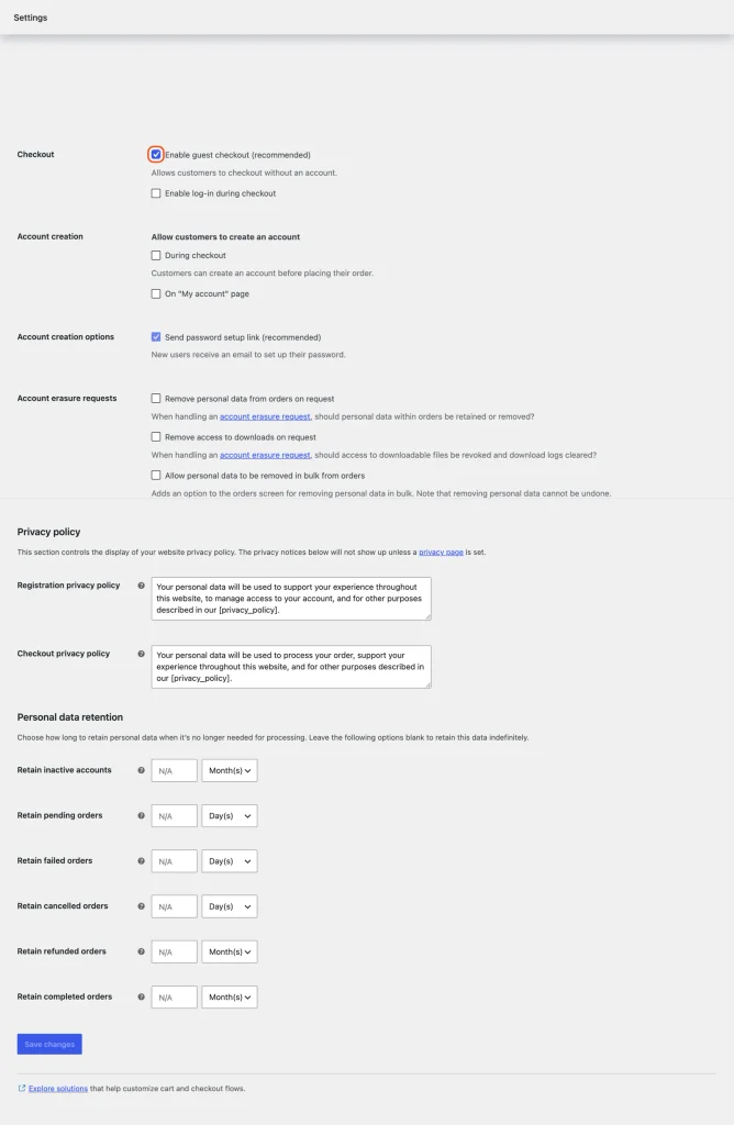
Guest checkout lives under WooCommerce > Settings > Accounts and Privacy.
Dropping the demand does not mean losing the account. Customer email confirmation, on that screen, links a past guest order to an account once the shopper confirms the email. Enable log-in during checkout lets a returning buyer sign in without retyping an address you already hold.
Social login is the other half of this on most guides. Sign in with Google, Apple or Facebook hands identity to a provider the shopper already uses, and neither WooCommerce nor CartFlows ships it.
Say you sell coffee gear. Your form asks for a company name, a second address line and a phone number, and none of them has ever moved a grinder to a door.
A field earns its place when something downstream reads it. Country and postcode feed your shipping zones and tax rates, so they stay whatever else goes. A company name feeds an invoice you do not raise, and order notes feed a habit.
Cutting them is the one decision on this page that turns on which checkout you run. That is what the answer from earlier buys you.
The block checkout hands you three of them for nothing. Open the page set as Checkout, then pick the Checkout Fields block out of the editor’s list view. Its Address Fields setting toggles the company field, the second address line and the phone number.
WooCommerce documents that setting on the checkout block, where it also sets whether the address and phone are required to complete checkout. Nothing on that screen costs anything, and nothing on it needs a plugin.
The classic checkout has no such sidebar, because the shortcode renders that form instead. Hiding a field there is where a plugin starts, and so is everything past those three on either checkout.
A checkout your page builder owns is the third answer, and neither route above reaches it. The builder holds the layout, so its own widget renders those fields rather than a WooCommerce settings screen. CartFlows replaces the checkout page instead of layering onto one, so that store is choosing between the two, and the other five places hold either way.
Reordering checkout fields, editing their labels, hiding them and setting their widths is in the free CartFlows plugin, on both checkouts alike. None of it opens a template file.
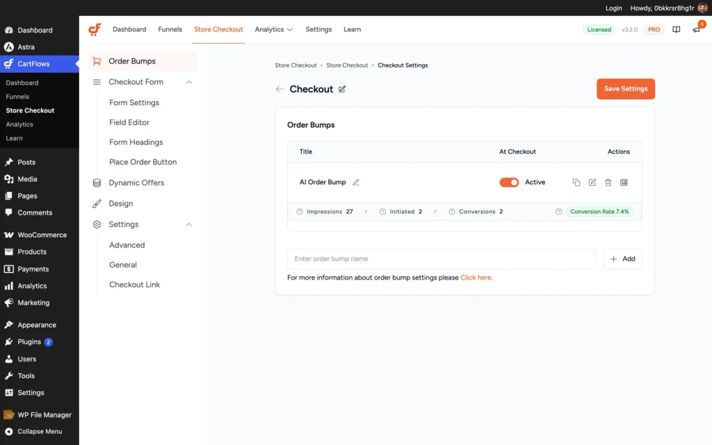
CartFlows > Store Checkout > Checkout: the Field Editor sits under Checkout Form, and the Order Bumps tab above it is CartFlows Pro.
Adding custom checkout fields needs CartFlows Pro. If your store genuinely needs a VAT number, a delivery date or a gift message on the form, that is the step where the paid tier bites.
Nothing costs a shopper more than typing something twice. A form that waits until Place Order to mention the postcode is wrong hands back a page of red text, and the patience they were spending on you is gone.
Google’s web.dev guidance for payment and address forms names the fix: “validate data during entry”, not only on submission. Feedback as the shopper leaves a field turns a mistake into a correction, and feedback after the button turns it into a wall.
We have not measured that behavior on both checkouts, and no dated figure exists for what it is worth. The test costs five minutes: type a deliberately wrong postcode into your own checkout while logged out and watch when the error arrives.
Laid out side by side, each demand has a cost to the shopper, a case where it earns its place, and a fix.
| What it asks for | What it costs the shopper | When it earns its place | What to do |
|---|---|---|---|
| An account before checkout | Abandoning with a full cart and a card already in hand | Rarely; guest checkout removes the requirement | Turn on guest checkout |
| Company name, a second address line, a phone number | Keystrokes spent on a field nothing downstream reads | When the store actually raises an invoice from it | Hide it in the Field Editor |
| Country, state or province, postcode | The one stretch of typing that has to stay | Always; shipping zones and tax rates read it | Keep it, and reorder the rest around it |
| An error that appears only after Place Order | A page of red text, and the patience already spent | Never; the mistake can be caught as it happens | Validate it as the shopper leaves the field, not after Place Order |
| A field WooCommerce does not ship, like a VAT number or a delivery date | One more field, one more place a ready shopper can stop | When the order genuinely cannot ship or invoice without it | Add it as a custom field, only where it is needed |
In order, and starting with what costs nothing, here is what we recommend changing about what your checkout asks for. The first four are free, and the fifth is where the paid tier starts.
- Turn guest checkout on under WooCommerce > Settings > Accounts and Privacy, then switch on customer email confirmation on the same screen.
- Hide the fields nothing downstream reads. On a block checkout those three are the Address Fields setting on the Checkout Fields block, free and already yours. For anything past them, the free CartFlows Field Editor under CartFlows > Store Checkout > Checkout > Checkout Form.
- Reorder and relabel what is left in that same Field Editor, so every label says what goes in it. Free.
- Switch on Google Address Autocomplete, which removes keystrokes instead of fields. The toggle is free in CartFlows, at CartFlows > Store Checkout > Checkout > Checkout Form > Form Settings, and it does nothing on its own.
Two steps come first. Create a Google Maps Platform API key, which Google activates only once you enter customer and billing details, then paste that key at CartFlows > Settings > Integrations under the Google Address Autocomplete tab. Free in the plugin is not free at Google.
- Add a custom field only where the order cannot ship or invoice without one, which is where CartFlows Pro starts.
Our guide to customize the WooCommerce checkout page walks the Field Editor screen by screen, with a reorder and a relabel done on a live form.
A form that short still loses the shopper who meets a shipping charge nobody mentioned. That is not a question of what you asked them for. It is a question of what you told them.
What Your Checkout Tells Them Before They Pay
A shopper who has filled in your short form still has to decide, and they cannot decide on a price, an arrival date or an order they cannot see. Show shipping and tax before the payment step, name a delivery date rather than a range, and let them change a quantity without leaving the page.
The largest fixable leak on the checkout is usually filed under the wrong heading. The published abandonment figures hold them both.
- 40 percent of 2026 shoppers walked away over extra costs such as shipping, tax and fees.
- A further 12 percent could not see or calculate the total upfront, in the same Baymard Institute figures.
Those two numbers say different things, and the second is the useful half. A shipping charge is not an ambush because it exists, but because it arrives on the last screen, after the shopper has spent ten minutes deciding the order was worth it.
The fix is rarely the price itself, and two WooCommerce screens carry it, both free. WooCommerce > Settings > Shipping holds the zones, the rates and the option that puts a shipping calculator on the cart. WooCommerce > Settings > Tax decides whether prices during cart and checkout show tax included or excluded.
Free shipping is the version store owners already half know. FedEx’s 2024 research found 75 percent of US shoppers prioritize free shipping over fast shipping. The same research found 81 percent will spend more to reach a free shipping threshold.
A threshold only works when the shopper can see how close they are. A line that appears after the order already qualifies tells them nothing.
Set the threshold from your own numbers rather than a round figure. Twice your average order value reads as a tax, and a line below it gives shipping away on orders that were coming anyway.
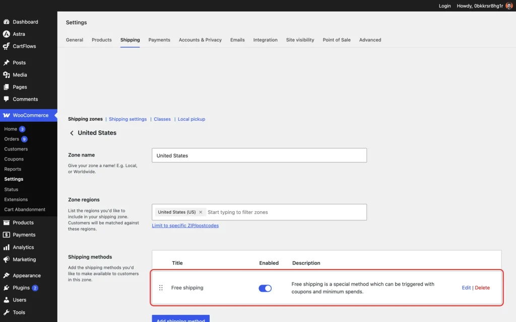
WooCommerce > Settings > Shipping: open the zone, add Free shipping, then set it to require a minimum order amount.
Coupons sit right beside this and pull the other way. Most guides answer the empty coupon box by telling you to remove it, when your own coupon reports settle it. A store with no code issued in six months is advertising a discount nobody can have, and a store running codes weekly keeps the field.
Turning coupons off across the store is a WooCommerce setting, under WooCommerce > Settings > General. Hiding the field on the checkout alone, while coupons stay on everywhere else, is free in the CartFlows Form Settings panel.
Delivery dates are the quietest of these and the most human. A shopper asking when it arrives is asking whether the order still makes sense, because the gift is on Saturday. Three to five business days answers a different question.
Naming a date beats naming a window, even when the date is conservative. Collecting or confirming that date on the form makes it a custom checkout field, and adding custom checkout fields needs CartFlows Pro.
Last comes the order itself. A summary listing three items and a total answers what am I paying. One with an editable quantity answers whether this order is still the one they wanted. We have no figure for what an editable summary is worth.
Seen together, here is what the shopper needs to see, when they need it, and where it belongs:
| What the shopper needs to see | When they need it | Where it belongs |
|---|---|---|
| The full price, including shipping and tax | Before they have spent ten minutes deciding the order was worth it | On the cart, before the payment step loads |
| How close they are to a free shipping threshold | While they can still add an item to reach it | A visible line, not a total that appears once they already qualify |
| When the order actually arrives | While deciding if the order still makes sense | A named date carried into the shipping method, not a window |
| That a discount exists, if one does | Before they go looking for one elsewhere | A coupon field, kept only where the store issues codes |
| What they are buying, and if they can still change it | While reviewing, before paying | An editable order summary, not a trip back to the cart |
Six changes sit behind that table, and the ones that cost nothing come first. Only the last of them reaches a paid tier.
- Show shipping and tax on the cart, before the payment step loads, with the cart calculator option under WooCommerce > Settings > Shipping and the display setting under WooCommerce > Settings > Tax.
- Set a free shipping minimum under WooCommerce > Settings > Shipping, a little above your own average order value.
- Check the shipping zones on that same screen reach every country you sell to.
- Hide the coupon field if no code has gone out in six months. Turn coupons off under WooCommerce > Settings > General, or hide the field alone under CartFlows > Store Checkout > Checkout > Checkout Form > Form Settings. Both free.
- Move the order summary where it can be read while paying, in that same Form Settings panel.
- Rename the shipping method so it carries the date, in the zone under WooCommerce > Settings > Shipping, so a shopper reads an arrival date instead of a service name. Collecting a date from the shopper is a custom field, which is CartFlows Pro.
Asking for little and telling them everything still leaves one question. How many screens all of it lands on, and what else is sharing the page, is the next decision.
The Shape of the Checkout, and What Else Is on the Page
How much your checkout has to ask and show settles its shape before taste gets a vote. Catalog size, cart shape and form length decide whether it is one page, several steps or the page WooCommerce ships. Store Checkout, the CartFlows screen that replaces that page along with its header and footer, is free. Multistep needs CartFlows Pro.
Three shapes cover almost every WooCommerce store. The page WooCommerce hands you, block or classic, stacks billing, shipping, order review and payment down one column in a fixed order.
A one page checkout sits the form and the order summary together. A multistep checkout breaks the same form into named steps, so three short questions replace twenty fields. None of the three wins in the abstract, which is why copying a store you admire goes wrong.
Say you sell one digital product. Your form runs to five fields and nothing is left to choose, so a second screen is only a second screen.
Made to order furniture sits at the other end, with a delivery window, an assembly option and a separate billing address. Three labeled steps read as progress there, and one page reads as a wall.
| Your store looks like this | Flow that fits | What it needs |
|---|---|---|
| Small catalog, one or two items per cart, digital or a single shipping rate | The WooCommerce checkout page, trimmed | Free, WooCommerce |
| Physical goods, short form, one shipping zone, and a checkout that looks nothing like the rest of the store | One page checkout in a one column or two column layout | Free, CartFlows |
| Long form: several shipping choices, business billing details, fields WooCommerce does not ship | Multistep or two step checkout | CartFlows Pro |
| A checkout template your developer built and your team maintains | Keep it and work the form instead | Free, WooCommerce |
Most stores land on the middle two rows. The one column and two column Modern Checkout layouts come with Store Checkout, which replaces the WooCommerce checkout page and is in the free CartFlows plugin. Replacing the page rather than restyling it is how you get a checkout shaped around your own catalog without paying a developer for a template.
Multistep and two step checkout layouts need CartFlows Pro. The line on this decision runs there: the shape is free, and cutting the shape into steps is the paid part.
A big catalog means more shipping options and more fields to confirm before payment, and that longer form is the case multistep fits. Without the paid tier, cut what the form asks for and run what is left in the two column layout, which often takes the case for steps with it.
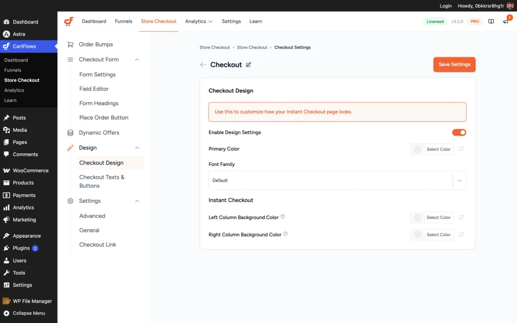
CartFlows > Store Checkout > Checkout > Design: the primary color, the font family and the column background colors.
The part nobody mentions is what leaves with the page. A WooCommerce checkout inherits your theme, so it arrives carrying the header, the navigation, the footer links, the newsletter banner and last year’s chat widget. Every one is an exit offered to somebody already holding a card, and replacing the checkout page is how they go.
Steps buy you something and cost you something. A shopper who cannot see how many screens are left assumes the worst, so name the steps and show which one they are on.
One more screen sits in front of all this. Most WooCommerce stores put a cart page between deciding and paying, where it shows the shopper what they already knew.
Baymard Institute found in 2026 that 17 percent of shoppers left because the checkout was too long or complicated. That measures the whole run, and an extra screen is part of the whole.
The decision is not remove it or keep it. A store where carts hold eight items needs somewhere to fix quantities, and an editable order summary already is that somewhere.
The cart page is named on that same WooCommerce > Settings > Advanced screen, and the assignment is what your store’s own cart links read. Dropping the screen from the route is not the same as unassigning the page.
Trimmed, the page WooCommerce ships keeps its shape: the same column in the same fixed order, minus the fields you hid, still inside the theme header and footer. Our guide to create a one-page checkout in WooCommerce walks the free route from there.
The shape work runs in this order, and only the last line costs anything. Each step assumes the one above it has landed.
- Confirm which page your store serves as the checkout under WooCommerce > Settings > Advanced, so the work lands on the page shoppers see.
- Replace that page with Store Checkout in CartFlows, which takes the theme header, footer and chat widget off the screen with it. Free.
- Pick the one column or two column layout in that same Store Checkout step, where Design also sets the primary color, the font family and the column backgrounds. Free.
- Decide on the cart page from your own carts, since a store whose carts hold one item is charging a screen to confirm a choice made seconds ago.
- Split a long form into named steps with the multistep or two step layout, which needs CartFlows Pro.
The right shape on a page with nothing else on it is still only the checkout you built. The one your shopper uses arrives on a handset you have never held, over a connection you never tested.
Whether the Checkout Holds Up on Their Phone and Their Connection
Your checkout is the one page in the store that cannot be cached, and most shoppers meet it on a phone over mobile data. Measure it after you have settled its shape, because a page you are about to replace is not worth timing.
Speed reports almost always describe a home page, the easiest page a store has: cached, few queries, no session. The checkout is the opposite on all three counts, which is why timing comes fourth.
Your own version of the test needs no plugin and no numbers from us. Open your checkout URL on a phone, on mobile data rather than the office wifi, logged out, with one product in the cart.
Too slow looks like a blank screen long enough that you wonder whether the tap registered. It also looks like a pay button you still cannot reach once the page has settled, because the layout is still moving under your thumb.
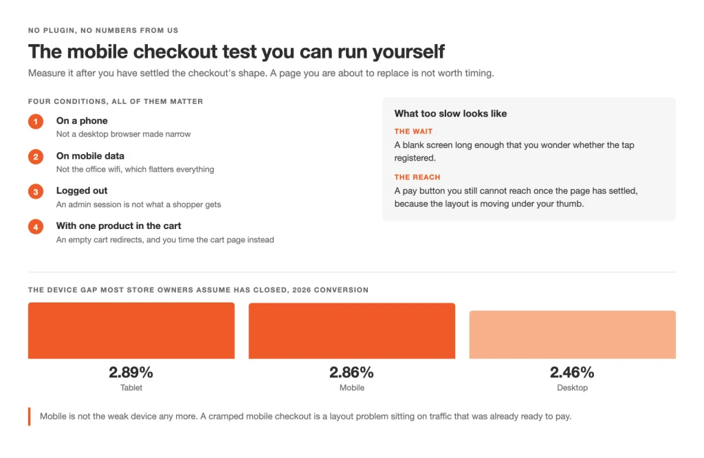
The mobile test needs no plugin: a phone, mobile data, logged out, one product in the cart
Our own WooCommerce test store sets a floor under all of that. We measured it logged out, with one product in the cart, over five runs, on WordPress 7.1, WooCommerce 11.0.1, CartFlows and CartFlows Pro 3.2.0, on 13 September 2026.
| What the test store did | The number |
|---|---|
| Median response | 0.431 seconds |
| Full response | 0.508 seconds |
Those runs measured a CartFlows Pro Store Checkout rather than the stock WooCommerce page, with no page cache active. Query Monitor, the free WordPress diagnostics plugin, ran on every request, so read the numbers as a ceiling.
A reading with no band around it settles nothing. Google’s own guidance puts a good server response under 800 milliseconds, which both of those clear with room to spare, so measure your own against that line rather than against ours.
A live store with a theme and a dozen plugins sits above those numbers. Cart, checkout and account pages hold state belonging to one shopper, and a page cache serves one copy to everyone, so a cached checkout can show the wrong total.
WooCommerce > Settings > Advanced names those pages, which is the exclusion list a caching plugin and a host both need. WooCommerce says the same in its documentation on configuring caching plugins.
Waiting has a conversion shape, and so does the device. The conversion research puts numbers on both.
- Conversion fell from 3.05 percent at a one second load to 0.67 percent at four seconds, in a 2022 study.
- Tablet conversion ran at 2.89 percent, mobile at 2.86 percent and desktop at 2.46 percent, in the 2026 figures.
The device gap most store owners assume has closed has not. A cramped mobile checkout is a layout problem sitting on traffic that was ready to pay.
What makes the WooCommerce checkout process faster, once it is uncached, is a separate job: the queries it runs, the gateway scripts it loads and the hosting underneath them. Our guide to speeding up the WooCommerce checkout page covers that work.
Everything worth doing here is free, and the order matters more than the list. Measure first, then fix what the measurement names.
- Exclude the cart, checkout and account pages from every cache, taking the URLs from WooCommerce > Settings > Advanced.
- Read the server environment under WooCommerce > Status, which names the memory limit and flags what needs raising.
- Time the checkout URL itself, logged out, with one product in the cart, on a phone over mobile data.
- Collapse the order summary when a cart holds more than three items, so a long list stops burying the pay button.
- Keep the pay button in reach without a scroll on the phone you tested with, and check it again once the order summary is collapsed.
Making the WooCommerce mobile checkout better means working that order, and our guide to mobile checkout optimization takes each step from the column count down to the input types. A page that answers quickly on a phone has bought attention for the step that decides everything, and what happens there has little to do with the software.
Whether They Believe You at the Payment Step
You never feel this one on your own checkout, because you already trust the store. A first time buyer at your payment step does not. Name the card brands you take, keep the payment on your own site, show the return policy where it can be read, and offer the method they reach for.
Trust breaks at one moment, the second the form stops asking where to send the order and starts asking for a card number. Baymard Institute found in 2026 that 19 percent of US shoppers abandoned a checkout because they did not trust the site with their card details.
That figure names the symptom, and no study we hold measures a badge or a seal putting any of those shoppers back. What does move at this step is configuration: where the payment happens, which card brands are named, which methods are offered, and what a shopper reads about the order going wrong.
Adding a method is only half of it, because the store runs lighter for every gateway you take out. Express Checkout is a WooCommerce feature. The shortcut payment buttons on the cart and checkout come from WooCommerce and its gateways, so no checkout plugin hands them to you.
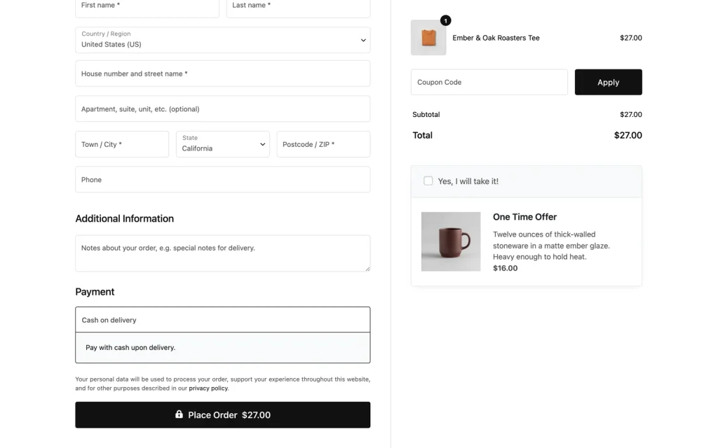
The payment step a first-time shopper sees, logged out, with one product in the cart: the lock on the pay button and the privacy line. Card brand icons come from the gateway, and this test store runs none.
Before you buy anything that promises to add trust, two findings save you the money. Google Research found that most people misread the browser padlock, on a web where nearly every site now runs HTTPS anyway.
A 2013 Baymard survey of 2,510 shoppers found no clear preference between one trust seal and another. A marker near the pay button earns its place when it answers a question the shopper is asking at that second, and it is clutter when it decorates.
A padlock decorates. A named return window answers, and so does the proof a shopper already saw upstream, which is why we recommend carrying it into the order summary with the product thumbnail and the name they clicked.
That summary is free, since Store Checkout is in the free CartFlows plugin, and CartFlows has no review widget to sell you. Reviews earn their lift on the product page, upstream of the card field.
The five moves below sit on WooCommerce’s own screens, and none of them is a purchase from us. Gateway configuration itself is where this guide stops and your provider’s account starts, which our guide to payment gateway setup for WooCommerce covers.
- Enable the method your own completed orders show buyers reaching for, under WooCommerce > Settings > Payments.
- Disable the gateways nobody uses, on that same screen, since each one loads its scripts across the store.
- Switch on the card brand icons in the gateway’s own settings, so a shopper looking for their card finds it.
- Keep the payment on your own site rather than sending shoppers to a redirect, which those same settings decide.
- Put a line of return policy text beside the card field instead of leaving it in the footer.
Get these right and some shoppers still leave. What you can do about them was decided several screens earlier.
Winning Back the Ones Who Still Leave
Some shoppers leave whatever you do, and whether you ever hear from them again turns on one thing: was their email captured before they went. That makes the position of the email field a recovery decision as much as a form decision. Cart Abandonment Recovery is a separate Brainstorm Force plugin, free and Pro.
Asking for the email first holds an address for every shopper who got that far, including the ones who never reached the card field. Asking for it last holds nothing from them at all.
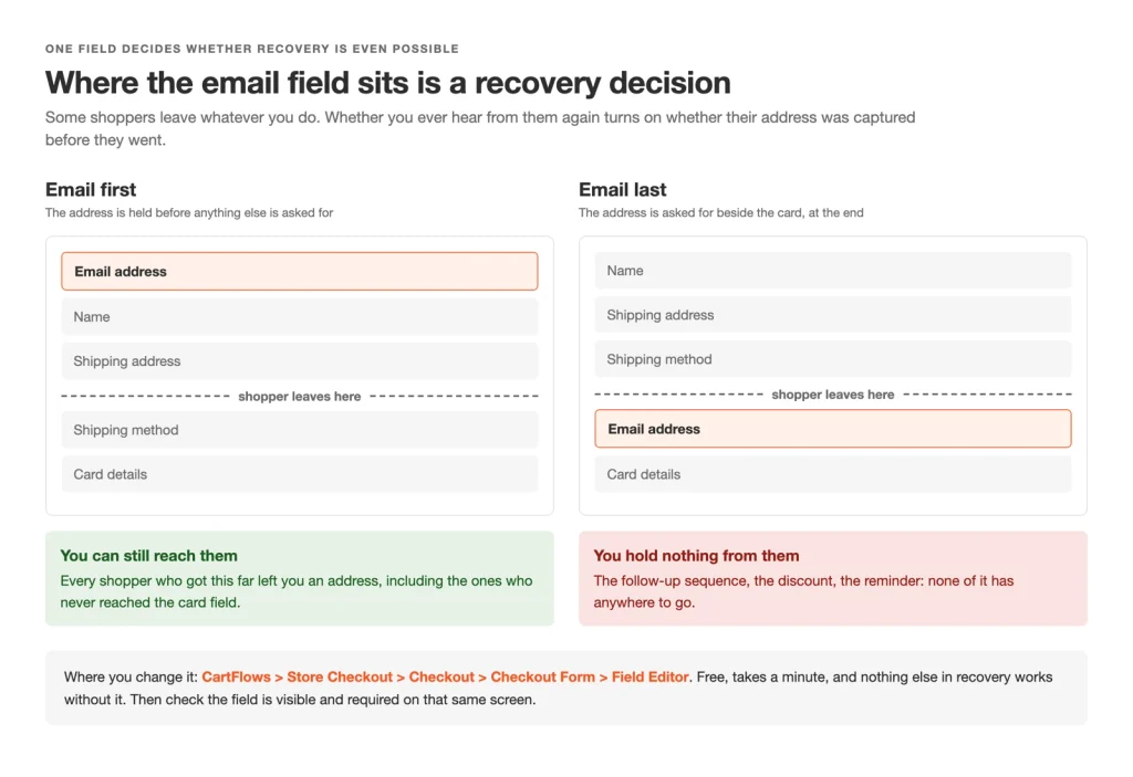
Where the email field sits decides whether a shopper who leaves can ever be reached again
Moving that field depends on which checkout you run, the same way hiding one did. WooCommerce’s documentation says a block checkout’s blocks can be repositioned from the editor’s list view, so look at your own page first. The classic checkout fixes the order in its shortcode, so there it is a plugin job, free in the CartFlows Field Editor.
Follow-up works better than most store owners expect. Across more than 143,000 Klaviyo flows in 2023, abandoned-cart email posted a 3.33 percent placed-order conversion rate, the highest of any flow type.
Omnisend put abandoned-cart SMS at a 42.02 percent click-to-conversion rate in 2025. Read both as channel benchmarks rather than promises, because the list you send to is your own.
Cart Abandonment Recovery for WooCommerce is the plugin behind these plays. It is not inside CartFlows Pro and not an upsell within it. It installs and runs on its own, free and Pro, from Brainstorm Force, the company that makes CartFlows.
Recovery is decided in two places. The first is free and takes a minute.
- Move the email field to the top of the form, from the list view on a block checkout or in the free CartFlows Field Editor on a classic one, so an address is held before anyone leaves. Free either way, and nothing else here works without it.
- Check that field is visible and required wherever you moved it, since a captured address is the whole mechanism.
- Install Cart Abandonment Recovery, the separate Brainstorm Force plugin, which is free, and let it run two weeks before judging it.
- Write the first message around the product they left rather than a discount, and send it while the decision is still warm.
- Keep a phone field only if you will send SMS, which makes that field a recovery decision rather than a habit.
Six places, six decisions. The question store owners ask first is the one we left until last: does any of this need a plugin.
Do You Need a Checkout Plugin, and Which Tier?
Most store owners reach this question with a plugin tab open. WooCommerce alone handles guest checkout, page assignment and, on a block checkout, hiding three of the fields. The free CartFlows plugin earns its place for reordering and replacing the checkout without code. CartFlows Pro earns its place for custom fields, multistep, order bumps and one-click upsells.
Those last two raise the value of an order rather than the completion rate. An order bump is a small add-on offered as a tick box on the checkout form. A one-click upsell is the follow-on offer after payment, accepted without entering card details again.
Match the fix to the place your own checkout loses people, and start with the cheapest, because the free answer is often enough on its own. Guest checkout, the cart and checkout page assignments and the block checkout’s Address Fields setting are all WooCommerce settings, so that first set of changes costs nothing.
A free plugin is the next option, and it does more than store owners expect. The field work, Store Checkout and Instant Layouts, the ready-made designs for each funnel step, are all in the free CartFlows plugin.
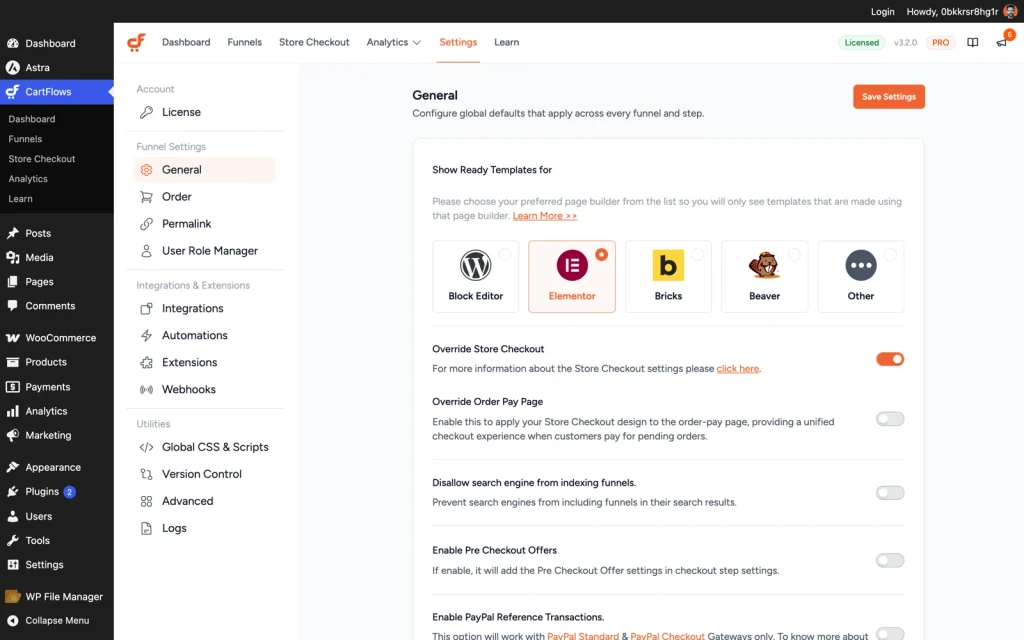
CartFlows > Settings, where the Store Checkout and layout options live.
The paid option begins where the checkout stops being a form and turns into a revenue mechanic, and the table below draws that line row by row.
| Capability | WooCommerce alone | CartFlows free | CartFlows Pro |
|---|---|---|---|
| Guest checkout | Free | Free | Free |
| Hiding the company field, second address line and phone number | Free on a block checkout | Free | Free |
| Field reordering, labels and width | No | Free | Free |
| One-column and two-column Modern Checkout layouts | No | Free | Free |
| Store Checkout, replacing the WooCommerce checkout page | No | Free | Free |
| Instant Layouts for checkout, upsell, downsell and thank-you steps | No | Free | Free |
| Adding custom checkout fields | No | No | Pro |
| Multistep and two-step checkout | No | No | Pro |
| Order bumps and bump conditions | No | No | Pro |
| One-click upsells and downsells | No | No | Pro |
| A/B split testing of any funnel step | No | No | Pro |
| Premium funnel templates | No | No | Pro |
A store that wants a better-looking checkout and nothing more has a free answer in the middle column. The right column is for stores chasing the value of each order rather than the rate, and the wider set of ways to increase average order value frames that decision better than a feature list.
One honest limitation before you decide. CartFlows replaces the checkout page, so a store that has already built a custom checkout template is choosing between the two rather than layering them. That is a real cost for anyone who paid a developer for the template they run today.
Checkout plugins from other vendors cover much of the same ground, and several are good. We are not ranking them here: the tier you need is a fact about your store, and the vendor is a preference our roundup of the best WooCommerce checkout plugins settles.
Every row in that table has a free route above it, which leaves one open question: what the paid one costs. Plans change often enough that we link them rather than print a figure that goes stale, so the current ones sit on the CartFlows pricing page.
Knowing which option you need counts only once you act, and the first move is smaller than any of this suggests.
How to Start This Week
You have an hour this week, not a month. Below is the whole guide as one list, in the order we would work it, with the place that owns each item. The first four cost nothing and need no plugin.
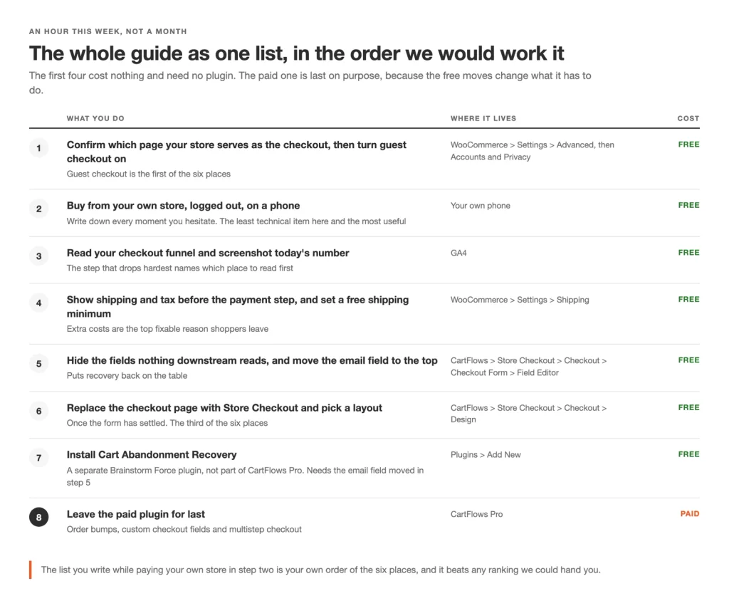
The whole guide as one ordered list, with the screen that owns each step and what it costs
- Confirm which page your store serves as the checkout, under WooCommerce > Settings > Advanced, then turn guest checkout on under WooCommerce > Settings > Accounts and Privacy. Both take five minutes and cost nothing. Guest checkout is the first place.
- Buy from your own store, logged out, on a phone. Write down every moment you hesitate and which of the six places it belongs to.
- Read your checkout funnel in GA4 and screenshot today’s number. The step that drops hardest names which of the six places to read first.
- Show shipping and tax before the payment step, and set a free shipping minimum under WooCommerce > Settings > Shipping. That is what your checkout tells them, the second place.
- Hide the fields nothing downstream reads and move the email field to the top. On a block checkout, start with WooCommerce’s own Address Fields setting. Beyond it, the free CartFlows Field Editor does the rest. Free, and it puts recovery back on the table.
- Replace the checkout page with Store Checkout and pick a layout under CartFlows > Store Checkout > Checkout > Design, once the form has settled. Free, and it is the third place.
- Install Cart Abandonment Recovery, the separate Brainstorm Force plugin, which is free and is not part of CartFlows Pro. It emails the shoppers who left, so it keeps working after you stop, and it needs the email field moved in item 5.
- Leave the paid plugin for last. Order bumps, custom checkout fields and multistep checkout need CartFlows Pro, so reach for them once the free moves have landed.
The second item is the least technical and the most useful. The list you write while paying your own store is your own order of the six, and it beats any ranking we could hand you.
Frequently Asked Questions
Final Thoughts
The checkout is the part of a store nobody enjoys working on, and it is still the one screen where every visitor you paid for either becomes revenue or does not.
Start with the move that costs nothing and takes five minutes. Open WooCommerce > Settings > Advanced, confirm which page your store actually serves as the checkout, then turn guest checkout on under WooCommerce > Settings > Accounts and Privacy. Every other decision on this page gets easier once those two are settled.
Continue Learning
Each place has a guide that executes the fix. These are live today.
- What it asks for: customize the WooCommerce checkout page
- What shape it is: create a one-page checkout in WooCommerce
- On their phone: mobile checkout optimization
- On their connection: speed up the WooCommerce checkout page
- At the payment step: payment gateway setup for WooCommerce
- Choosing a tool: best WooCommerce checkout plugins
One of the six places has no guide yet. Winning back the shoppers who leave is worked in full above, and it gets a guide of its own linked here the day that one publishes.