




You want your WooCommerce checkout to feel like the Shopify checkout your shoppers know: the logo alone at the top, express payment buttons before the form, and the summary beside it.
Every Shopify store gets that page because Shopify builds one checkout for all of them. Yours is a page on your own site instead, so it wears your theme’s header, menu and footer.
That makes a WooCommerce checkout like Shopify’s a settings job, not a platform move: install a checkout plugin, switch your store to the new checkout page it creates, then set the layout, fields and buttons. We studied three live Shopify checkouts and rebuilt their layout on a test store to show what copies for free and the one part that needs a developer.
First, the question before any setting: should you just move to Shopify?
- Should You Rebuild Your Checkout or Move to Shopify?
- What a Shopify Checkout Actually Looks Like (We Checked Three)
- Which Plugin to Use, and Where Each Free Tier Stops
- One Page or Multiple Steps?
- Copy Shopify's Checkout Field Order With Four Free Settings
- Keep the Order Summary in View
- Put the Express Payment Buttons on Top
- Strip the Header and Add Trust at the Pay Button
- Check It on a Phone
- Go Past What Shopify Allows
- Instant Checkout: Buy Without Ever Reaching the Cart
- Test the New Checkout Before Shoppers See It
- Final Thoughts
- Frequently Asked Questions
Should You Rebuild Your Checkout or Move to Shopify?
Rebuild it. The gap comes from who designs the page, not from what WooCommerce can do: Shopify designs one checkout for every store, and WooCommerce leaves the design to your theme. Shopify lets you restyle that checkout with your own colors and fonts; deeper changes need Shopify Plus, its enterprise plan.
We set up a test store for this guide, a WooCommerce coffee shop running CartFlows Pro 3.2.0. Its default WooCommerce checkout kept the theme’s full header and menu at the top, while the new checkout page we built shows only the logo and the order. Everything on that page is a free setting except the order bump under the totals, which is CartFlows Pro.
That page matters because every shopper who decides to buy passes through it, and most carts never become orders: Baymard Institute’s average across 50 studies puts cart abandonment at 70.22 percent, as collected in our ecommerce statistics library.
Moving fixes the checkout by moving the whole store, and it brings its own costs.
| What you are weighing | Moving to Shopify | Staying on WooCommerce |
|---|---|---|
| Payment fees | An extra transaction fee on every sale not taken through Shopify Payments | Your gateway’s rate only |
| Where the store lives | Shopify’s platform | The site you already host |
| The work | Move products, orders, customers and URLs, then rebuild | Change settings on a store already selling |
We took the fee line from Shopify’s pricing page on 23 September 2026.
For a WooCommerce store already taking orders, keeping the platform and rebuilding one page is almost always the cheaper move. The rest of this guide assumes you are staying and covers the Shopify look; speed, payments and everything else are in the full checkout optimization guide.
Further reading: WooCommerce vs Shopify: Real Cost Comparison for 2026
What a Shopify Checkout Actually Looks Like (We Checked Three)
Three well-known Shopify stores, Death Wish Coffee, Allbirds and Glossier, run the same checkout process in the same order. Almost every part of it copies to WooCommerce with settings.
We opened each one as an ordinary shopper on 18 September 2026, at desktop and phone width. We placed no order and created no account.
So a Shopify-style checkout is a page order you can copy, not a platform: logo, express buttons, email, address from country down, and a summary beside the form.
The Order Every Shopify Checkout Follows
All three Shopify checkout pages ran top to bottom in this order. The right-hand column is what the default WooCommerce checkout showed at the same point on our test store.
| Part of the page | All three Shopify checkouts | Default WooCommerce checkout |
|---|---|---|
| Top of the page | The store logo, nothing else | Your theme’s full header and menu |
| First block | Express checkout: Shop Pay (Shopify’s saved wallet), PayPal and G Pay (Google Pay), then an OR divider | No express payment buttons unless your gateway adds them |
| Contact | Email only, marketing opt-in beneath it | Email first, as on Shopify |
| Delivery, first field | Country, set to United States | Country, as on Shopify |
| Address field | Searches as the shopper types | A plain text field |
| Order summary | A tinted panel beside the form, with the discount field | Depends on the theme |
The field order is closer than it looks. WooCommerce’s default block checkout already opens on email, then country, just as Shopify does.
The real gaps are the header, the express payment buttons and the address search. The new checkout page starts from WooCommerce’s older form, which puts the names above the country, so the rest of this guide closes those three gaps and puts the Shopify field order back.
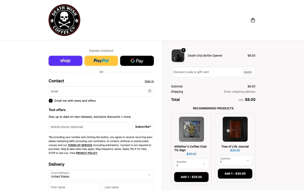
Death Wish Coffee: logo alone, then Shop Pay, PayPal and G Pay, an OR divider, and email as the first field.
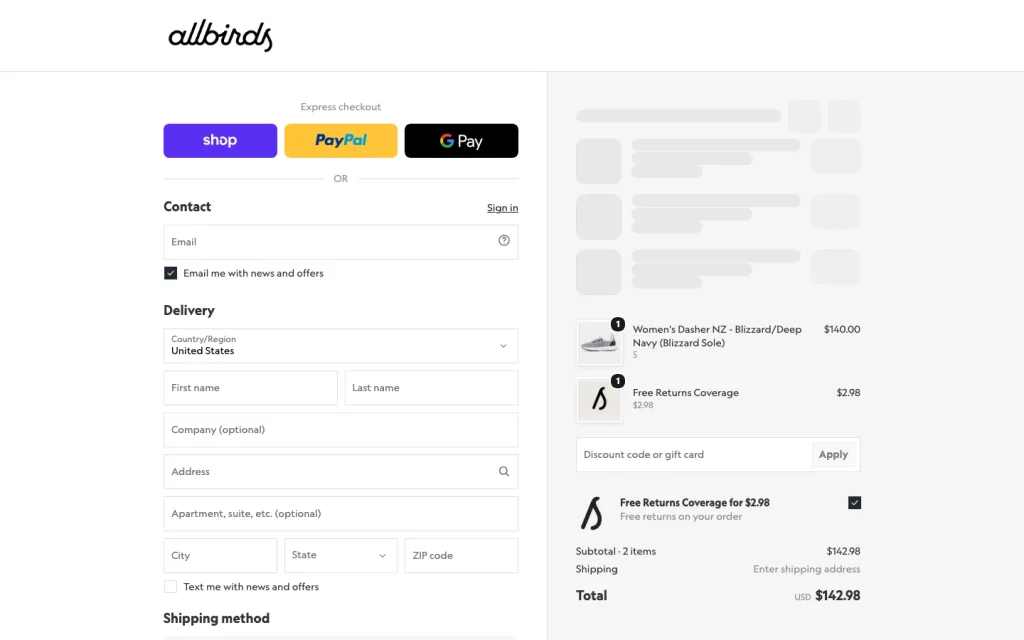
Allbirds, same day: the same order from the logo down, on a store selling shoes with sizes.
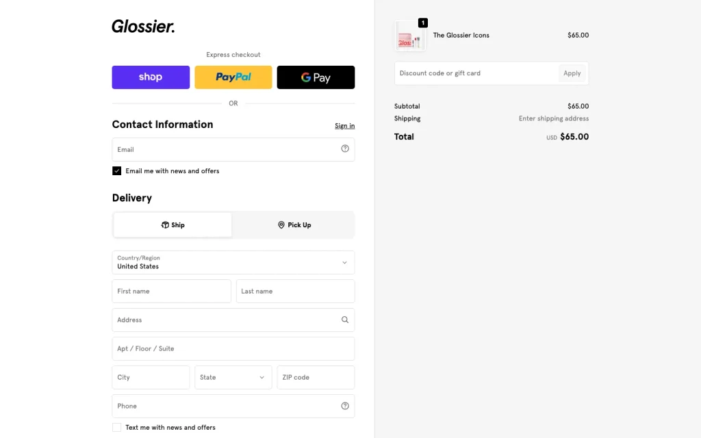
Glossier, same day: the same skeleton under heavier brand styling.
What Copies, What Needs a Developer, and What Never Moves
Every part of the page’s layout copies with settings. Shop Pay needs a developer, and Shopify Checkout, the application behind the page, stays on Shopify.
| Shopify checkout element | Verdict | Where it lives on WooCommerce |
|---|---|---|
| Header stripped to the logo | Copies | The new CartFlows checkout page, free |
| Two columns, summary beside the form | Copies | Two-column layout, free in CartFlows |
| Email first, country-first address | Copies | Field editor, free in CartFlows |
| Address search as the shopper types | Copies | Google address autocomplete, free in CartFlows |
| Express buttons above the form | Copies | WooCommerce and your payment gateway |
| Lock icon and total on the pay button | Copies | Place Order Button settings, free in CartFlows |
| Summary collapsed to one bar on a phone | Copies | The mobile layout, free in CartFlows |
| Three steps instead of one page | Copies | Multistep layout, in CartFlows Pro |
| Products offered under the order totals | Copies | Order bumps, in CartFlows Pro |
| Shop Pay | Needs a developer | Shopify Payments plus the Shop Pay Wallet API |
| Shopify Checkout itself | Never moves | Runs only on Shopify’s platform |
Shop Pay is the row most people ask about: the saved wallet that fills the whole form in a tap.
Shopify’s help page says Shop Pay can run on another platform. It lists four conditions, and all four must be true:
- Your checkout collects the customer’s email address before payment.
- Your business is eligible for Shopify Payments.
- Your store is in a country or region where Shopify Payments is available.
- You, or a developer, can integrate directly with the Shop Pay Wallet API.
No plugin installs it, so for most stores that fourth condition makes Shop Pay a development project, not a setting.
Several guides ranking for this search get one detail wrong. Shopify’s one-page checkout became the default on 2 October 2023, and its checkout settings page still lets store owners switch to three pages.
Some guides say the three-page layout is being retired in 2026. Shopify’s own pages, read on 23 September 2026, say no such thing.
Which Plugin to Use, and Where Each Free Tier Stops
To make your WooCommerce checkout like Shopify’s without writing code, install a plugin that gives you a new checkout page. The free CartFlows plugin covers the whole Shopify look, and CartFlows Pro adds the offers and flows on top.
Code, Theme, Page Builder or Plugin
Four routes get you there, and they differ in where each one stops.
| Route | What it changes | Where it stops |
|---|---|---|
| WooCommerce checkout block | The layout of the existing page | Header and address search stay as shipped |
| A conversion theme, such as Shoptimizer | How the checkout looks | The page underneath is still WooCommerce’s |
| A page builder template | The design, if you already run a builder | Restyles the page but keeps WooCommerce’s checkout underneath |
| A checkout plugin | Gives you a new checkout page | Depends on the plugin; see the table below |
Editing WooCommerce’s template files in a child theme is a fifth route. It works, but it is a developer’s job, and every WooCommerce update is yours to maintain.
CartFlows, FunnelKit, CheckoutWC and Fluid Checkout Compared
Four plugins show up in the results for this search. Here is what each one’s free tier covers, and where you start paying.
| Plugin | Free version | What the free tier covers | Where free stops | Paid plans start at |
|---|---|---|---|---|
| CartFlows | Yes, 200,000+ active installs | A new checkout page, one and two-column layouts, Google address autocomplete, field editor (rename, reorder, hide) | Multistep, new custom fields, order bumps, upsells | See our pricing page |
| FunnelKit | Yes, 30,000+ active installs | A new checkout page from templates, and a field editor | Its pricing page lists multistep, custom fields and address autocomplete under Basic; order bumps and upsells under Plus | Basic, $99.50 a year, 1 site |
| CheckoutWC | No | Nothing free | Everything; order bumps, side cart and abandoned cart emails start at Plus | Basic, $149 a year, 1 site |
| Fluid Checkout | Yes, 20,000+ active installs | One-page or multistep layout | Express buttons in PRO; address autocomplete is a paid add-on; no order bumps listed | PRO, €99 a year, 1 site |
Prices were read from each vendor’s own pricing page on 23 September 2026. Most were introductory offers that renew higher, so check the live page before you buy. Install counts come from each plugin’s wordpress.org listing on the same day.
CartFlows is the plugin we build, so weigh this accordingly. Two facts are why we recommend it.
Address autocomplete, the part that makes typing an address feel like Shopify, is free in CartFlows. FunnelKit and CheckoutWC list it in a paid plan, and Fluid Checkout sells it as an add-on.
CartFlows Pro adds order bumps, one-click upsells and A/B testing, as FunnelKit’s and CheckoutWC’s higher plans do, plus Instant Checkout, a Buy Now popup none of the other three lists on its pricing page.
Plugins sold as a “WooCommerce Shopify checkout” rebuild the look; none of them runs Shopify’s own checkout.
Fluid Checkout’s free multistep layout is a genuine edge if a multistep flow is all you want. ShopLentor and Barn2’s Fast Cart also offer Shopify-style layouts, and our longer roundup below covers them.
Which CartFlows Plan You Need
Start free: the free plugin builds the whole Shopify look in this guide. Multistep layouts, new custom fields, order bumps, one-click upsells, A/B testing and Instant Checkout are not in the free plugin; CartFlows Pro adds them. Current plans are on our pricing page.
Before you install anything, check your plugins list for a second checkout field editor. Two plugins editing the same fields is the most common cause we see of fields vanishing or landing in the wrong place.
Every step in this guide starts on the new checkout page that CartFlows creates. Here’s how to switch it on:
- Install CartFlows from Plugins > Add New in your WordPress dashboard, then activate it.
- Open CartFlows > Store Checkout.
- Switch on Enable Store Checkout, the CartFlows setting that sends shoppers to the new checkout page instead of the WooCommerce one.
- Open the Checkout step listed under the toggle. This opens your new checkout page’s settings, where most of the CartFlows panels in this guide live; the steps say when a setting sits somewhere else.
Want a finished design instead of building one? The free plugin also ships Instant Layouts, ready-made checkout designs that need no page builder.
Further reading: 20 Best WooCommerce Checkout Plugins (Tested) 2026
One Page or Multiple Steps?
Use one page unless your store has high order values, complicated shipping or mostly first-time buyers. Multistep layouts are not in the free plugin; CartFlows Pro adds them.
A one-page checkout puts contact, delivery and payment on one scrolling page. A multistep checkout splits them into screens the shopper moves through, usually with a progress bar.
Shopify’s default checkout process is one page, so that is what most shoppers now expect. Your own store’s signals matter more than the default, though.
| Signal in your store | Points to |
|---|---|
| Low average order value | One page |
| High average order value | Multiple steps |
| One shipping option, one country | One page |
| Several shipping methods or international rates | Multiple steps |
| Mostly returning buyers | One page |
| Mostly first-time buyers | Multiple steps |
Two WooCommerce screens answer the first four rows in a minute: WooCommerce > Reports shows your average order value, and WooCommerce > Settings > Shipping shows how many zones and methods a shopper meets.
No clear read either way? Choose one page, because it’s the free layout and the checkout experience Shopify shoppers already know.
Further reading: How to Create a WooCommerce One Page Checkout (2026)
Copy Shopify’s Checkout Field Order With Four Free Settings
Shopify asks for email first, then the delivery address from the country down. Four free settings, spread across three CartFlows panels (Form Headings, Form Settings and the Field Editor), give you the same order.
The new checkout page starts from WooCommerce’s older, classic form. That form puts first and last name above the country, where Shopify puts country first, so a few moves are needed.
Work through the panels in this order, because each one changes what the next shows. Here’s how:
- Rename the blocks. Open CartFlows > Store Checkout > Checkout Form > Form Headings. Set Billing Details to “Delivery”, Your Order to “Order summary”, Customer Information to “Contact” and Shipping to “Shipping method”.
- Remove the extras. In Form Settings, switch Enable Additional Field off to drop the order notes box. Switch Enable Ship To Different Address off too, unless your shoppers often ship gifts.
- Reorder the fields. Open the Field Editor and switch Enable Custom Field Editor on. Drag Country / Region above the names, and set first and last name to half width so they share a line.
- Turn on address search. Leave Enable Google Address Autocomplete on in Form Settings. It needs a Google Maps Platform API key, added under CartFlows > Settings > Integrations, from a Google Cloud project with billing turned on.
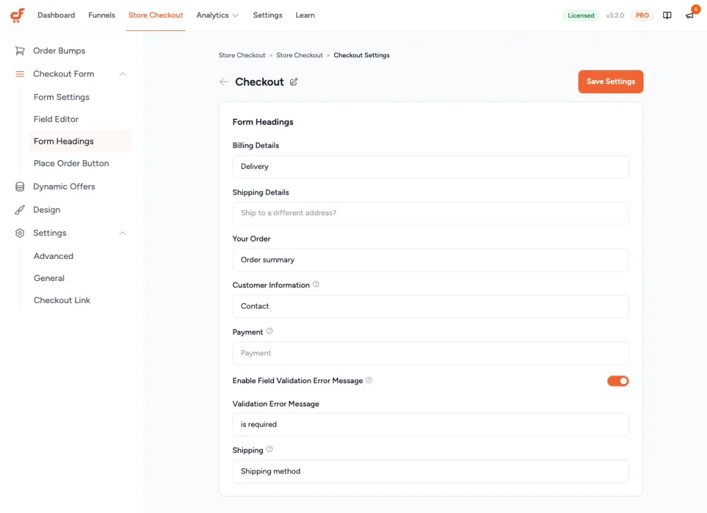
CartFlows > Store Checkout > Checkout Form > Form Headings, with Shopify’s wording entered. The validation message setting sits in the same panel.
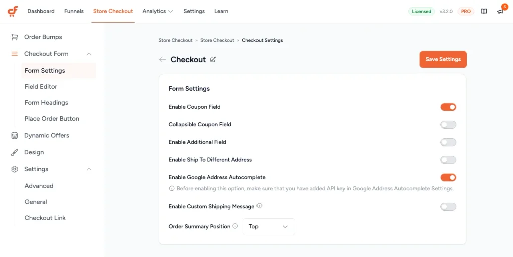
Form Settings: order notes and the second address off, Google address autocomplete on. The note under it is the API key reminder.
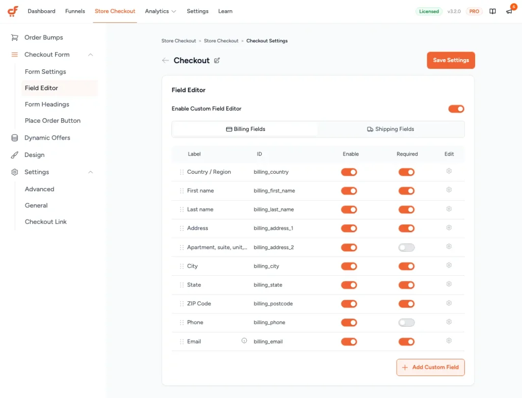
Field Editor with the custom field editor on. Country / Region sits at the top of the billing fields; the gear on each row opens label and placeholder.
One thing trips up almost everyone in the Field Editor: on a CartFlows checkout, the text a shopper sees inside a field is the placeholder, not the label. Change only the label and the form looks exactly the same, so open the field’s gear icon and set both inputs.
Once the key is in, the address field suggests full addresses from the first few letters, the way Shopify’s does.
Our documentation on Google address autocomplete walks through creating the key.
On the test store, these changes cut the visible fields from 14 to 13 on desktop, and from 13 to 12 on a phone.
Back in Form Headings, Enable Field Validation Error Message sets the message an empty field shows, which by default reads “is required”. Put the field’s name in it instead: a shopper told “Enter a ZIP code” fixes it at once.
Your checkout will not match Shopify’s pixel for pixel. Shopify adds an SMS opt-in and a “Finalize order” heading that WooCommerce has no field for; the page works without both.
Need a field WooCommerce does not ship, such as a delivery date or a gift message? Creating a new field is not in the free plugin; CartFlows Pro adds it.
Stores in the EU may also need a terms checkbox, which WooCommerce already has. Our guide to displaying the terms and conditions checkbox covers it.
Further reading: How to Customize the WooCommerce Checkout Page (7 Easy Ways)
Keep the Order Summary in View
In the two-column layout, the order summary stays beside the form all the way down, as on Shopify. One free toggle also lets shoppers remove an item without going back to the cart. Here’s how:
- Open CartFlows > Store Checkout > Settings > Advanced.
- Turn on Enable Cart Editing on Checkout.
- Save, then load the checkout with two items to check each line shows a remove control.
Cart editing adds a remove control only, with no quantity stepper. Leave it off if you sell a single product, where removing the one item leaves nothing to buy.
For a full slide-out cart with quantities and recommendations, Modern Cart is our separate side cart plugin.
Put the Express Payment Buttons on Top
Express checkout is a WooCommerce feature, not part of CartFlows or any other checkout builder. Apple Pay, Google Pay and PayPal come from your payment gateway, and they appear once WooCommerce has them switched on.
Express checkout means wallet buttons that fill the whole form from a saved account, so the shopper types nothing. It’s the “one click” feeling people mean when they ask for a Shopify checkout.
Update CartFlows and every payment plugin before you start. With express payments on, we have seen a standard card payment stop creating orders until CartFlows and the gateway plugin were both updated.
Here’s how:
- Open WooCommerce > Settings > Payments and confirm a gateway that supports express checkout is active. Stripe, PayPal and WooPayments all do.
- Open that gateway’s own settings and switch on the express methods it offers, such as Apple Pay and Google Pay.
- Choose where the buttons show. Product page, cart and checkout are the usual three.
- Load the checkout and check that the buttons sit above the form, where a Shopify-style checkout puts them. If they show beside the pay button instead, change the placement in the gateway’s settings.
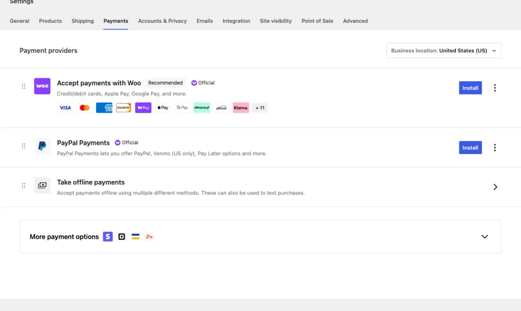
WooCommerce > Settings > Payments. The Apple Pay and Google Pay logos sit on the gateway’s row, which is why express buttons belong to WooCommerce, not a checkout plugin.
WooCommerce’s express checkouts documentation covers the placement options gateway by gateway.
Offer the payment apps your shoppers actually use. Three buttons read as a choice; eight read as a decision.
Then place one test order with a regular card payment as well. An Apple Pay order going through proves nothing about the card form.
Further reading: WooCommerce Payment Gateway Optimization Guide
Strip the Header and Add Trust at the Pay Button
Shopify keeps the store’s branding at the top and drops the rest. The new checkout page already leaves out your theme’s header, menu and footer, so there is nothing left to strip, and two free panels handle the look and the pay button.
Here’s how:
- Open CartFlows > Store Checkout > Design and switch Enable Design Settings on. Colors, fonts, fields and buttons now sit in one panel.
- Open Checkout Form > Place Order Button to reach the pay button’s own settings.
- Switch Enable Lock Icon on to put a padlock beside the button text.
- Switch Enable Price Display on to print the order total on the button.
- Set Button Text to something final, such as “Pay now”.
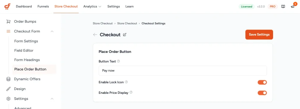
Place Order Button: “Pay now” as the button text, with the lock icon and the order total switched on.
The total on the button saves the last scroll a shopper makes before paying. On the default checkout, checking it means scrolling back up to the summary.
Add one guarantee line above the button, such as your returns window. It answers “what if this goes wrong” at the moment the question comes up.
Leave two things off entirely. A badge for a certification you do not hold is a liability, and a countdown timer at payment reads as pressure.
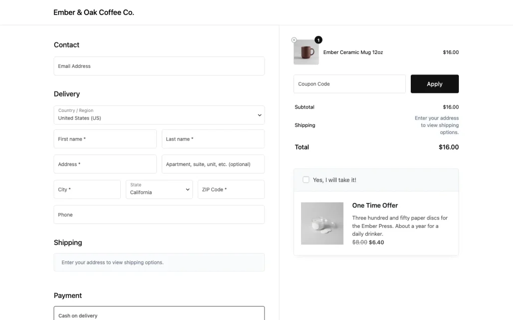
The finished test-store checkout: logo only, Contact then Delivery from country down, summary beside the form. The offer under the totals is an order bump, which is CartFlows Pro.
Two cosmetic details in that capture came from the Custom CSS box in Settings > General: the add-to-cart notice is hidden, and the shipping prompt is grey rather than red. The checkout works the same without them.
Check It on a Phone
A checkout that works on a laptop can still fail on a phone, so open yours on a real phone with something in the cart.
Phones brought 76 percent of traffic to ecommerce sites in June 2026, according to our ecommerce statistics library.
Shopify’s phone checkout folds the order summary into one bar at the top, showing only the total.
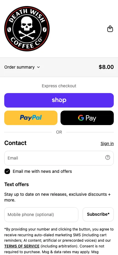
Death Wish Coffee at phone width: the order summary folded into one bar with the total.
A responsive checkout changes four things when it narrows to a phone:
- The order summary collapses into one tappable row with the total, so it stops pushing the form down.
- Fields stack into one column. Pairs that share a line on a laptop break onto their own lines.
- Tap targets grow. Inputs and buttons get taller than a fingertip.
- Input text stays large enough to stop zooming. Too small, and the phone zooms in when a field is tapped.
Further reading: Mobile Checkout Optimization Tips to Increase Revenue
Go Past What Shopify Allows
Matching Shopify is where you start, not where you stop. Outside Shopify Plus, Shopify limits what a store can change on its checkout; WooCommerce does not.
Shopify stores do sell at checkout too: Death Wish Coffee shows a recommended products block, with its own add buttons, right under the order totals.
On WooCommerce, the offer can react to what is in the cart. These are the four features stores start with to make each order bigger. None is in the free plugin, and CartFlows Pro adds all four:
- Order bumps. A checkbox offer under the order totals, added with one tap.
- One-click upsells and downsells. An offer after payment, charged to the card already used.
- Dynamic Offers. Rules that change the offer based on the cart, so a grinder buyer and a subscriber see different things.
- A/B split testing. Two versions of the checkout on split traffic, so you compare conversion rates instead of guessing.
For carts left at checkout, Cart Abandonment Recovery is our separate plugin for follow-up emails to shoppers who leave.
Know one limit before you plan around any of this. CartFlows has no conditional field logic, so it cannot show a field only when a shopper picks a certain option.
Instant Checkout: Buy Without Ever Reaching the Cart
Instant Checkout puts a Buy Now button beside the Add to Cart button. It opens the full checkout in a popup over the product page, order bumps included, so the shopper never visits the cart. It’s not in the free plugin; CartFlows Pro adds it, and it ships switched off.
The cart page is the step a decided shopper needs least. Someone who wants one bag of beans clicks through it only to press another button.
The popup is the real checkout, not a shortcut around it. Items a shopper ticks in the Frequently Bought Together box, the free CartFlows widget that suggests add-ons on the product page, carry into it.
Every order bump condition still applies inside the popup: cart value, products, categories, tags, coupons, shipping method and country.
Shopify’s own quick-buy buttons work differently. Its accelerated checkout buttons buy a single variant of one product and do not support cart attributes such as gift wrap or a delivery date.
Instant Checkout runs in two modes:
- Two Pane. A wide two-column popup with three steps (Contact, Address and Payment), which suits a checkout that needs room.
- QuickBuy. A narrow single column in two steps, which suits a store selling one simple thing fast.
Here’s how to switch it on:
- Open CartFlows > Store Checkout and check Enable Store Checkout is on.
- Click Funnel Settings, the gear icon at the top right.
- Open Instant Checkout and switch Enable Instant Checkout on.
- Pick Two Pane or QuickBuy, set the Button Text, then click Save Settings.
Left off, Instant Checkout changes nothing in your checkout experience; turned on, it puts a shopper who knows what they want one button away from paying.
Test the New Checkout Before Shoppers See It
Switching to a new checkout page is the change most likely to break a payment method, so run real test orders through the whole checkout process before go-live.
The risk is in the combination: your theme, gateway, tax plugin, shipping plugin and the plugin behind your new checkout all write to the same form.
Run these checks on the new checkout page before real shoppers reach it:
- Place a full test order with a regular card payment, from the product page to the confirmation email. A payment form that loads is not proof; an order in WooCommerce > Orders is.
- Place one test order per express method, one at a time, so a failure points at a method, not the page.
- Compare the visible fields with the old checkout, and confirm the site menu is gone.
- Complete an order on a real phone.
- Open the order pay URL, the page WooCommerce uses when a customer pays for an existing order, and check which checkout it serves.
When something breaks, the symptom usually names the cause:
| What you see | Check first |
|---|---|
| A payment method disappeared, or a hidden field still shows | A second plugin editing the same checkout fields |
| Apple Pay or Google Pay works, but a card payment creates no order | Update CartFlows and the payment plugins, then test the card alone |
| It worked yesterday and not today | A gateway plugin update; re-test the whole flow |
| An old-looking checkout at one URL | The order pay page, which WooCommerce serves from its own template |
| Fields show twice, or styles fight | The WooCommerce checkout block and the new checkout page both active |
The field-editor conflict in the table’s first row shows up in public, too. On a WordPress.org support thread, a store owner watched the card option load on a Shopify-style checkout, then vanish. They closed it themselves on 27 January 2025: “it was a different plugin conflict”.
For anything the table does not cover, open WooCommerce > Status and click Get system report, which copies the details any support team will ask for.
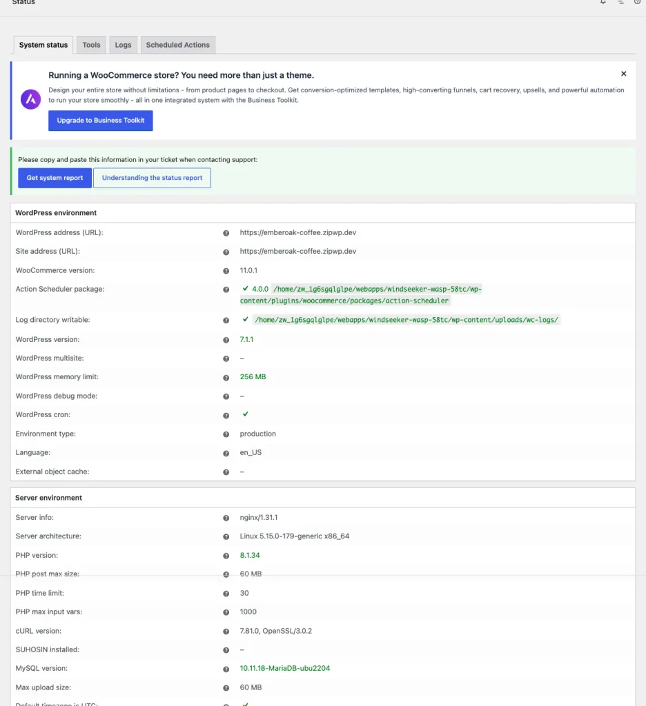
WooCommerce > Status > System status. Get system report copies the environment details a support team asks for.
After launch, put a monthly test order with a regular card payment on the calendar, beside your backups.
Final Thoughts
Your checkout and a Shopify checkout sit closer than they look. A new checkout page, a field order and a row of payment buttons get you a checkout like Shopify’s, and none of them needs code.
If the Shopify look is all you want, the free CartFlows plugin builds it.
If you want the offers Shopify limits and a Buy Now popup that skips the cart, CartFlows Pro is the next step.
For speed and the rest of the checkout, work through our WooCommerce checkout optimization guide.