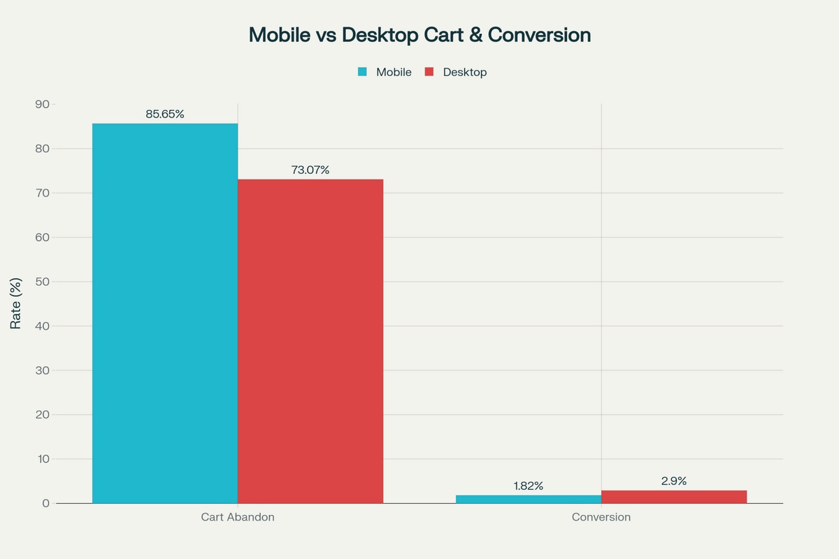
Mobile shoppers generate 57% of all eCommerce revenue globally. However, since 85% of customers abandon their mobile carts, even a 10% improvement in your mobile checkout process can result in thousands of dollars in recovered revenue.
This gap between traffic and completed purchases is your biggest untapped revenue source and the main reason for optimizing mobile checkout.
With mobile commerce projected to reach $4 trillion by 2025, stores that optimize mobile checkouts will capture the lion’s share of that growth.
And you don’t want to be left behind.
Why Mobile Checkout Optimization Matters
Customers are constantly comparing you to the best customer experience they have had.
For instance, their previous experience could be with Amazon, which conditions people to expect one-page checkouts and instant payments.
Or it could be Shopify with its thumb-friendly interfaces.
In fact, if your website requires customers to:
- Fill out lengthy forms
- Create an account before they buy
- Has errors on the form
People will likely leave.
18% of visitors abandoned their order in 2025 just because the checkout was too complicated.
But the good news is, recovering even a small portion of abandoned carts can result in a huge revenue boost.
Remove one unnecessary form field, and you recover some of those users who dropped due to complexity. Speed up your checkout by two seconds and capture more. Add one-click payments and you see even more conversions.
The math directly favors mobile checkout optimizations. So why doesn’t everyone do it?
What Are the Biggest Barriers to Optimizing Mobile Checkout?
We already know the common factors for cart abandonment, extra costs, slow deliveries, lack of trust, and so on.
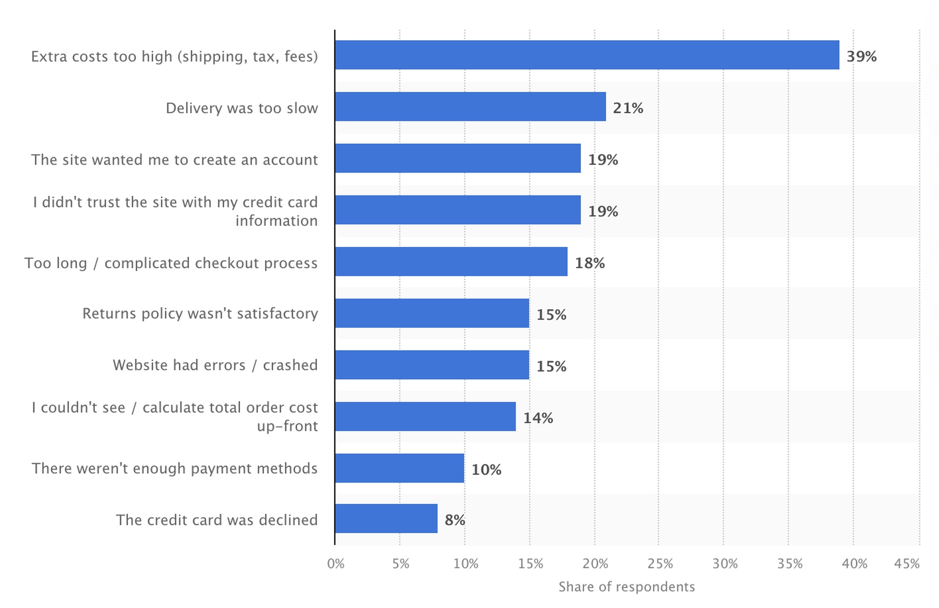
The numbers below are sourced from Statista.
- Unexpected costs drive 39% of US consumers away from checkout. Shipping fees appearing at the last second feel worse on mobile because limited screen space makes it harder to review total costs while examining itemized charges. Desktop users can keep multiple browser tabs open to compare prices. Mobile users see one screen at a time, so surprise fees hit harder when there’s no easy way to validate whether they’re reasonable.
- Account creation requirements can cause friction. 19% of shoppers abandon when forced to create accounts because typing email addresses and creating passwords on touchscreens takes three times longer than on physical keyboards. Mobile users shop during commutes, lunch breaks, or while waiting in line. Asking them to remember and type complex passwords during these moments almost guarantees lost sales. Implementing an SMS otp can streamline authentication by letting users verify their identity with a quick mobile code instead of creating a full account password.
- Complicated checkout causes 18% of cart abandonment. Forms designed for desktops become scrolling marathons on phones. Multi-step checkouts add frustrating page loads over slow mobile networks. Desktop shoppers might complete a 15-field form. But mobile shoppers quickly abandon because typing on glass is tedious and error-prone.
- Form errors cause 15% of the visitors to abandon. Auto-fill fails when input types don’t match browser expectations. Keyboards default to letters when numbers would make sense. Required fields lack clear indicators. Validation errors hide below the fold. Desktop users navigate these annoyances with precise mouse clicks and full keyboards. Mobile users just leave.
All of these problems, while evident on desktops, are amplified on smaller screens.
It’s harder to navigate when you’re trying to tap the form inputs, buttons, checkboxes, and payment options.
There are more distractions like notifications from different apps, DMs from contacts, and more, causing far lower attention spans compared to desktop.
The question is, how do you overcome these barriers and optimize mobile checkout forms?
How To Optimize Mobile Checkout Forms
We’ve worked with multiple clients across our CartFlows implementations and have a clear picture of what works and what doesn’t.
A lot of what we notice is old-school advice, and yet, a lot of customers are missing it.
Here are six steps you can take today:
1. Remove All Unnecessary Form Fields
Email, phone, and shipping address cover all the essential information for shipping physical products.
Everything else can wait until after the purchase. Try to ask for only the most essential fields to allow completing the purchase. You can always ask for more details afterwards.
2. Add Technical Type Tags for Each Field
Setting type=”email” triggers email-specific keyboards with @ symbols and .com shortcuts.
Phone fields with type=”tel” show number pads immediately. Credit card inputs using type=”number” and autocomplete=”cc-number” enable one-tap autofill from saved payment methods.
These simple changes make it simpler to enter data on mobile devices.
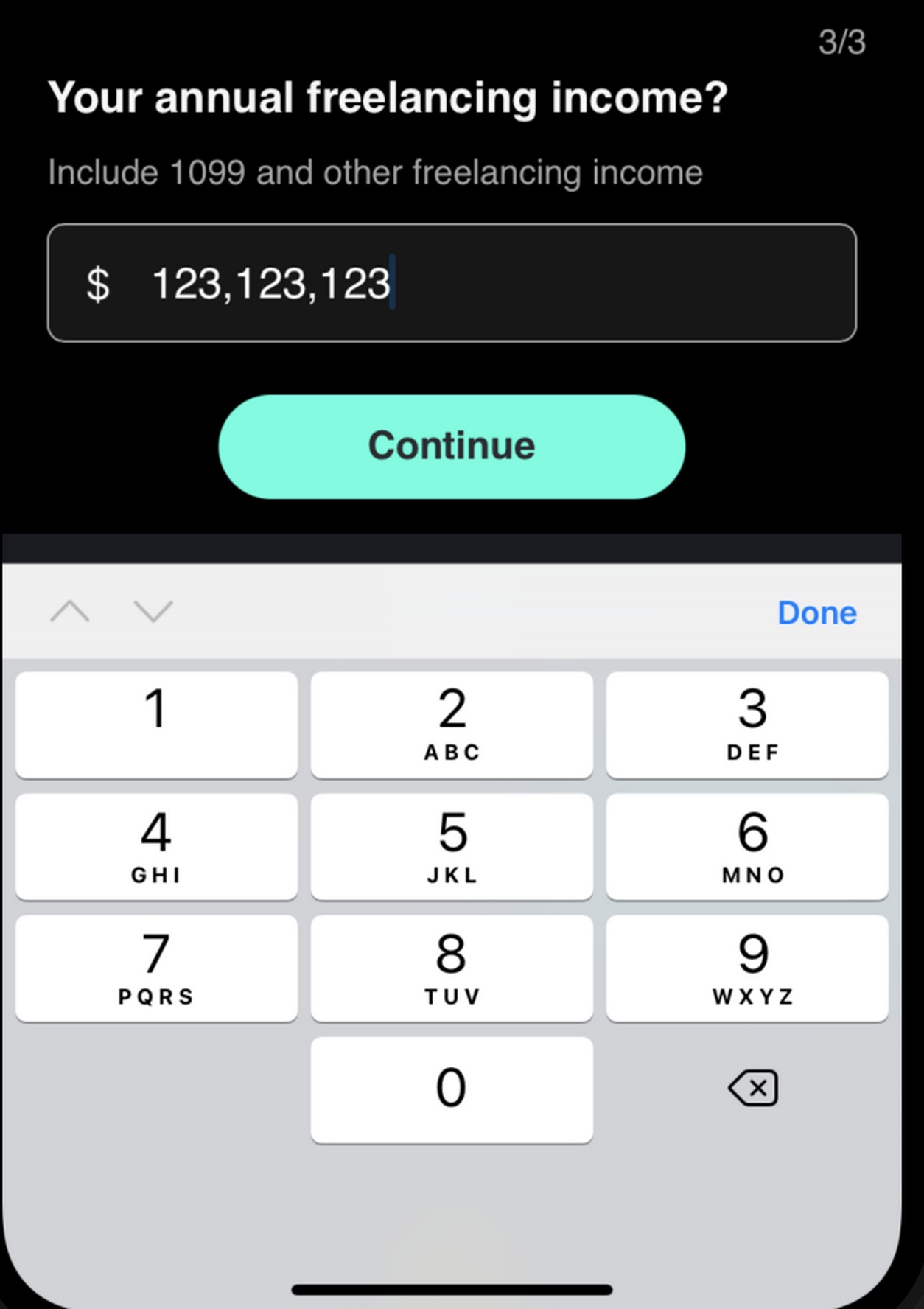
For instance, setting type=”tel” automatically opens a numpad as the keyboard instead of the full QWERTY keyboard.
3. Autocomplete For Entire Forms
Adding autocomplete=”shipping street-address” and autocomplete=”postal-code” lets browsers populate complete address blocks with one tap.
Mobile users who’ve saved addresses in their browser can skip typing 30+ characters across six fields, saving them time and helping them move to payment much faster.
4. Use Address Validation Through Google Maps
Real-time verification prevents typos that lead to failed deliveries, customer service calls and refund requests.
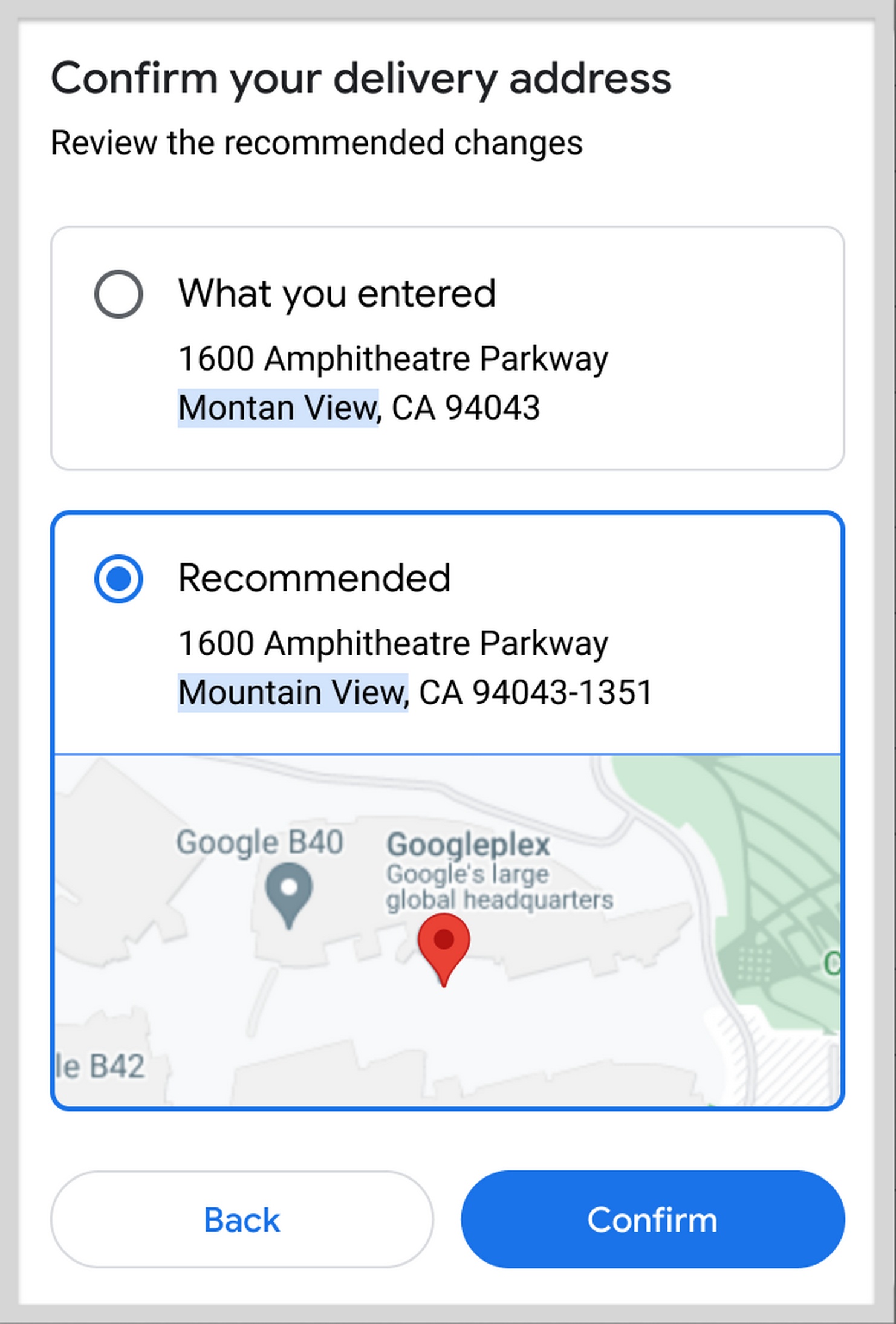
Google Address Autocomplete reduces full address entry to typing just three or four characters before selecting from a dropdown.
Someone typing “123 M” will see their complete address appear, then tap once to populate all address fields simultaneously.
5. Inline Validation To Avoid Having To Check For Errors
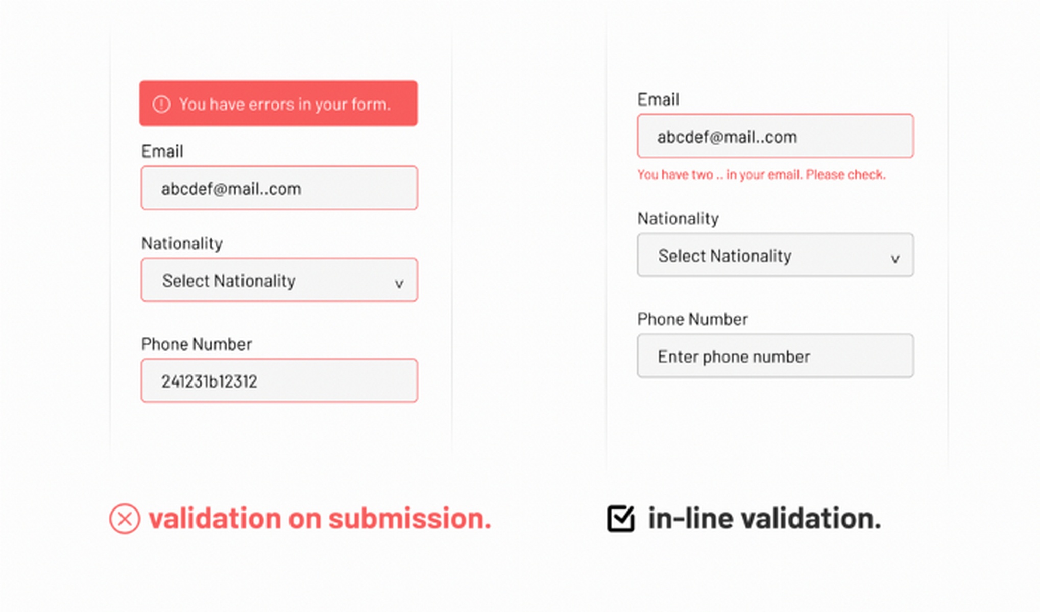
Mobile users see one section at a time. So showing errors immediately after completing each field prevents the frustration of submitting, scrolling back up, finding the error, fixing it, scrolling down, and submitting again.
6. Floating Labels To Solve The Vertical Space Problem On Mobile
Labels that move above input fields when users start typing maintain context without consuming extra screen real estate.
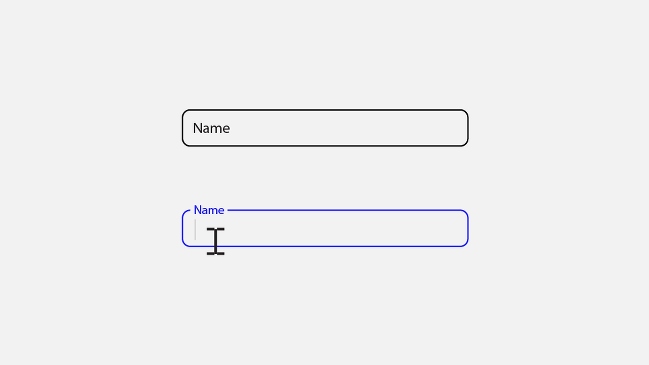
Placeholder text alone disappears during typing, forcing users to remember what information belongs in each field.
Floating labels stay visible, reducing the cognitive load of completing forms on small screens.
Which Payment Methods Work Best on Mobile?
You fixed your checkout forms. But now comes the most important part, payment.
You want to make payments as smooth as possible. And every additional step here reduces the probability of a visitor completing checkout..
Payment methods determine whether mobile users complete checkout. Apple Pay and Google Pay eliminate the typing that mobile users hate.
One tap authorizes payment using information already stored on their device. Cards don’t need manual entry. CVV codes don’t need typing.
The purchase completes before users can reconsider.
Payment priority for mobile:
- Digital wallets (Apple Pay, Google Pay): One-tap checkout eliminates typing
- PayPal, Stripe, Link: Login replaces card entry, buyer protection reduces security anxiety
- Credit cards: Necessary for users without a digital wallet setup
- Buy now, pay later (Affirm, Afterpay): Reduces purchase anxiety for expensive items
- Local payment methods: iDEAL in the Netherlands, Klarna in Nordic countries and UPI in India will help you match the local preferences.
You can also use the Payment Request API to fetch saved payment information from the browser.
This does two things: One, it allows users to automatically fill in their credit card and billing information with a single tap. And two, it speeds up checkout by eliminating the process of entering card details.
What Design Principles Improve Mobile Checkout UX
Mobile checkout success also depends on proper interface design.
- 49% of users operate phones one-handed
- 36% cradle devices in one hand
- Only 15% use both hands consistently
With these usage patterns in mind, it makes sense to place critical actions in the bottom 40% of screens where thumbs can reach.
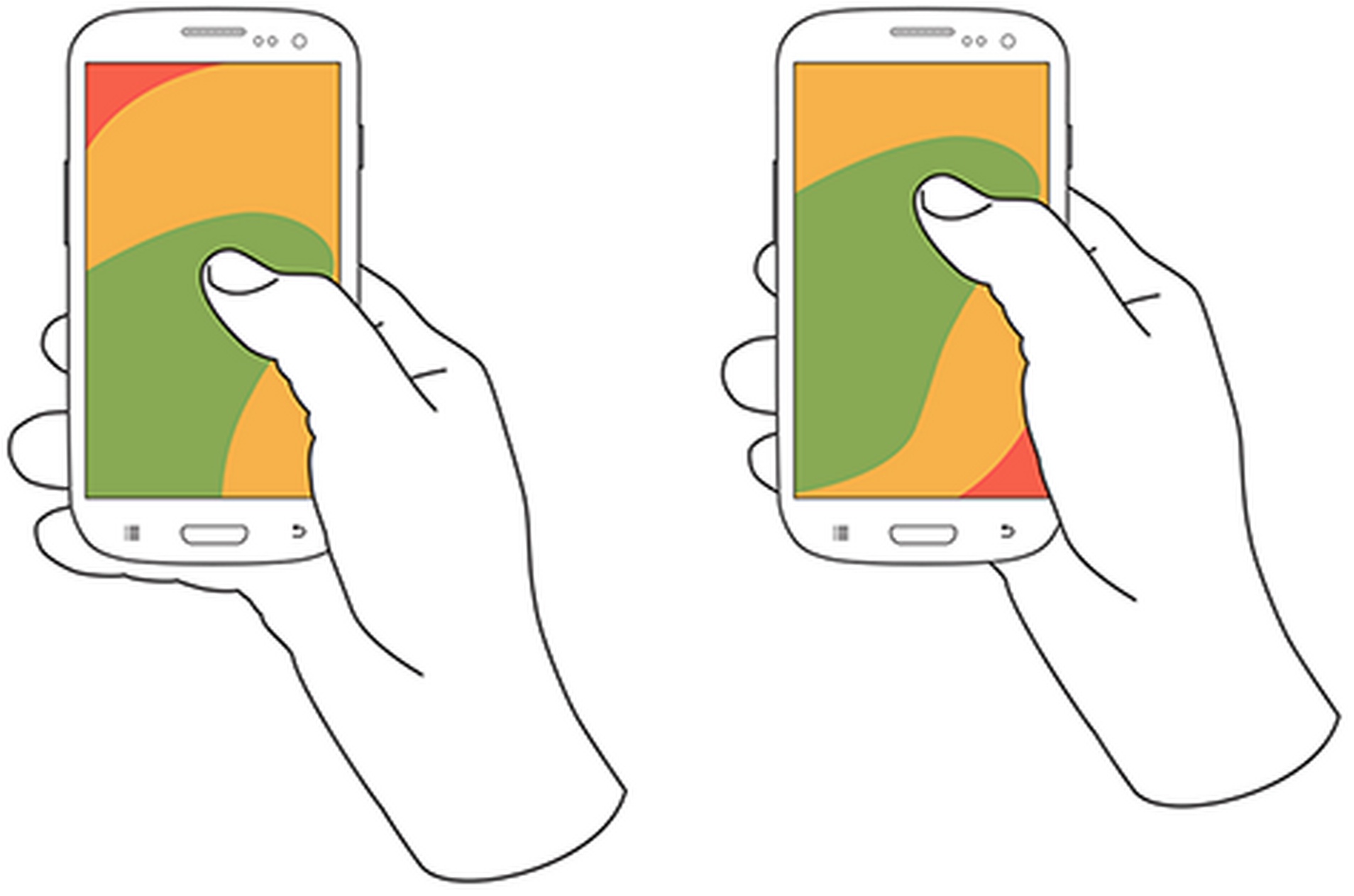
Mobile-first design basics support these natural interaction patterns:
- Use single-column layouts that work within thumb reach
- Avoid side-scrolling or multi-column arrangements that require precise navigation
- Implement generous whitespace and clear visual hierarchy
- Use high contrast ratios for text readability in various lighting conditions
- Make primary action buttons bold with contrasting colors
All visual feedback, like instant suggestions as the user types the address, auto progress to the next field when entering dates and easy access to the cart summary, can help customers stay engaged throughout the interaction.
How Page Speed Affects Mobile Checkout
You can have the best design and CX in the world, but if the page loads slowly, people are going to leave.
The average mobile page load time is 8.6 seconds, but users expect your pages to load between 2 to 3 seconds at most. And conversion rates begin to rapidly decline after the 3.5-second mark.
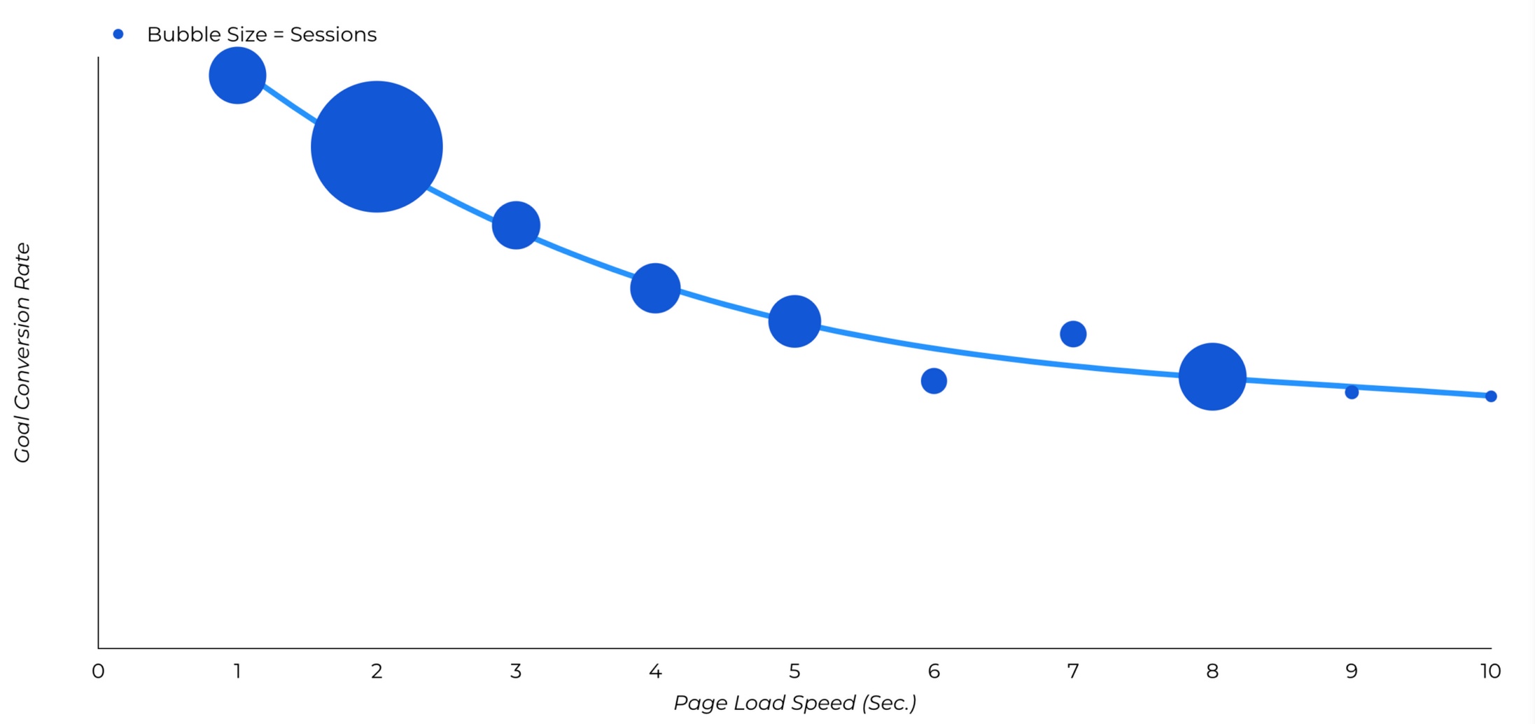
There are a few ways to speed up your eCommerce website to improve the conversion rates:
- Compress and optimize images without sacrificing visual quality
- Use a photo enhancer to improve clarity and sharpness for a more polished, professional look
- Implement Content Delivery Networks (CDNs) to serve content from geographically closer servers
- Minify CSS, JavaScript and HTML to eliminate unnecessary code
- Use browser and server-side caching for repeat visitor performance
- Implement Progressive Web App (PWA) technology for app-like experiences
You can also add mobile-specific optimizations to target smartphones, like the use of Accelerated Mobile Pages (AMP) for instant loading.
When optimizing your WooCommerce website, think of users who are still using 3G or are in poor network areas.
If they have a good experience, the rest of your users are bound to be delighted with your website.
Using the right website builder can help you create a seamless, visually appealing, and user-friendly site that enhances that positive experience even further.
How To Use CartFlows to Optimize Your Mobile Checkout
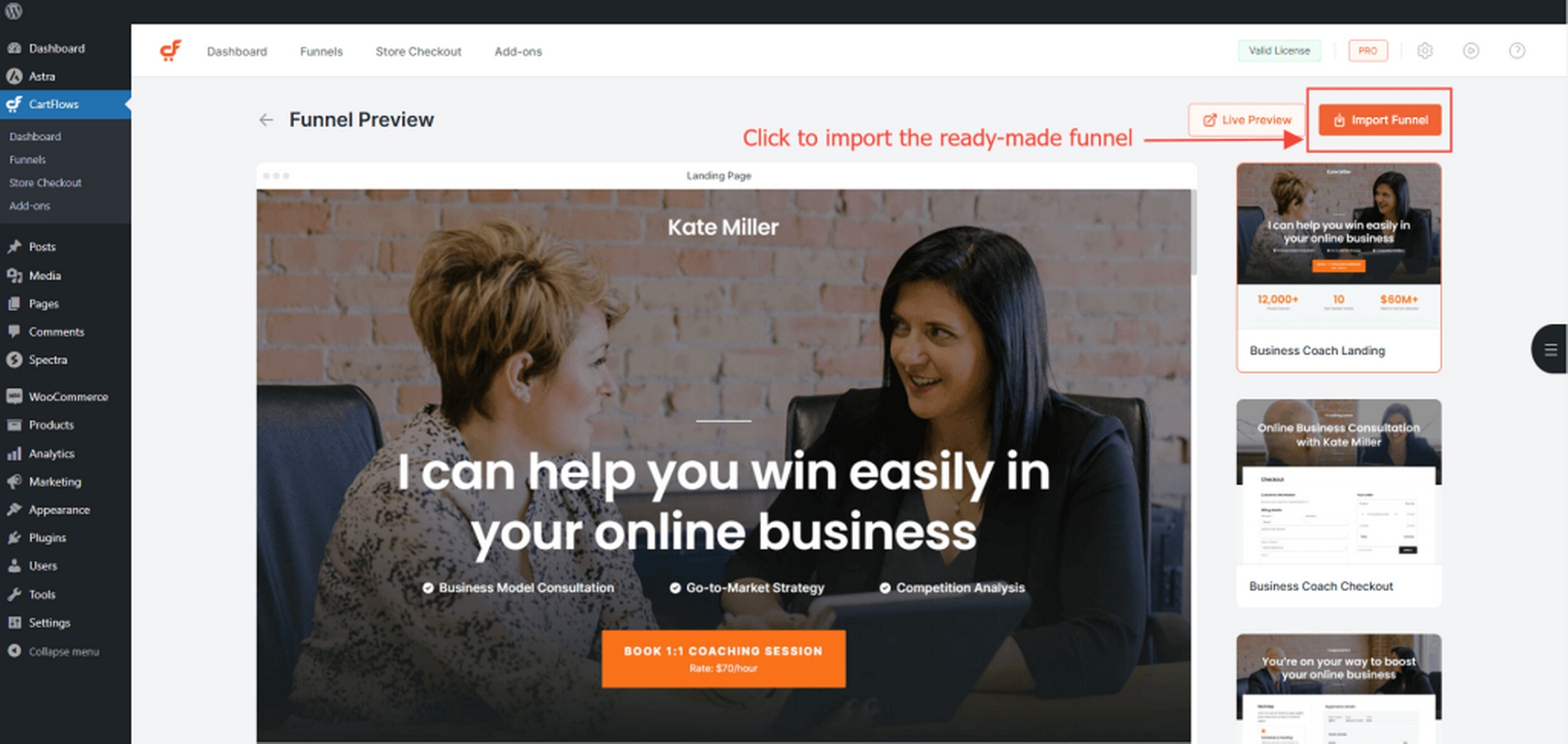
CartFlows helps optimize mobile checkout in two key ways.
First, its instant layouts remove clutter and provide you with conversion-optimized designs without adding the complexity of a page builder.
Second, it adapts to all screen sizes so mobile users have a large, “tappable” form input.
CartFlows’ built-in mobile responsiveness also solves all the problems we discussed above:
- Checkout templates that adapt seamlessly to different screen sizes and thumb navigation patterns
- Order summaries collapse automatically on mobile devices to prioritize checkout fields (the Modern Cart plugin, discussed next, takes care of this)
- Real-time email validation catches errors immediately during form entry
- Google Address Autocomplete reduces typing and input errors
- Express checkout integration with payment processors enables one-click purchasing
There are also a few advanced optimization tools that allow the testing capabilities needed for continuous improvement:
- A/B split testing for data-driven design decisions
- Integration with Google Analytics for conversion tracking across device types
- Pixel integration with Facebook, Google, Pinterest, Snapchat, and TikTok for retargeting optimization
What Makes Modern Cart Perfect for Mobile
CartFlows optimizes the final checkout experience. But you also need to perfect the cart experience.
Modern Cart replaces the default WooCommerce cart with a slide-out interface that maintains mobile-first design principles.
Customers view items, apply coupons, and track free shipping progress without leaving their current page.
The mobile-first design offered by Modern Cart builds upon the thumb-friendly approach we discussed before:
- The floating cart provides instant access through customizable positioning within thumb reach
- Cart slides in smoothly without page reloads that would interrupt the shopping flow
- Works seamlessly across phones and tablets with responsive sizing
- Maintains shopping momentum while providing full cart functionality
Conversion-focused features work before users reach checkout pages:
- Free shipping progress bars show customers how much more to spend for qualification
- Product recommendations highlight upsells and cross-sells during cart review
- Customizable colors, width and animation speed match brand requirements
- Choose between minimized or traditional coupon field styles based on strategy
Modern Cart Free vs Pro: Which Version Should You Choose?
| Feature | Free Version | Pro Version |
|---|---|---|
| Price | $0 | $79/year for 10 sites $249 lifetime for up to 30 sites |
| Slide-out cart interface | ✅ | ✅ |
| Mobile optimization | ✅ | ✅ |
| Basic color customization | ✅ | ✅ |
| Floating cart positioning | Bottom-right/left only | Multiple positions |
| Free shipping progress bar | ❌ | ✅ |
| Product recommendations | ❌ | ✅ |
| Express checkout integration | ❌ | ✅ |
| Styling options | Basic | Comprehensive |
| Multiple cart styles | Slide-in only | Slide-in + popup |
| Priority support | ❌ | ✅ |
Choose Modern Cart Free if you want basic cart improvement without ongoing costs.
Choose Modern Cart Pro if you need the conversion optimization features like progress bars and product recommendations that drive average order value increases.
How CartFlows and Modern Cart Work Together
Both plugins serve a different purpose but work together for the good of your store.
CartFlows handles checkout page optimization while Modern Cart enhances pre-checkout cart interaction.
You could absolutely use them independently, but the combination addresses mobile conversion barriers from initial cart interaction through final purchase completion.
Here are a few improvements that both plugins collectively offer:
- Modern Cart’s slide-out interface works with CartFlows’ mobile-optimized checkout templates
- Users move seamlessly from cart interaction to checkout
- Deep integration with Google Analytics gives you a complete picture of your user behavior and where people are dropping off in your funnel
- Social media pixel tracking continues from cart interaction through conversion completion
- Modern Cart encourages additional purchases through recommendations and progress bars
- CartFlows captures these enhanced carts through streamlined, mobile-first checkout
- Express checkout works across both cart and checkout for consistent user experience
Get More out of Mobile Checkout
Here are a few more tips we find useful for mobile eCommerce:
- Make checkout buttons highly visible: Use contrasting colors and sticky placement so they’re always accessible. If users can’t instantly spot the checkout button, completion drops.
- Display safety badges and SSL protection. Trust seals and privacy icons right at checkout directly address customer concerns about payment security, a top barrier to completion.
- Add a checkout progress indicator. Walk users through multistep checkouts with a visual progress bar to reduce uncertainty.
- Promote relevant upsells and cross-sells in the cart, not just after, to increase order value without introducing too many steps.
- Instantly send order confirmations and thank-you pages, giving users summary details and next steps, which maintains trust after payment.
- Proactively keep customers informed on delivery status to reduce “where’s my order?” tickets and support a smoother post-purchase experience.
FAQs on Mobile Checkout Optimization
Mobile checkout optimization means improving the checkout process on smartphones so users can complete purchases faster, with fewer steps and greater security.
You can reduce mobile cart abandonment by highlighting checkout buttons, offering guest checkout, supporting popular payment methods like Apple Pay and PayPal, and being upfront about shipping costs.
Mobile shoppers face more friction from tiny screens, slow load times, complex forms, and unclear instructions. Simplified checkout and fast page speeds help prevent drop-offs.
CartFlows and Modern Cart integrate smoothly with WooCommerce to optimize both the cart and checkout experience. You can use them together for a seamless, high-converting mobile flow.
Adding digital wallets (Apple Pay, Google Pay), PayPal, and one-click express options raises conversion rates and boosts user satisfaction for mobile shoppers.
Guest checkout streamlines the process, reduces hesitation, and eliminates a major reason for cart abandonment, especially for first-time customers.
Optimizing Mobile Checkout Experiences
CartFlows and Modern Cart provide you with the tools to create a checkout experience that feels effortless on mobile.
You can tailor every step, use mobile-first templates, simplify navigation, and include practical features like guest checkout and clear payment options.
Small design choices, such as well-placed buttons and logical flow, help shoppers complete purchases without friction.
Together, these tools make checkout faster, clearer, and more reassuring for every customer. The result is a smoother buying experience that fosters trust and encourages people to return.
