Emails have stood the test of time and have remained the best-performing channel to communicate and build a connection with eCommerce customers.
But building a relationship largely depends on crafting an effective email and needs to be in motion the moment a customer subscribes or opts in.
The very first email that must hit their inboxes is the welcome email.
Welcome emails are more than just sending a ‘thank you for subscribing’ message or using them as an ‘about us’ page.
So what makes a welcome email impactful? What should it include?
This article will take you through everything you need to know about welcome emails with inspiring examples.
What is an eCommerce welcome email?
A welcome email, as the name suggests, is a type of marketing email sent to new subscribers or new customers who’ve just purchased from you.
A warm welcome email sets the tone for your relationship with the customer and encourages healthy engagement.
Why are welcome emails important in eCommerce?
There’s nothing more sustainable for sales than the solid connection you build with each of your customers. Welcome emails help make this a reality.
Here’s how:
1. Customers expect it
Once your customers have made some effort to sign up for your newsletter or purchase from you, they expect you to welcome them.
Around 74% of customers expect brands to send them a welcome message as soon as they subscribe.
Since most customers would’ve already left your website, it only makes sense to send them a warm and personalized welcome email straight to their inboxes.
Utilizing one of the top email builders can help in crafting these personalized welcome messages, ensuring they resonate with your subscribers.
2. Better customer engagement
Welcome emails and eCommerce customer engagement work hand in hand.
You can garner higher open and click-through rates by incorporating a referral marketing tool to offer discounts like a first-time coupon code, referral offers, and more. Platforms such as Referral Rock make it easy to manage your referral programs, track results, and ensure customers are rewarded promptly, all without added manual work.
While you’re improving your campaign, there are also methods to enhance click-through rates using organic-like automated traffic that could help boost your SEO efforts and ensure better visibility on search engines.
In fact, welcome emails are known to have the highest email open rates of 91.4%. But here it is important to make sure that your letters are actually delivered.
To ensure this, use a reliable bulk email sender or SMTP server with a high deliverability rate.
3. Boosts loyalty
By creating a great first impression with your welcome email, you’re sure to turn new customers into loyal brand followers. But how do you do this?
Add incentives that inspire them to take action, including dynamic content for each customer and valuable insights around their purchases, to name a few. But make sure not to overload the message and use a DKIM validator to avoid appearing in their spam folders.
4. Saves time
When welcome emails are a part of your outreach strategy, they help save time that would’ve otherwise taken to nurture and convert leads.
How?
Your welcome emails can be crafted to offer valuable advice about your products and offer exclusive deals that could move your customer rapidly down the sales funnel.
Struggling to Get Sales? Use This Proven Funnel Building Checklist
Clicks but no customers? You might be missing the most important piece: a proper sales funnel.
Our FREE step-by-step Sales Funnel Building Checklist helps you plan, build, and optimize each stage, even if you’re a beginner.
Get Your FREE Sales Funnel Building Checklist Now!
Step-by-step guidance to help beginners build high-converting sales funnels without the guesswork.
5. Helps segment customers better
Welcome emails offer an incredible opportunity to segment your customers for future communications.
For instance, you could add recommended products of multiple categories within your welcome email. A customer browsing custom clothing items will appreciate recommendations for custom embroidery like hoodies, and printed T-shirts.
Similarly, one interested in interior decor will expect further suggestions such as wall art, bedside lamps and scented candles. Depending on what the consumers click on, you can segment them and send tailored emails.
6. Reduces spam complaints and unsubscribes by setting expectations
Since welcome emails let you familiarize your eCommerce business with new subscribers, you can set expectations on what their journey with your brand is going to be like.
If they’re uninterested, you could include an option for them to unsubscribe from future communications. This lets you control avoidable spam complaints that could hurt your reputation in the long run.
As you craft these emails, implementing proven email marketing best practices can greatly enhance their effectiveness and contribute to your overall marketing strategy.
It’s time to visually understand the importance of welcome emails and what makes them stand apart.
15 welcome email examples and what’s good about them
Now let’s take a look at some email examples in everyday use for inspiration.
1. ColourPop
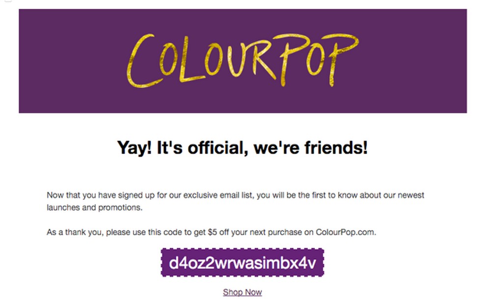
Since most of ColourPop’s subscribers are younger females, they’ve added a pretty touch to their welcome email with an attractive tagline. They’ve thoroughly understood their consumers and their lingo.
What did we like?
As mentioned, welcome emails are windows to establishing the much-needed customer connection. There’s no better way to set sail than by offering a discount code.
You can see how ColourPop does this as a CTA:
2. Clinique
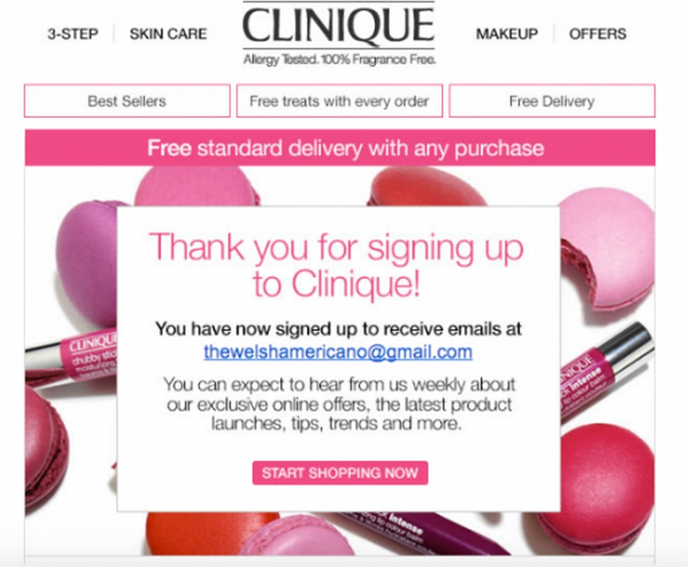
Clinique did it best by being straightforward with setting expectations with the new subscriber/customer.
What did we like?
A simple “this is what you signed up for” in your welcome email goes a long way to establishing a strong connection and setting the next steps.
Clinique has also highlighted additional perks, such as ‘free treats’ and ‘free delivery,’ for its subscribers — which helps boost loyalty and repeat purchases.
3. Ikea
Helpful tips and product advice help your potential customers make buying decisions. One way to ensure tips and useful resources reach such customers is to tie them into your welcome emails.
What did we like?
Ikea does this best by sharing its recent blog posts and best-selling products to inspire new subscribers.

4. Kiehl’s
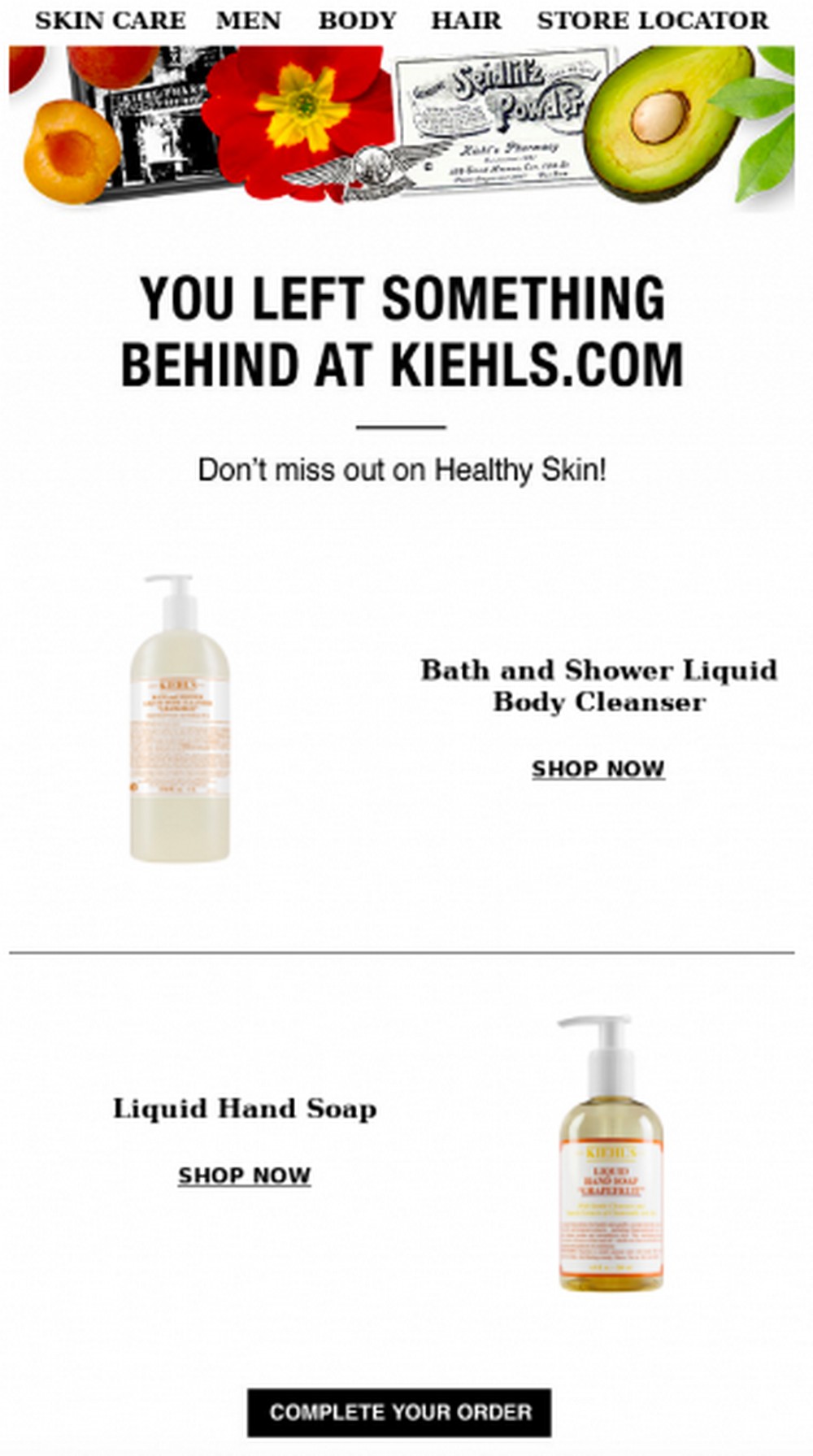
Kiehl’s tries to set its subscribers on the right path from the get-go.
What did we like?
Kiehl offers recommended products for subscribers to click on and check out. Also, don’t miss the inviting headline that piques the reader’s interest.
5. Lush
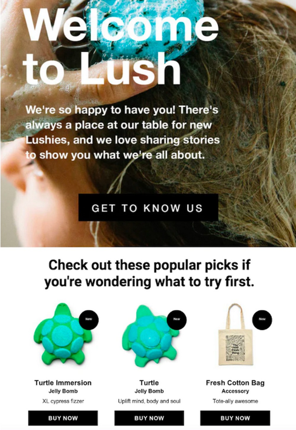
Your welcome emails must embody your brand’s tone and voice. Look at Lush, for instance.
What did we like?
We loved Lush’s welcome email tagline and the short message that follows while addressing newbies as ‘Lushies.’ It surely highlights the brand’s tone that’s known to be friendly and inviting.
The brand has also added a product carousel of its popular picks for new subscribers to explore.
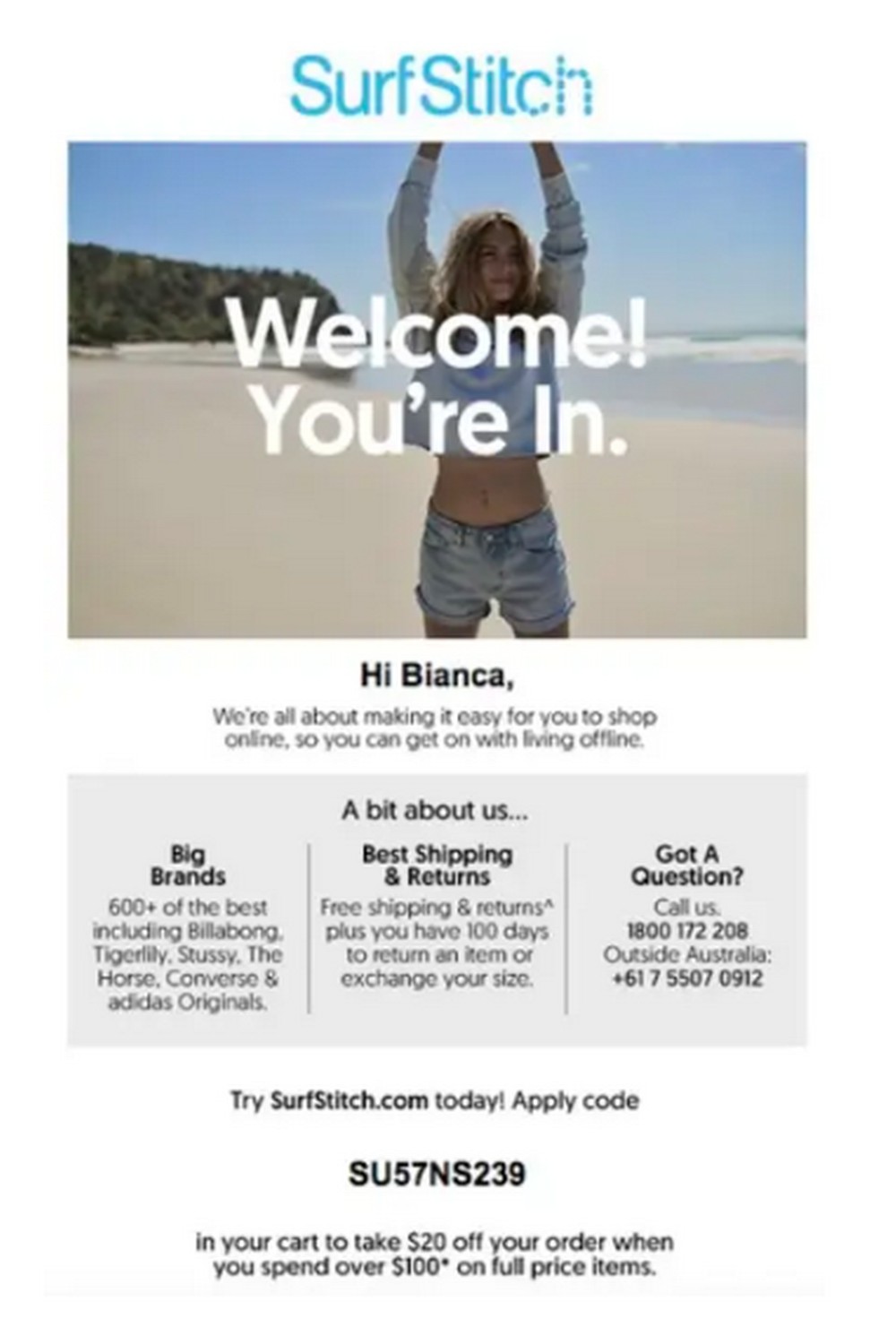
6. SurfStitch
Personalization ads the soul back into your email communications. Addressing your new customer/subscriber by their first names is the best way to add a unique spin to your welcome emails.
Although simple, we noticed that not many brands do this.
What did we like?
SurfStitch shows you how it’s done with the below example of their welcome email. Instead of the routine “Hey you,” the brand addresses the customer by their first names:
7. Ralph Lauren
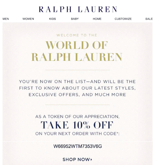
Acknowledging a new subscriber’s effort for signing up to your email list is the best thing eCommerce business could do. It helps nurture the leads and grow sales through loyalty.
What did we like?
Ralph Lauren acknowledges the subscriber and offers a 10% discount on their next order as a token of appreciation.
8. Charlotte Tilbury
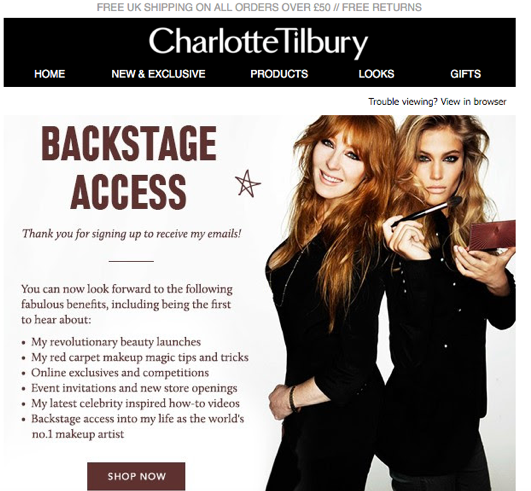
The popular luxury beauty brand Charlotte Tilbury’s welcome email makes it sound like it’s coming directly from the founder herself, making the email unique.
What did we like?
The ‘backstage access’ and what the fresh subscriber can expect is like a drum roll about their upcoming journey.
This friendly tone would no doubt linger on the subscribers’ minds, and they would look forward to more such emails.
9. Vinomofo
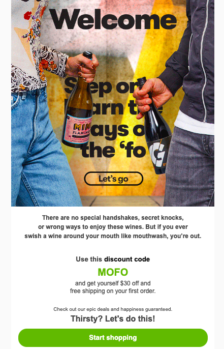
Vinomofo packs a punch with its direct and full-of-slang welcome email paired with a high-quality GIF.
What did we like?
The brand subtly puts across its product’s benefit and ends on a click-worthy CTA like ‘Thirsty? Let’s do this.’
Vinomofo also created a product catalog and asked subscribers to follow them on their socials which most brands miss adding.
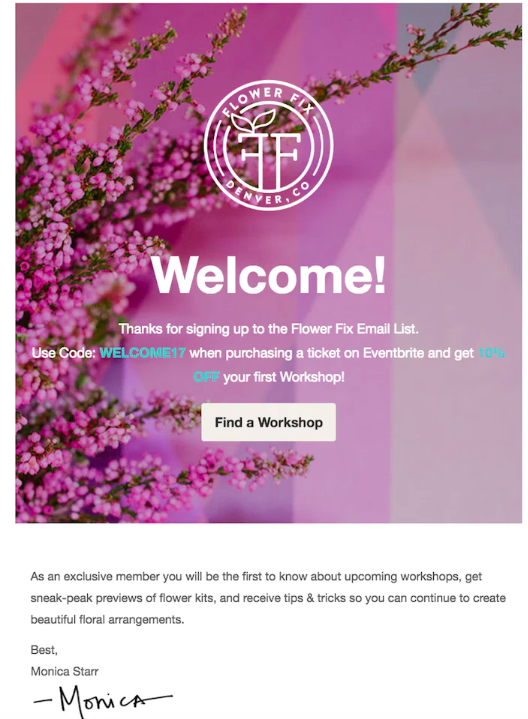
10. Flower Fix
Flower Fix brings much-needed warmth to otherwise generic welcome emails by adding a small and meaningful note from its founder.
What did we like?
The brand highlights the resources, such as workshops and expert tips the subscriber would get by staying on the list, along with a discount code.
11. Glossier
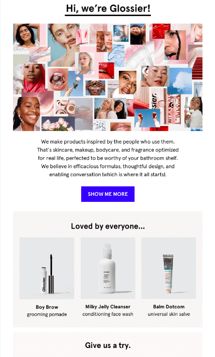
Glossier, the popular luxury beauty brand, has a worldwide fan following and a loyal customer base. Their welcome emails are very scroll-worthy.
What did we like?
We love emails with storytelling. Glossier starts off by putting across its biggest brand benefit — its products and a short story on its mission.
Also, notice how the image is a collage of the brand’s products in use by its real users.
12. Sephora
There’s nothing like belonging to a community of like-minded folks. For eCommerce brands, communities can build healthy conversations between customers and improve customer service where customers help each other out.
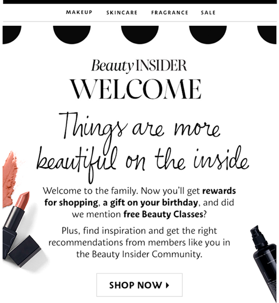
Sephora, being a world-famous beauty eCommerce store, uses the community dynamic with its welcome emails.
What did we like?
The tagline ‘Welcome to the family’ and words such as ‘beauty insider’ make customers feel welcomed into their community and are more likely to linger on for longer.
Also, the brand added how being a part of its community gives customers access to a whole range of incentives.
13. Tarte
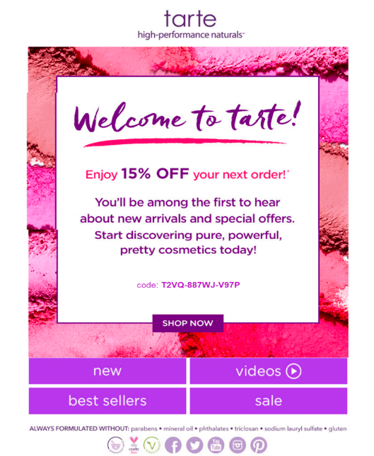
Tarte’s welcome email is short, sweet, and hits the bull’s eye.
What did we like?
The brand has placed its reward right on top of its email and clearly stated what subscribers can expect from their communications. Notice how the reward is not just a generic discount code but is a unique redeemable code as a powerful CTA.
14. Bulk
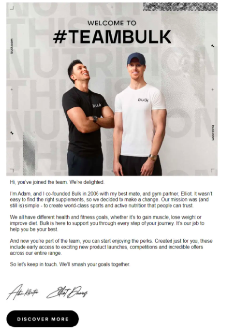
Leading with a brand story is a great way to paint a picture of your products and the journey behind the brand’s foundation. Bulk used this tactic well.
What did we like?
Bulk leads the email with a picture of its founders and a personal note from them.
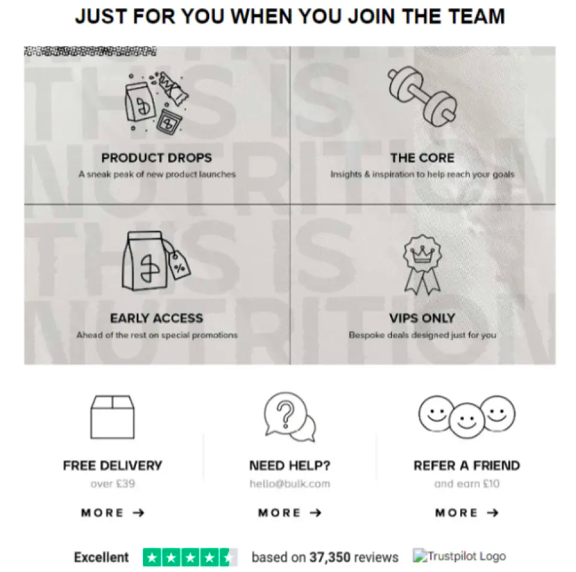
Before subscribers begin to question, ‘what’s in it for me?’, Bulk includes a bunch of perks like sneak peeks into product launches, early access and VIP-only deals.
15. Mode Chocolate
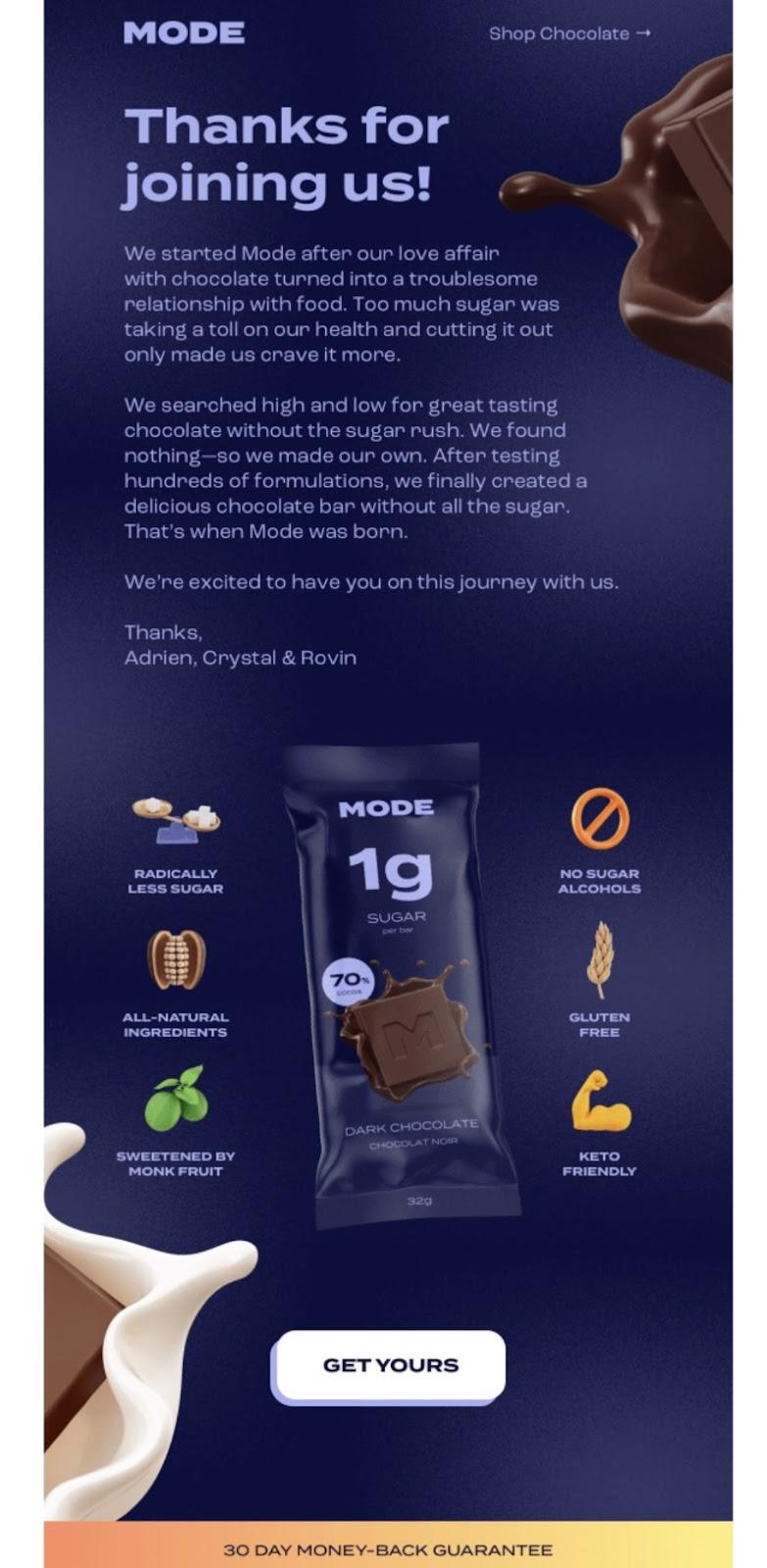
Your new subscribers are likely to hesitate before purchasing from you, especially if they’ve never heard of your brand. Mode Chocolate offers a subtle yet powerful assurance to its new subscribers/customers.
What did we like?
Along with the stunning user elements, Mode Chocolate takes its subscribers down memory lane by talking about the founders’ love for chocolates. Notice (although it’s hard to miss) the high-quality product image surrounded by its best features.
But what really does the trick is the bold statement made by the brand – ‘31-day money back guarantee’. This CTA is sure to turn suspicious subscribers into eager new customers.
Best practices for welcome emails
Here are five best practices for welcome emails that, when followed, are sure to attract more sales:
1. Structure your welcome email thoughtfully
As you might’ve noticed from the examples, each welcome email has one thing in common – an excellent structure and email copy with a perfect balance of words, pictures, and CTAs.
Ensure you make your offer compelling enough by adding high-quality images of your products, using a click-worthy subject line and a powerful CTA.
An AI photo editor can help enhance your product images by improving lighting, removing imperfections, and making colors more vibrant. This ensures your visuals look professional and grab attention immediately.
Most of all, make sure your email design will work on all-devices.
2. Don’t just send one welcome email
You don’t have to send just one welcome email to a new subscriber that covers everything under the sun, from your brand story to product recommendations.
You could treat sending welcome emails as a drip campaign and send multiple emails at different stages of the new customer’s journey. This keeps the journey smooth and natural. Kick off your email strategy with video content and get YouTube views to attract more attention right away.
For instance, you can send your first email within 24 hours of the subscription, followed by the second email that collects user preferences, and then tailor your offer in the third consecutive email.
3. Lead with personalization
Personalize your emails by referring to the subscribers by their names. Also try sharing relatable journeys, and tailoring offers by considering the point at which they subscribed to your emails.
4. Always have a clear CTA
The purpose of sending a welcome email is to nudge your subscribers to take action. CTAs help in grasping reader attention and converting them.
For instance, your CTAs could lead them to discover more of your products, apply a discount code or submit a response. Using display ad networks broadens its reach. The purpose of a welcome email is to prompt action. CTAs grab attention and drive conversions.
5. Analyze and update your welcome emails often based on performance
Strive to improve your future welcome email campaign by regularly measuring and analyzing performance.
You could analyze metrics such as open rates, click rates, bounce rates, total spam marks, unsubscribe rates, forward or shares, campaign ROI, and more.
Conclusion
Welcome emails are often downplayed in eCommerce and are not deemed as important as promotional emails. But the truth is, welcome emails help set the stage for customer expectations and understand consumer interest which is necessary for a promising sales potential.
We recommend using them for every new customer!
This is a guest article contributed by Quinn Malloy.
Quinn Malloy is a copywriter and marketing professional based in Prague, Czech Republic. He works for CloudTalk, helping to create compelling messaging in support of the next generation of cloud communication.
FAQs – eCommerce Welcome Email
A welcome email is the first direct interaction you have with new customers, and it plays a vital role in setting the tone for your relationship. It can increase customer engagement, build loyalty, and ultimately drive conversions. A well-crafted welcome email can boost open rates to 91.4% and significantly reduce the chances of customers unsubscribing or marking your emails as spam. Plus, offering incentives like discounts can prompt customers to make their first purchase.
An impactful welcome email should include a personalized greeting, a clear introduction to your brand, a special offer or discount, and a clear call-to-action (CTA). It’s also important to set expectations for future emails and communications. Best practices include keeping the message warm, concise, and tailored to the customer’s preferences to maximize engagement and conversions.
To boost open rates and engagement, ensure your subject line is attention-grabbing and personalized. Use high-quality images, relevant product recommendations, and dynamic content that resonates with the customer’s interests. A strong, clear CTA will guide the recipient toward the next step such as exploring products or redeeming a discount.
Segmentation allows you to send tailored welcome emails based on user behavior, interests, or demographics. For example, a customer browsing home décor items might appreciate a welcome email featuring related products like lamps or wall art. By segmenting your audience, you can send more relevant emails that increase customer engagement and boost conversion rates.
A single welcome email is a great start, but a series of welcome emails (a drip campaign) can be more effective. You can gradually build a relationship with customers by sending a sequence of emails that nurture leads, introduce your brand more deeply, and offer personalized product recommendations.
Tracking the performance of your welcome emails is essential to understanding what works and optimizing future campaigns. Monitor metrics like open rates, click-through rates (CTR), bounce rates, and conversion rates.
